Amid the chaos of a world in crisis, I’ve found hope in an unexpected place: coding. With tools like Claude.ai and MCP, I’ve been building a web app to help food pantries serve their communities better—automating inventory, breaking language barriers, and streamlining processes. This isn’t just about code; it’s about turning anxiety into action, using technology to create something meaningful. If you’ve ever wondered how AI can amplify human effort, this is a story for you.
Read MoreWeek 2: Summer Internship
This week I continued working on 3D asset creation. My basic approach so far has been to start with a simplified geometry from Fusion 360, then export that design as an .FBX (Autodesk Maya file format), import the FBX to Blender for UV mapping, material, and motion rigging. There’s probably a more streamline way to generate this content, but from a feasibility standpoint, this approach allows me to be flexible and to use different tools for discrete tasks. This week I will be importing these combined assets into Unreal Engine.
This week was also my final week for the term at PCC, where I have enrolled in their online course for Advanced Fusion 360. I’ve been working on a group project, and designing assemblies for use in a solar projector system. The design is based on COTS (commercial off-the-self parts), which required me to draft profiles to meet engineering specifications.
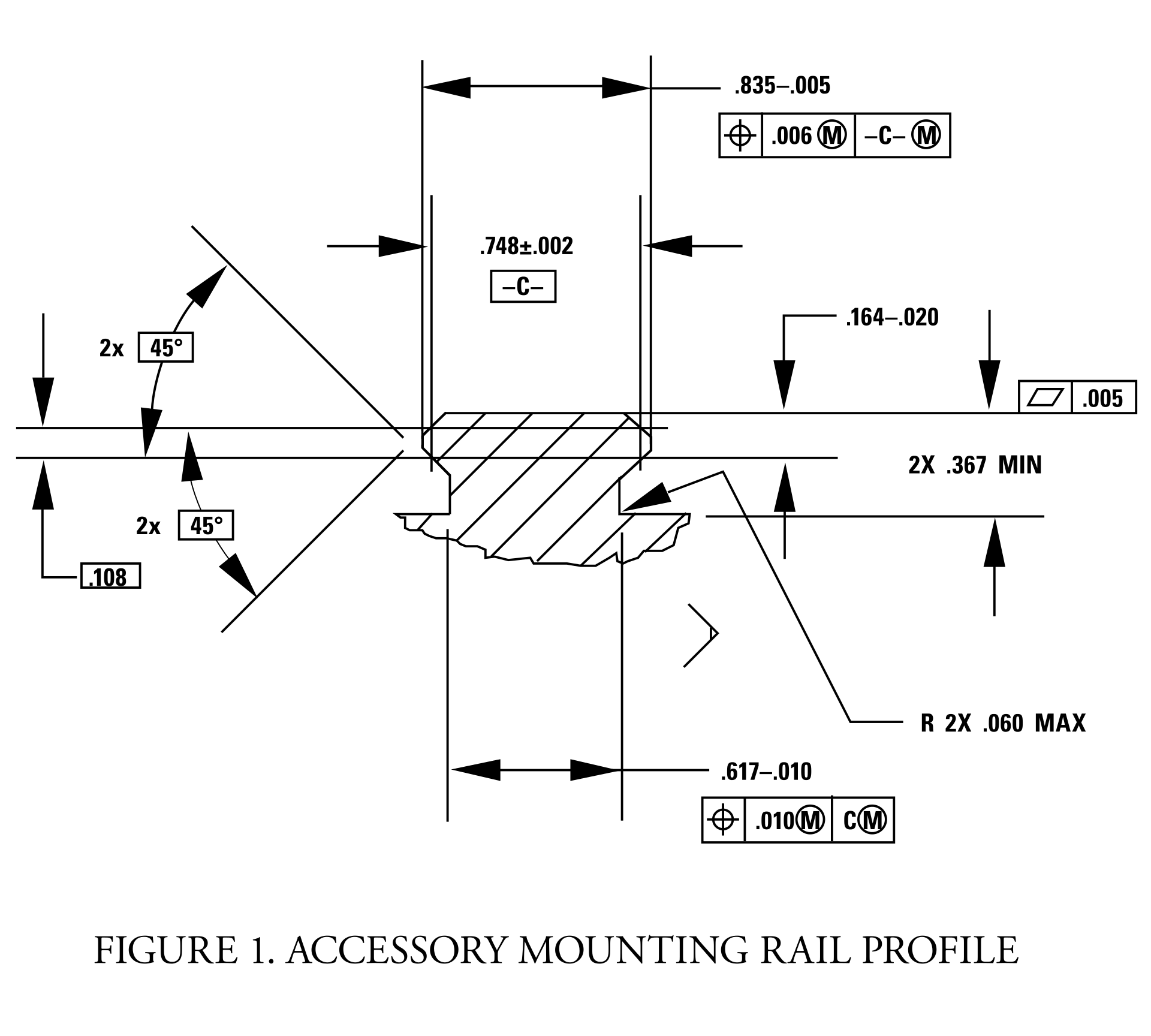
Picatinny rail specification downloaded from wiki-commons.
The final deliverables are due this coming Saturday, and there is still a good bit of work to be done before we get graded on this project. Nevertheless, I am very pleased with the current state of things. I’ve been using Quixel Mixer to produce more realistic rendering material than the library included with Fusion 360. I say, “more” realistic because Fusion 360 already has some excellent materials. Take a look at this rendering of a Bushnell 10x42 monocle (one of the components in this project):

I haven’t yet added any details, but as you can see, the rubberized exterior and textured plastic hardware are fairly convincing. Now, take a look at the mounting hardware rendered with Quixel textures:

An important component in photorealism is the inclusion of flaws. Real life objects are never perfectly clean, perfectly smooth, or with perfect edges. Surface defects, dirt, scratches, and optical effects play an important role in tricking the eye into believing a rendering. With Quixel Mixer, it is possible to quickly generate customized materials. While this product is intended for use with Unreal Engine and other real-time applications, it does an amazing job when coupled with a physical based renderer.

Picatinny rail set with hardware and bracket.
I’m excited to see what can be done with these materials in a real-time engine, especially given the advanced features of Unreal Engine 5. Fusion 360’s rendering is CPU driven, whereas Unreal is GPU accelerated. With both Nvidia and AMD now selling GPUs with built-in raytracing support, it won’t be long before we see applications that offer simultaneous photorealism rendering within modeling workflows.
Additionally, GPUs also work extremely well as massively parallel computing units, ideal for physical simulations. This opens up all kinds of possibilities for real-time simulated stress testing and destructive testing. It wasn’t that long ago that that ASCI Red was the pinnacle of physical simulation via supercomputer. Today, comparable systems can be purchased for less than $2,000.
Of course, this price assumes you can buy the hardware retail. The current chip shortage has inflated prices more than 200% above MSRP. Fortunately, with crypto markets in decline and businesses reopening as vaccination rates exceed 50% in some regions, there are rays of hope for raytracing-capable hardware being in hand soon.
Week 2 mini-update: outputting video from Unreal Engine 5
Usually, I only update my blog on Sunday nights — I like to reflect after the week is done and I’ve had a full dose of daylight to consider what matters.
I’m breaking that rule because I’ve learned something that I think might be useful to others. Last week, Epic Games released a preview of Unreal Engine 5. If you haven’t looked at this tech, it’s worth your attention. We’re rapidly approaching a point where individual creatives (equipped with modern hardware) will be capable of producing photorealistic graphics in realtime. This is due to a convergence of procedurally-generated content, open libraries providing physically based materials, templates, and raytracing technology.
I’m a huge advocate for 3D technology. Being able to show something instead of telling it is huge. Consider all of the times in your life that you had an idea, something that you could clearly, vividly see inside your mind, but you felt was difficult or impossible to describe? What if you had the tools to quickly take your idea and represent it visually, with no limits to fidelity or realism? These tools exist, and they are getting better every day. Additionally, many of these tools are free and have a wealth of community-led learning and support.
Today I was asked to come up with a way to capture video from unreal, and I discovered a great way to do it in Unreal 5 Engine. Here’s how!
Geigertron’s Very Practical Guide to Exporting Video From Unreal Engine 5
For this example, I’m using a sample project based on MetaHuman Creator, you can download UE5 preview, it’s all free!
1) After opening the sample project, click on the clapperboard icon (“Cinematics”).
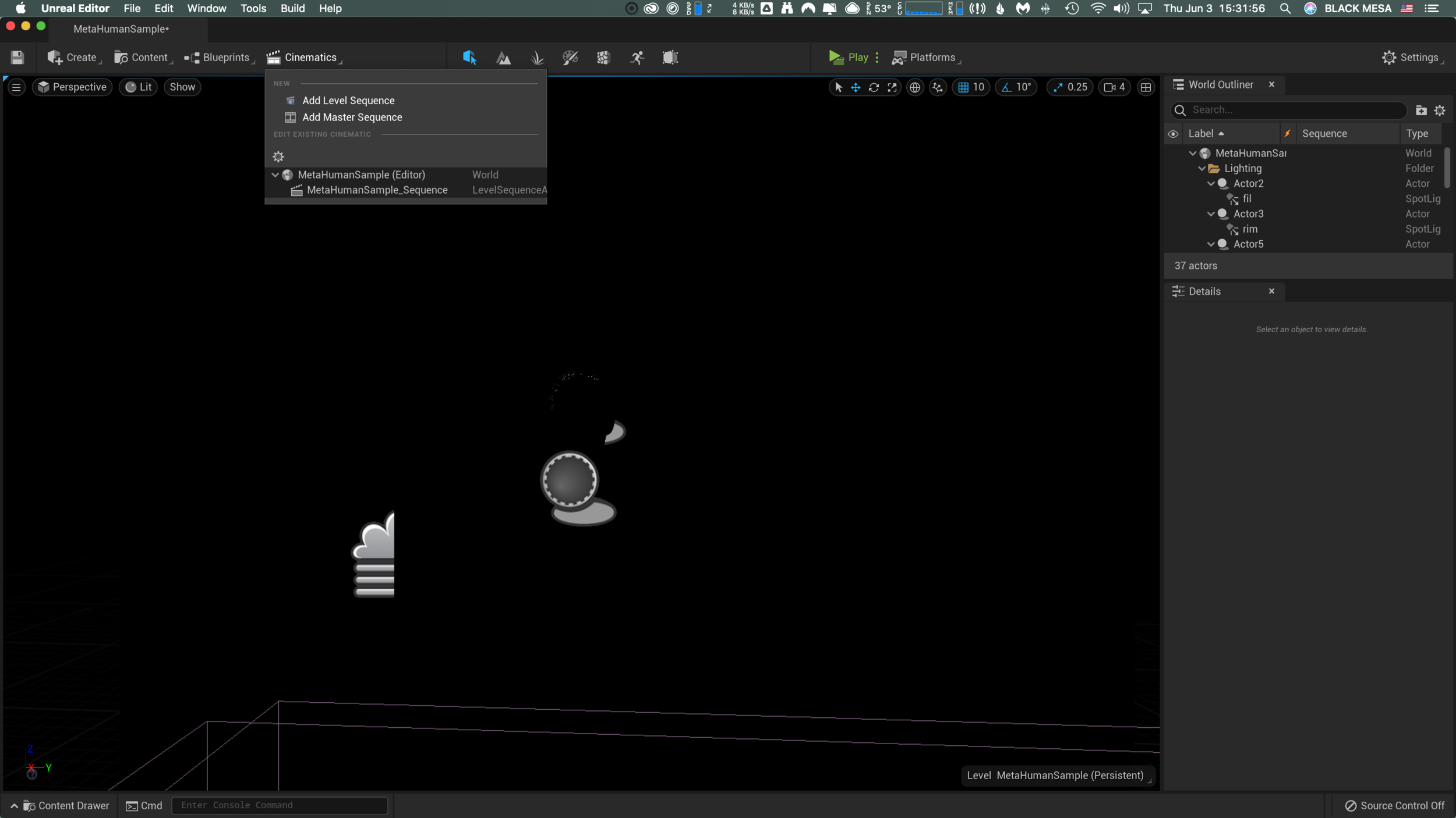
2) In this example, there’s already a sequence (MetaHumanSample_Sequence), so we’ll select that. To learn more about creating a cinematic sequence, click here.

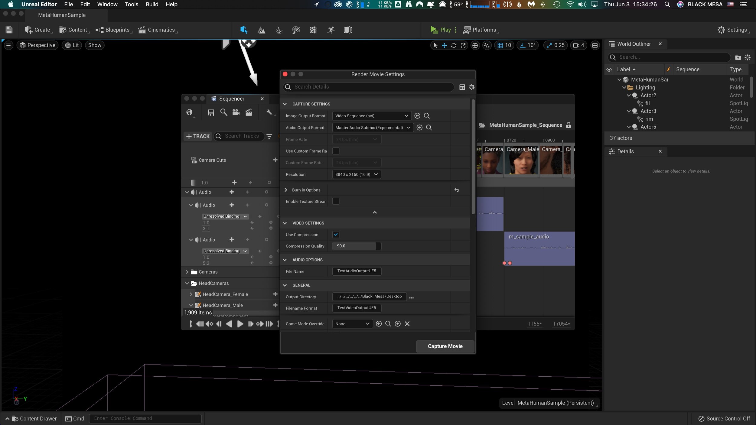
3) Within the sequencer window, there is another clapperboard icon on the top row menu. Click this to open the “Render Movie Settings” window.

4) From the Render Movie Settings window, you can select, output format for image and audio, resolution, compression, and output file location. After setting up, click the “Capture Movie” button on the lower right and wait for UE5 to finish rendering and saving your output file.
This operation completed in near realtime and the output is pristine. If your scene contains audio, then you’ll need to merge/combine it with the video output. I did this in After Effects, but other programs would probably work equally well.
Kinetic-friendly spoon project Mega Post
That’s a wrap! It’s certainly been an interesting semester, but now I am ready to put it behind me. Reflecting on the spoon project, I have some final thoughts and observations. First, I want to thank the fine folks at CMU School of Design. From the amazing and hardworking faculty and graduate student cohort, I have had nothing less than inspiration and encouragement throughout this entire process, despite the obvious challenges of working remotely.

Rendering of sixth and final (?) spoon design. I pulled the kitchen design (Pierre Gilles) and bowl (Damogran Labs) from GrabCad.com. The spoon and coffee mug are mine.
This project was divided into two parts: the first part focused on exploring different ways of prototyping and making. This was described to me as an informal way of A/B Testing for methods. The second part involved the deliberate iteration of prototypes through user testing — a challenge in the context of a global pandemic and social distancing. To make the most meaningful design choices possible given limited resources, I decided to leverage the power of physical simulation to supplement the making of physical prototypes.
There are a variety of 3D software tools that offer some degree of physical simulation. For this project, I selected Maxon Cinema 4D R20 (Educational License) and Blender as my two ways of making. I chose these because I already am familiar with Cinema 4D and understand know how to manage a workflow in that context, because Blender is open source and free for anyone to use, and both programs work under MacOS and Windows environments (my rendering workstation is a Hackintosh with multiple operating systems, which grants the flexibility to overcome certain technical limitations). My initial experiments with Cinema 4D were… not great.
My very first (and failed) attempt to simulate fluids in Cinema 4D.
Carnegie Mellon University
School of Design
Prototyping for Interaction
Spring 2020
As you can see, there are “physics” happening here, but they are not anything close to the physics of the real world. This is not “real world” physics, this is Asshole Physics:
Zachary "Spokker Jones" Gutierrez and I came up with the term "Asshole Physics" when we were discussing the game and the physics models it employed. Basically there's a lot of crap you can knock over and kick around, including dead bodies, buckets, cans, and little sections of drywall which are standing around in the middle of rooms for no obvious reason. Zachary casually mentioned, "I have made it a point to knock over every fucking thing in that game. I am living out my fantasies of being a giant asshole," and I responded by stealing his "asshole" comment and claiming that I made it up. Thus "Asshole Physics" was born.
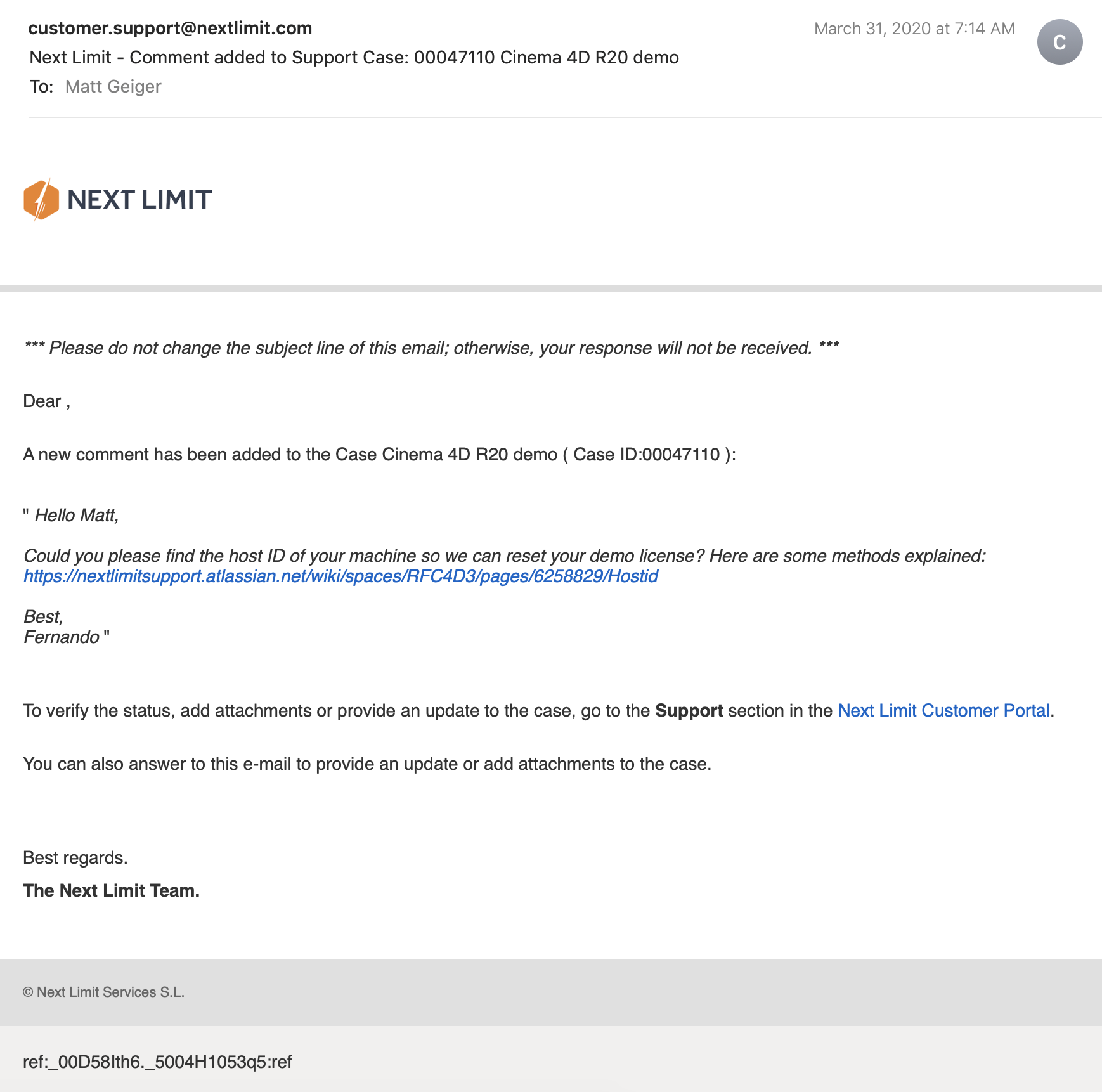
Without more sophisticated plugins to simulate fluid, Cinema 4D R20 is only “out of the box” capable of non-newtonian semisolids. I can make stuff bump around and “squish.” I can have a 3D character micturating on the side of a building. I can create the appearance and illusion of something like a fluid, but with such restrictions, I could not realistically evaluate my spoon designs. I explored my options and found that Next Limit’s RealFlow plugin would meet my basic needs. Best of all, they offer a free 30-day trial! My initial excitement quickly waned after the plugin failed to install and activate on my system…
(This email chain is long and covers a week of back and forth with customer service. I am including the entire conversation as a way to recreate my experience. While this may not directly relate to the scope of this project, I still believe that there is value in documenting the unexpected problems that crop up when trying to do something new.)


It took a week to finally get everything sorted with the demo. During that time, I began to explore option B: Blender.
Blender is a free, powerful, open source 3D creation tool. Best of all, it includes the mantaflow fluid simulation engine (since version 2.8). I have worked with Cinema 4D on other projects, and have become fairly comfortable with the interface. Given my experience with Fusion 360, Inventor, and C4D, I knew that I would need to overcome a learning curve before I could use this software to meet my needs for this project. Fortunately, I was able to find a spectacular tutorial series for beginners.
If you want to read more about my experience with the tutorial, click here.

This tutorial was ideal because it involved exercises that helped me learn how to use the interface, and covered several different workflows. I was really impressed with Blender’s node-based material system and procedural textures. You can work strictly with parametric modeling, or you can discretely modify mesh geometry to create highly organic and imperfect forms. I’m excited to work with Blender on future projects. It’s a very exciting time to be working in 3D.
While working through these tutorials, I began sketching and working in Fusion 360 to craft my first spoon designs for part 2 of this project. You can read more about this experience here.
Takeaways from Part 1
I really appreciated the responsiveness from the team at Next Limit. Clearly there are problems with the software’s implementation of their product’s copy protection. This is an all-too-common problem in the world of software. Programmers gotta eat just like everybody else, and we certainly should make sure that the talented and hardworking folks behind the code are able to put food on their table at the end of the day. Piracy can deprive a small business of the necessary revenue to keep the lights on, so I am absolutely sympathetic to this reality and what risks are involved when you release your software for demo purposes. Getting people to pay for something that they can easily get for free is a challenging proposition. At the same time, you cannot realistically expect to get customers to pay for software if they cannot try it first. Ultimately, this one week of back and forth with customer support was a critical loss. I never completed a side-by-side comparison of fluid simulations. While I did eventually succeed at installing and using RealFlow to do fluid simulations, (and was honestly impressed with how easy it was) I did not, however, have enough time to setup a comparable simulation to evaluate spoon designs. My trial expired about a week ago, and I see this aspect of the project as a lost opportunity. If Next Limit applied similar licensing practices as Maxon (verify it through .edu email address), they could offer an educational package of their RealFlow plugin.
Blender really came through for me. The learning curve was aggressive, but not impossible. While I found mantaflow to be a respectable and entirely capable fluid simulator, it was not without its own share of issues. I spent a lot of time making granular tweaks to improve the fidelity of my simulations, while also using the observations from my simulations to inform design decisions for my spoons in part 2 of this project.
Part 2: Design Iterations Based on User Testing
While this project required user testing and design iterations based on feedback, I decided to limit the user evaluations to address handle shape and the spoon’s overall dimensions. This was not an arbitrary decision or an excuse to focus on physical simulation of fluid dynamics (with user testing as an aside). No, this decision was based on the nature of the course from which it was assigned: Prototyping for Interaction Design. This semester I have have been focusing on designing for interaction (arguably, all designers do, at some point in their process, focus on this aspect). When thinking about the tools we use (to eat food) as a system, it is important to consider the touchpoints involved. The handle of a spoon is a non-trivial component. It can take on many forms, and naturally includes affordances. How someone holds a spoon, and how easy it is for them to use it are central to the evaluation of the design.
The iterations of design were highly generative in nature, inspired by both user evaluations and physical simulations, I maintained a homeomorphic continuity: treating the initial shape as an elastic form to be molded and reshaped to maximize performance. Knowing how a concave shape might be optimized to perform under rapid movement — I wanted to create something that would be useful, and the physical simulation of fluids facilitated a means of evaluation — is only one aspect of a more complicated interaction, and this test alone could not fully address human needs. When physical form is designed and directed to improve user interaction (and physical properties are given equal consideration), it is possible to create a truly useful tool. I realize that this is a very technical description, but it is easier to understand when properly visualized. I have rendered a compilation sequence to show how this spoon shape evolved to its final(?) form (I am still considering a physical prototyping stage for this project over the summer).
A sequence of fluid dynamics tests designed to evaluate fluid retention of concave forms. Carnegie Mellon University, School of Design, Prototyping for Interaction, Spring 2020.
Toward the latter half of this sequence, you will notice a change in colors (for both the liquids and spoons). I decided to differentiate the final rendering sequences as these were based on user evaluations. The colors chose for these final sequences are based on the color tags used for the user test:

These printouts are derived from DXF vector images exported from Fusion 360. The designs shown are oldest (top) to newest (bottom). The fifth design (blue) is rendered with a blue body and green liquid.
I printed and mailed the paper prototype to a potential user suffering from ongoing hand tremors (my partner’s mother). I sent this without written instructions. Instead, I only provided different color tags to facilitate feedback. My user let me know that the red spoon handle was in the “Goldilocks” zone in terms of size and shape: not too big, not too small, not too curvy, not too straight. Using this feedback I constructed the sixth and final (?) form — see the first image of this post.

The user test included a direct side-by-side comparison with existing dinnerware.
Before developing these simplified paper prototypes, I also experimented with ways of making more three-dimensional forms that could be sent in the mail. While this novel approach showed some potential, I was concerned with how user error might complicate or (even worse) bias feedback. Still, these paper prototypes helped me to better understand and interpret the scale of my 3D models.

Final Thoughts
This project still feels somewhat incomplete. Perhaps this is because the generative design process itself can always demand further iteration, or maybe it is because I have not yet created a physical prototype that can actually be tested as an eating instrument. Maybe it is only because there were still a few “rogue droplets” (grrrrrr) that I simply could not keep contained with the completion of my sixth iteration. Whatever the net effect might be from these various shortcomings, I am pleased with the learning opportunities that were presented throughout this exploration of design.
Were I to continue with this process, the next steps would be to 3D print the latest shape using a food-safe material (there are a few third-party vendors that offer this service). I would then ship that latest design for further user evaluation. I believe that there are still many additional iterations necessary before I could defend having created something that satisfies the criteria I set out with this project (i.e., a spoon that overcomes the challenges of involuntary muscle movements and essential tremors).
If I were to collaborate with others, I would also want to evaluate the ecological and economic impact of such a device. How might we go about manufacturing to appropriate scale? How might additional user tests with a wider audience influence the existing form? There remains many unanswered questions and a newfound respect for the power of generative design.
Interactive Design Prototyping
THE TIME HAS COME TO…PUSH THE BUTTON

Wireless communication between Arduino #1 and #2
My current project in IxD Prototyping involves physical computing (i.e., “interactive systems that can sense and respond to the world around them.”) I have worked with Arduino before (Restricted Area, 2017) but this newest project is expected to have a daily use. In my head, I keep a long list of annoying technology interactions—this gets updated frequently. We are saturated with unsatisfying technology and devices that cause more problems than they solve. We have inconveniences stacked upon inconveniences, and if we were to step outside of this environment, you would inevitably conclude that most electronics are made to punish the buyers. I am looking to improve just one such interaction.
Back in 2012 I bought an HD video projector. If you love to watch movies, there is something magical about having “the big screen” at home. I love it. Do you know what I don’t love? Using an infrared remote control on a devices that is mounted above and behind me. Seriously, Epson: what where you guys (and yes, I’m assuming it was a team of men, with their dumb penises getting in the way of common sense) thinking?! The primary function of the remote control is to simply turn the projector on and off. I would gladly give up the remote control entirely if I could simply move the power button to the armrest of my couch. Instead, I must contort my arm in Kama Sutra fashion just to find the right angle to get the sensor to recognize the POWER-ON command from the remote.

Getty Images: the various methods for turning on an Epson HD Projector.
My girlfriend’s method to bypass the projector is more elegant: she retrieves a step-stool from our utility closet and presses the ON/OFF button on the projector chassis. This works well, but … well, let’s just say, it ruins the mood. I began to explore other options, and realized that the primary issue is that IR remotes are directional. The IR sensor is part of the assembly, and cannot be relocated. Arduino is capable of IR communication, it is also capable of RF communication. Radio frequency is far less dependent on line-of-sight, especially within the context of indoor and residential use. Imagine what WiFi would be like if it worked over infrared. Consider also that Apple abandoned their IR remote interface for the Mac.
Enter the Arduino
I found a few open source projects that utilize IR and RF communication:
https://learn.sparkfun.com/tutorials/ir-communication/all
https://www.electroschematics.com/ir-decoder-encoder-part-2-diy-38-khz-irtr-module/
https://learn.adafruit.com/using-an-infrared-library/hardware-needed
https://www.sparkfun.com/datasheets/Components/nRF24L01_prelim_prod_spec_1_2.pdf (PDF Warning)
https://www.deviceplus.com/arduino/nrf24l01-rf-module-tutorial/
https://forum.arduino.cc/index.php?topic=421081.0
https://howtomechatronics.com/tutorials/arduino/arduino-wireless-communication-nrf24l01-tutorial/
All of these resources are excellent. I want to call attention to one more link: https://create.arduino.cc/projecthub/muhammad-aqib/nrf24l01-interfacing-with-arduino-wireless-communication-0c13d4
I have a bone to pick with this one. Take a look at the wiring diagram:

Diagram created by /u/Muhammadaqibdutt
Note the LED pin-out for the receiver. This diagram shows the positive leg of the LED connecting to Pin 3
Now, lets take a look at the code:
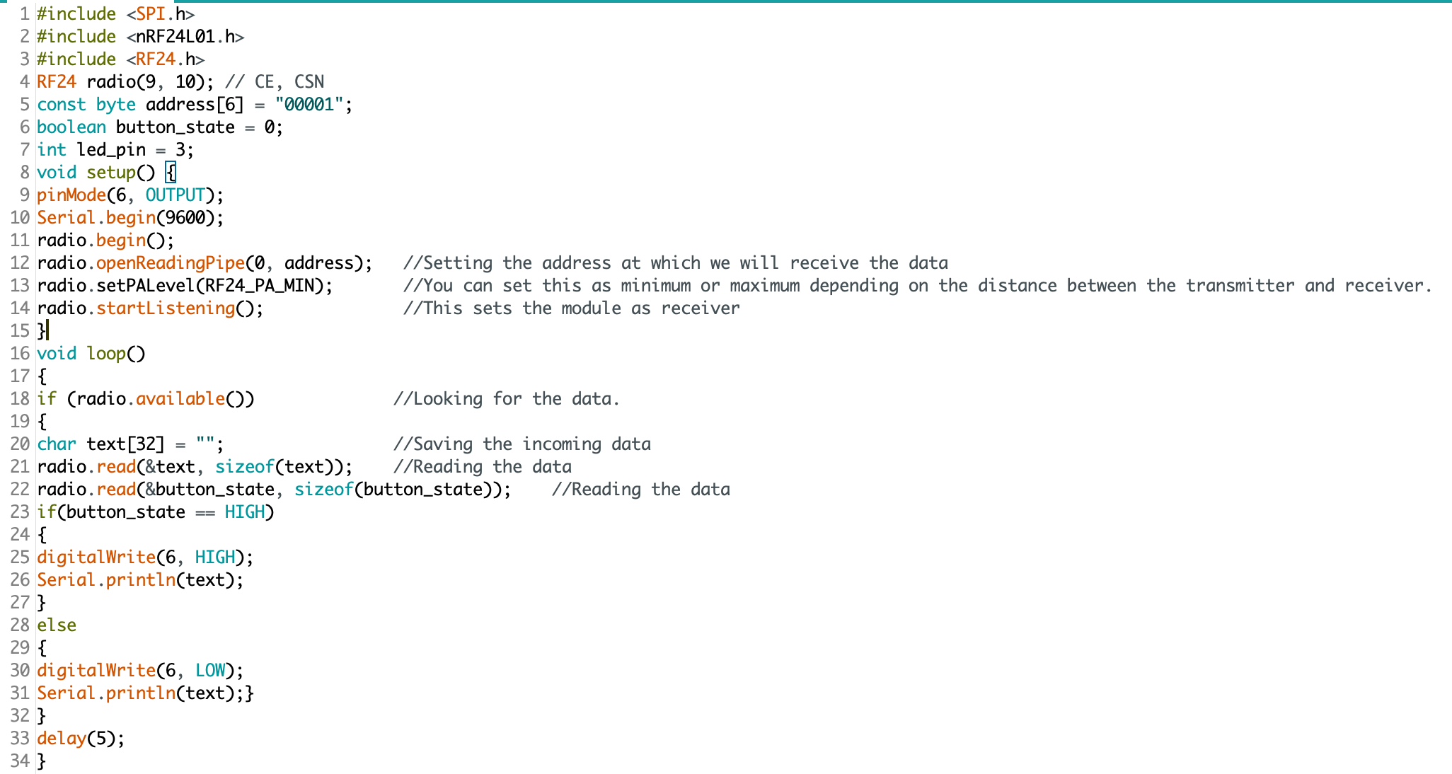
The devil is in the details: “digitalWrite(6, HIGH)” condition turns the LED on. Pin 3 does nothing.
This made for some very “fun” troubleshooting. I’ve since ironed out all the kinks, and have successfully pirated the IR remote signal from an Epson brand projector (on loan from the Design Office at CMU), and have moved on to making an enclosure. Will I 3D print or laser cut? I have not yet decided.
Here is some sample code for my RF triggered IR emitter:
(NOTE: this code is just one half of the project, and by itself cannot do anything. You’ll also need IR and RF libraries to make this code work on your Arduino)
#include <SPI.h>
#include <nRF24L01.h>
#include <RF24.h>
#include <IRLibAll.h>
RF24 radio(9, 10); // CE, CSN
const byte address[6] = "00001";
boolean button_state = 0;
int led_pin = 3;
IRsend mySender;
void setup() {
  pinMode(6, OUTPUT);
  Serial.begin(9600);
  radio.begin();
  radio.openReadingPipe(0, address);
  radio.setPALevel(RF24_PA_MIN);
  radio.startListening();
}
void loop()
{
  if (radio.available())
  {
    char text[32] = "";
    radio.read(&text, sizeof(text));
    radio.read(&button_state, sizeof(button_state));
    if (button_state == HIGH)
    {
      digitalWrite(6, HIGH);
      Serial.println(text);
      //Arduino Remote On/Off button code
      mySender.send(NEC, 0xffa25d);
    }
    else
    {
      digitalWrite(6, LOW);
      Serial.println(text);
    }
  }
  delay(5);
}
Monopoly, by Parker Brothers, 1935
DO YOU WANT TO PLAY A GAME?
Over the weekend, I had some time to digest a very fruitful and in-depth session with my design team. We focused on learning experiences through play. There is no denying that gameplay has significant educational value. Consider the 2002 Millennium Challenge. The US Dept. of Defense spent over $250 million to explore the scenario of a US invasion of Iran. A retired USMC Lt. Gen, playing for the “red team” (i.e., opposing forces), and shocked US commanders when his opening moves defeated the US Navy during a simulated attack. His tactics were so devastating that the game facilitators had no choice but to reset the scenario, and impose artificial restrictions. His tactics revealed a strategic weakness, and exposed the unknown. Was it worth $250 million? Considering the expensive lessons we learn (or, fail to learn) during actual warfare, I would argue that such simulations are a bargain.
With so much potential (for both learning and fun), we explored game mechanics as a way to make the abstract concepts of digital rights more accessible. We rant into a few obstacles with this approach, but none more frustrating than the fact that there are already several games that attempt to do exactly that. We agreed that we do not need one more in that mix.
Toward the end of that session, I became acutely frustrated by the divide between tactics and strategy. Encryption is important, and I want people to know about it, but I also don’t see it as a solution to systemic issues of user privacy, data collection, and surveillance capitalism. To be clear, I still think that it is a valuable tactic and an essential technology, but it falls short of addressing most of my strategic concerns. Worse yet, addressing these technologies as their discrete parts leaves little room for addressing the issue of digital citizenship, digital rights, and the electronic frontier we all care so much about.
How then, can we present this level of complexity to our intended learners? And *who* are our learners, exactly? We reached consensus that “digital natives” make the most sense — but really it should be everyone who benefits from (or can be harmed by) the internet.

Pictured: a young netizen. There is no way that this kid gave consent for this picture to be distributed, but let’s put a pin in that for now... Intel Free Press — https://www.flickr.com/photos/intelfreepress/8433147083/sizes/o/in/photostream/
Where is the strategy? Where is the awareness? We began to focus these concerns through a framework created by Grant Wiggins and Jay McTighe, and their “six facets of understanding.” Before we can decide how to address *how* learners will understand this complexity, we first needed to develop concrete goals for learning.
The six facets for learners
Explain: learners can produce written/verbal information relevant to the topic
Interpret: learners can construct a narrative, linking cause and effect for a given phenomenon
Apply: by contextualizing what they know, learners can adapt their model of understanding to solve novel problems
Perspective: learners are able to think through a problem from the perspectives of different actors
Empathize: can think experientially about other’s interactions with a context, and value how they experience it
Self-knowledge: be aware of how that knowledge affects their thinking and decision making. Know the limits of their understanding, and what remains unknown to them
In the game monopoly, children (ages 3 to 10) learn zero-sum capitalism, market failure, scarcity, opportunity cost, property rights, legal penalties, and much, much more. The players get to take on the role of a property tycoon, and quickly learn that there are different layers to the game. This was by design: the original intent of the game was to teach players about income inequality. It is a game born out of the Great Depression. One of the often overlooked aspects of Monopoly is that “house rules” are determined by the players. A game of monopoly need not be cut-throat. The rules can be tweaked to be more equitable for all. This is true beyond the board game context—this is core to the very concept of democracy.
Not knowing how to synthesize something so elegant (to address digital rights), I told the group that what I really wanted was a constitutional convention. I wanted people to take on the 21st century equivalent of Hamilton, Madison, Jefferson, and Washington. I wanted smartphones and powdered wigs, tough negotiations and duels. I wanted people to think about their dissatisfaction of being mere subjects to the kingdoms of Facebook and Google, to having no higher status than “colonist” on a digital frontier.
Could roleplaying be enough? Could personas to represent different stakeholders facilitate a learning experience? How can we get people to take these roles seriously? I had more questions leaving our session than I came in with.
Upon reflection and a white board session with Nandini, we returned to the idea of game mechanics in a learning experience. I think we both retreat to the territory of fun when things get difficult. Indeed, for such a heavy subject, I do want people to have fun, and make the learning happen under a blanket of stealth; people tend to be more open to new ideas when they step outside of their own context to engage in play, and we wanted to leverage that. As I alluded to earlier, this is also true in the context of war games.
Returning to Wiggins and McTighe, we began synthesizing game mechanics around the six facets.

I’ll do my best to make sense of these scribbles—I promise!
Mechanics under consideration (an incomplete inventory)
Digital and physical mechanics
Hidden agendas
Secret personas
Objectives with dynamic feedback
Inevitable conflict, plausible compromise
We now envision a game, where players use their mobile device as an interface, while interacting in physical space. The players are participating in the first constitutional convention of the internet. They are randomly assigned roles that will dictate their objectives (e.g., a movie and television streaming service, a government surveillance agency, or a social media platform). These personas will act as stakeholders, trying to advance their agenda. Players will take turns, negotiating for an objective to be codified into a digital constitution. Players will then anonymously vote (using their mobile device). As certain provisions are agreed upon, the player’s objectives will change in real-time. For example, an video streaming service is naturally harmed by asymmetrical restrictions on bandwidth… unless they also control that restriction themselves, giving them an unfair competitive advantage over competing platforms. If they “lose” the fight to obtain net-neutrality, their agenda shifts to obtain power over the inequality. Likewise, a government agency and a social media platform might both benefit from anti-privacy measures.
This is as much of a convention as it is a war game.
How does this perform under the six facets?
Explain: players will learn key terms related to cyber security, digital rights, privacy, and the institutional structures governing the World Wide Web
Interpret: to perform well at this game, players will need to engage their critical thinking skills and explore the relationships of a highly dynamic and complex system. They will develop mental models to account for economic, social, and political aspects of 21st century technology
Apply: as their mental model improves, players will begin to think strategically about their objectives, and the objectives of other players. They will improve their ability to persuade and advocate for complex policy positions
Perspective: players will become aware of the competing stakeholders, their agendas, and the consequences of their proposals over time
Empathize: players will learn to value differing and conflicting goals, and will understand the gains and loses for themselves and others
Self-knowledge: players will become aware of the complexity, and will identify gaps in their knowledge through multiple playthroughs
Tackling the challenges for our learners
Bridging knowledge gaps.
Working with a team of three other designers, we began to see points of divergence for our goals. Amanda’s focus on online activism and leveraging new technologies was compelling, but she was driven to do this work independently. Nandini and Michelle were also interested in the digital realm, but were not sure about the framing for citizenship.
One of the key challenges for addressing citizenship in the 21st century is the fundamental misunderstanding by the public of how we interact with these new technologies. Twitter, Facebook, Instagram, etc. have removed the traditional political boundaries and geographic limitations of culture and ideas.

This is our stake-holder map, there are many like it, but this one is ours.
The advantage of this style of mapping is that we do not need to work from the current state toward feasible solutions. While the appearance may be linear, we actually developed our ideas for bridging the gaps by first looking forward, to a preferred state. Herbert A. Simon succinctly described the field of design as “changing existing circumstances into preferred ones,” which is exactly what we are plotting with this map. We then can backcast from the preferred state, and identify patterns and opportunities for intervention.
This tool is simple as it is effective. For weeks we had been looking at how technology was affecting citizens’ perception of reality (bots, trolls, hackers, fake news, hoaxes, disinformation campaigns, post-truth, etc.) but we had not adequately considered how bidirectional that perception was. In late 2013, a hacktivist documentary titled, TPB AFK (The Pirate Bay, Away From Keyboard) was released. This film chronicled the political and social aspects of digital sharing, and the rise of Sweden’s “Pirate Party.” Having won seats in parliament in 2009, The Pirate Party of Sweden was a recognized political group. Since then, other nations (e.g., Germany and Iceland) have also elected members from this movement.
The philosophy of the Pirate Party is best understood from their belief that “the internet is real.” They do not make the distinction between interactions “IRL” (In Real Life) and “online.” Instead, they use the term “AFK” (Away From Keyboard) to describe that state. In American politics, we can see the disruption all around us from this misunderstanding. People have been tricked into believing that their online activities are somehow contained, safely behind a prophylactic digital barrier. It’s “on the internet” and therefore not real. Except that it is. Imagine the mayhem that would exist if people believed that their personal vehicles and the roads on which they travelled were somehow a totally self-contained reality, separate from everything else.
Our goal therefor is not to leverage technology to help citizens become more engaged IRL, or AFK, but to help them understand that they are still citizens, even (and especially) when occupying digital spaces.
Considering stakeholders
Civic engagement: how grassroots movements make lasting impact.
As I continue to think about what citizenship truly means, I am disturbed to think about the lack of participation in western democracy. As I mentioned in an earlier post, the 2016 general election saw a 20-year low in voter turnout. It is tempting to shake my finger and to blame systems and policy (I still do this, in private), but when you pan back and look at the tension between discrete categories, it becomes much clearer what the stakes really are. I have heard from many of my closest friends and peers, that the election of Donald Trump has sparked an ad-hoc civics class. The Washington Post even launched a podcast whose title illustrates this phenomenon: Can He Do That?
One of the factors that prevents people from engaging with politics in a meaningful way, is the pervasive feeling of uncertainty. When you do not understand the mechanics of government and politics it is easy to be discouraged. The first amendment of the US Constitution guarantees the right to petition government for redress of grievances. This principle makes sense, but government is not a monolith. Government is not a person or a place, so who or what do you call upon when you have a valid complaint? When there is an emergency, you can call 9–1–1, but what about the slow-moving emergency of climate change, wage stagnation, the rising costs of education, childcare, or medical services? We the people might be pissed off. Many of the people who voted for Trump were voting with their middle finger — people often make poor choices when acting in anger.
Grassroots movements have historically been the most successful when groups form durable solidarity toward specific and appropriate goals. If we can find a way to synthesize a learning experience to form coherence with groups who share common grievances, we can make real impact. The 2020 election presents a unique opportunity to pressure elected officials. This is an ideal setting for researching this wicked problem.
Citizenship and technology: questions and hypotheses
This week we continued to explore citizenship from the lens of learning experience design (LxD). This issue is complex, affecting countless individuals, institutions, systems, and more. It was helpful to visualize the issue with a team (we continued a second day of whiteboard sketching, with post-its for card sorting. Ultimately, this helped us to identify the categories of “Five Ws” (Who, What, When, Where, Why) and How.
Who: voters (including potential voters). In 2016, voter turnout was at a 20–year low. Nearly half of voting-age Americans did not cast a ballot in 2016. It could be easy — even tempting — to look at this group and condemn their inaction. After all, Hillary Clinton received nearly 3 million more votes than Donald Trump, but lost the electoral college due to roughly 100,000 votes spread between three so-called “swing states.” If we ever are to have a health democracy, we need more people to vote, and they need to vote consisently. There are no “off years” for civic duties.
What can be done to increase voter turnout? This varies from one state to the next, so this question cannot be addressed at a national level, unless we first address the specifics of each state. Since the focus of this class is not public policy, we should instead look at voters and what resources would help them to understand the election process. There are many competing ideas, and it is likely that not just one policy or change to our elections will do the trick. Ultimately, we need voters to understand the necessary steps in the process, from registration to the act of casting a ballot.
When? Now.
It is not particularly helpful to only look at voters during our election years — every year, all year is what we need. Voting is only one small piece of civic responsibility. Volunteering in your community, military service, writing and calling your representatives, participating in demonstrations, jury duty, and even paying your taxes are major areas of concern, and these activities happen every day (if not to you, then to someone you know) in the United States.
Where can we reach eligible voters? One of the challenges with an always-online culture is that attention itself has become a commodity. There is serious competition for clicks and participation. This constant battle for your attention leaves only razor-thin margins for the less exciting, less sexy areas of real life. Combating distraction presents a real challenge.
Why is voting turnout is low? This question is more difficult to answer. Voter suppression tactics, gerrymandering, apathy, and public misperceptions and attitudes about democracy are major factors.
How can we change that? Before we can answer that question, we must first understand what factors determine a person’s level of political engagement. This should be a serious area of focus for further research.
Further Reading:
Voter turnout (https://www.cnn.com/2016/11/11/politics/popular-vote-turnout-2016/index.html)
Swing state voter margin (https://www.washingtonpost.com/graphics/politics/2016-election/swing-state-margins/)
Voter suppression (https://www.motherjones.com/politics/2017/10/voter-suppression-wisconsin-election-2016/)
Gerrymandering(https://www.nytimes.com/2019/06/27/us/what-is-gerrymandering.html)

The most THIRSTY release of MacOS ever!
MacOS Mojave (MacOS 10.14) is out!
Apple has released an update for MacOS, and it’s now available in the App Store. I’ll be holding off on this update for now. I’m already on iOS12 for my mobile devices, but until nVidia releases new Pascal drivers for my Hackintosh, I’m outta luck! Additionally, I prefer to wait until at least x.3 before updating my operating system. I’m currently rocking High Sierra 10.13.6, so I’m not that far behind.
Autodesk Fusion 360
Just dived into this software and I’m already excited by what it can do! I didn’t get a chance to play around much with CAD when I was getting my BA. I’ve always wanted to learn, and finally have a chance after all - thanks, PCC!

Fusion 360 has a pretty nifty ray-tracing render mode. It pushes the CPU/GPU pretty hard, but looks glorious
It will probably take some time before I take on any meaningful projects, but so far I’m enjoying myself! :-D
PHOTOSHOP CALISTHENICS
“1) Use the selection tools + refine edge to isolate objects from the Culture Catalogue image, then copy and paste them into a New Document, so that each is on a new layer. Rename the layers, save as: lastname-isolated-objects.psd”

Click here to download a copy.
“2) Use Retouch and Repair tools to modify radically alter the castle while maintaining a ‘realist’ aesthetic. Save as lastname-weird-castle.psd”

Click here to download a copy.
“3) Recombine objects from the Culture Catalogue within the Castle image, using refine-edge to integrate the objects more seamlessly. Save as lastname-weird-castle-2.psd”

PHOTOSHOP INTRODUCTION
Week 3 – Day 2
Photoshop tutorial
First, make sure you change three defaults:

Auto-select/Layers/Show Transform Controls
SELECTION TOOLS
Marquee//Lasso//Wand

Modify Selections by holding down SHIFT to add to a selection or Option to subtract from a selection.
Note: By default, when copy/pasting, it is added to a new layer
Checkerboard pattern indicates a transparent background

When selecting an object on a white background, you may get a white edge.
Use Refine Edge:
Option under selection tool.
Brush based retouch and repair tools
Healing Brush
Patch Tool
Content-Aware
I started with this image:

Source: Flickr User – “tickr”
I then decided it was time to “patch” this castle to its former glory…

I expanded the vertical dimensions by more than 400%, and then proceeded to “build” more layers of bricks, up into the sky. I used the lens distortion tools to create an illusion of perspective. Finally, I decided to add a “window” by cloning and inverting one of the smaller doors. Overall, I am pleased with how convincing this image is, but there are a few “bugs” in the picture (redundant, duplicate patterns) that detract from the overall realism. Still, I think I’ve done a better job than North Korea, and their use of Photoshop.

We miss you, Jon.

Source: The Guardian
PROJECT 1: FINAL PRODUCT
That’s all, folks!
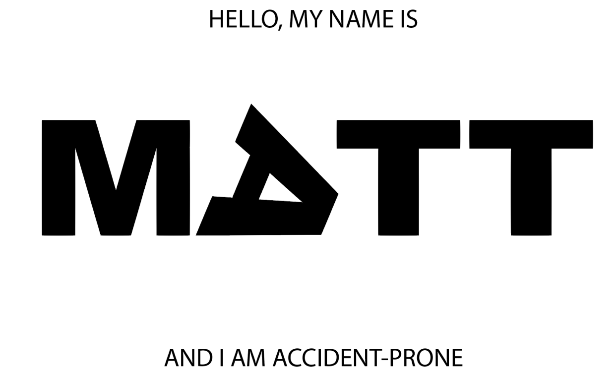
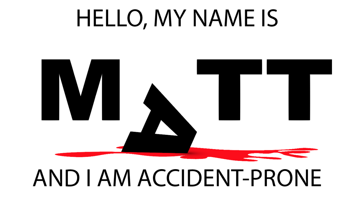
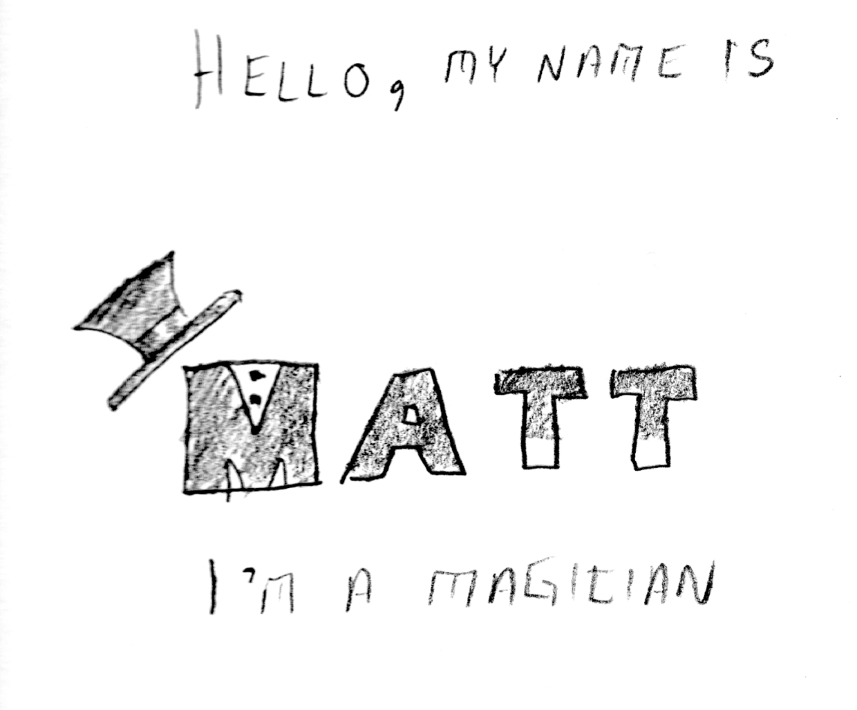
My final three images for the typographic portraits:

Even the letters in my name are "accident-prone."

This letter is serious business...pinky-swear!

A good magician can make a rabbit disappear behind their name.
PROJECT 1: TYPOGRAPHIC PORTRAIT
The first day of the week and we’ve hit the ground running on this first project. It’s almost the end of class and I’m just now getting to the 2nd (of three) portraits. I asked for help on my first iteration, because it seemed like something was missing. I had followed the basic draft pretty closely, but it felt bare and uninteresting.

After talking with the professor, it was clear that I needed to express a greater range of tools. This was my second iteration:

Better, but not great. I added an organic shape and used the gradient tool to create a shadow effect. Still, the image felt a little too flat. One more tweak:
This simple vertical offset creates a bit more motion and surprise. I’m not sure what more I could add or subtract at this point. On to my second portrait…
In order to create a three-dimensional “floor” I used the perspective grid tool:


It isn’t really easy to see what I’m experimenting with just by looking at the image, but I have several elements that are grouped into logical objects. The “wand tips”are made using the rectangle Shape Tool, arranged above the Text and then individually grouped with their respective “T”s. Same for the “shirt buttons” on the “M”, as well as the top-hat. I’m not sure if this one would benefit from color or not. Perhaps I can use the gradient tool to give the “wand” more of a cylindrical appearance?
ADOBE ILLUSTRATOR READING RESPONSE – ART 119
Over the weekend I had a chance to sit down and read over the first two chapters of Adobe Illustrator guide. I think I may have just confused myself. One of the key challenges is the fact that I have very little experience with Adobe’s Creative Suite. It’s like a whole new language. Furthermore, I do not have this software at home, and thus cannot easily relate to these new sets of terms. It is hard to apply knowledge when everything about it is purely theoretical. Last but not least: this was just a ton of new information.
At least there were pictures.

Clear as mud, but at least you can see it. Page 33 (Artboard printing)
llustrator is a massive heap of skeuomorphisms, and this only makes sense for those who began their careers in print making prior to the advent of computers in Graphics Design. This can be a huge challenge for newcomers, but this challenge is hardly unique to Illustrator. True story: a seventeen-year-old in one of my freshmen courses once described the save button in MS Word as a “purple truck”.

Beep! Beep! I’m a truck!
See, the thing was, she’d never even seen a floppy disk before. This graphic held no contextual meaning for her. She never experienced the joy of inserting a 3.5-inch piece of plastic into a clunky (yet essential) device to save her document. By the time she was old enough for K-12, the iMac was standard, and those computers (controversially) never shipped with a floppy drive.

“No floppy, no problem! You’ve got the World-Wide Web, son!” source:betanews.com
she accepted the function (saving her document was important, after all), but couldn’t make the connection between function and form. I’m not telling this story because it is funny (I still laugh when I think about her), but because I can now relate to her better after reading about Adobe Illustrator’s Tool Bar and Control Panel. Some of the symbols are easy to recognize, despite the fact that I’ve never actually used them in real life:
Page 3 – The tearoff toolbar
I’ve never used a fountain pen. I’ve had a classmate spatter ink on me accidentally with one, but that’s really about it. Generally speaking, I “get” pens. I’m fond of needlepoint over ballpoint, but that’s not the graphic here. What if I’d never seen a fountain pen before? How’d I ever hope to recognize the function?
I’m sure I’ll catch up, and with enough practice become proficient with this tool set. I just wonder how many “purple truck” moments I’ll have along the way.
INTRO TO ADOBE ILLUSTRATOR
Week 1 – Day 2
Introduction to Adobe Illustrator and Vector Graphics

Illustrator is part of Adobe’s Creative software suite (now “Creative Cloud”). The primary focus of Illustrator is the use of and creation of vector graphics. Most graphics are rasterized (a grid of pixels with assigned values); vectors are “drawn” by software (or hardware, if supported) and are not limited by resolution. At our university’s Mac lab, we have preloaded versions of Illustrator, here’s a quick run-through:
There are lots of ways to launch the program. My preferred method is to use Spotlight search.
Command+[Spacebar]
This will open a search box (this is like Google for your computer), just start typing “illustrator” and you’ll get an auto-complete before you finish typing it. Just hit Enter when it fills in the remaining characters. BAM! You’re in.
Next, we need to create a new project:

File -> New ->
Name: Lastname-Intro [Geiger-Intro ART119]
Profile: Web
Size: 960 x 560
Units: Pixels
Orientation: Landscape
After creating this new document, save it.
File -> Save ->
Save as: Lastname-Intro.ai [Geiger-Intro-ART119.ai]
Default settings -> OK
Terms:
Artboard
Working area
Shape Tool
Used to create a vector object
Vector object
Vector Objects are defined with Paths and Points
Stroke
Defines the thickness of lines (vectors)
Fill
Defines the “filling” of an object (like Twinkies)
Arrange
Illustrator “stacks” objects in the order they were created. To change this order, go to the top menu:
Object -> Arrange -> Send to…(back/front) Bring to (back/front)
Align
Like with a text editor, aligns an object to different orientations (objects, Artboard, etc.)
Keyboard Shortcuts:
Option+LeftClick(on object)+drag
Drag to new area to create a duplicate
LeftClick+drag(over objects)
Bounding box selects multiple items
Command+S
Save current progress
In-class exercise: practice drawing your name. I wrote mine in cyrillic:

The letter “а” is tricky, and I didn’t quite get it right on the first try (“Матвей Гайгер” The first “a” looks like an “o”). This was all done with the pen tool, but switching back and forth between the curve and straight pen.
Project 1: Typographic Portraits
Timeline:
Mar 30: Project Intro, sketch ideas for next class (blog)
Apr 05: Work time in class following demonstrations
Apr 07: Work Time in class, following demonstrations
Apr 11: Review Typographic Portraits
Example: “Eruption” “Tilt-A-Whirl” “Balloon Darts” “Roller Bowler” “Cock Clock” “Exit” “Copernicus”.
Choose 3 of 6 provided character prompts. Use your name, first and/or last or nickname. Along with typographic and design…
“Hello my name is______ and I’m…”
Due Monday:
Sketches and ideas for project
Reflection on Open House (Blog)
Reflection on reading (Adobe Illustrator (Blog))
TIME DESIGN: ART119- SPRING 2016
Time Design relies on a few key elements: recurrence, subjectivity, intensity, and scope.
Scope: The range of actions or viewpoints within a given moment, and, conceptually, the range of ideas one’s mind can grasp.
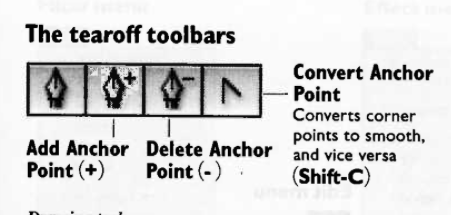
his single-panel sketch compacts an efficient narrative: We see a toaster oven, still plugged in, and a grave site next to the counter where toast never materialized.
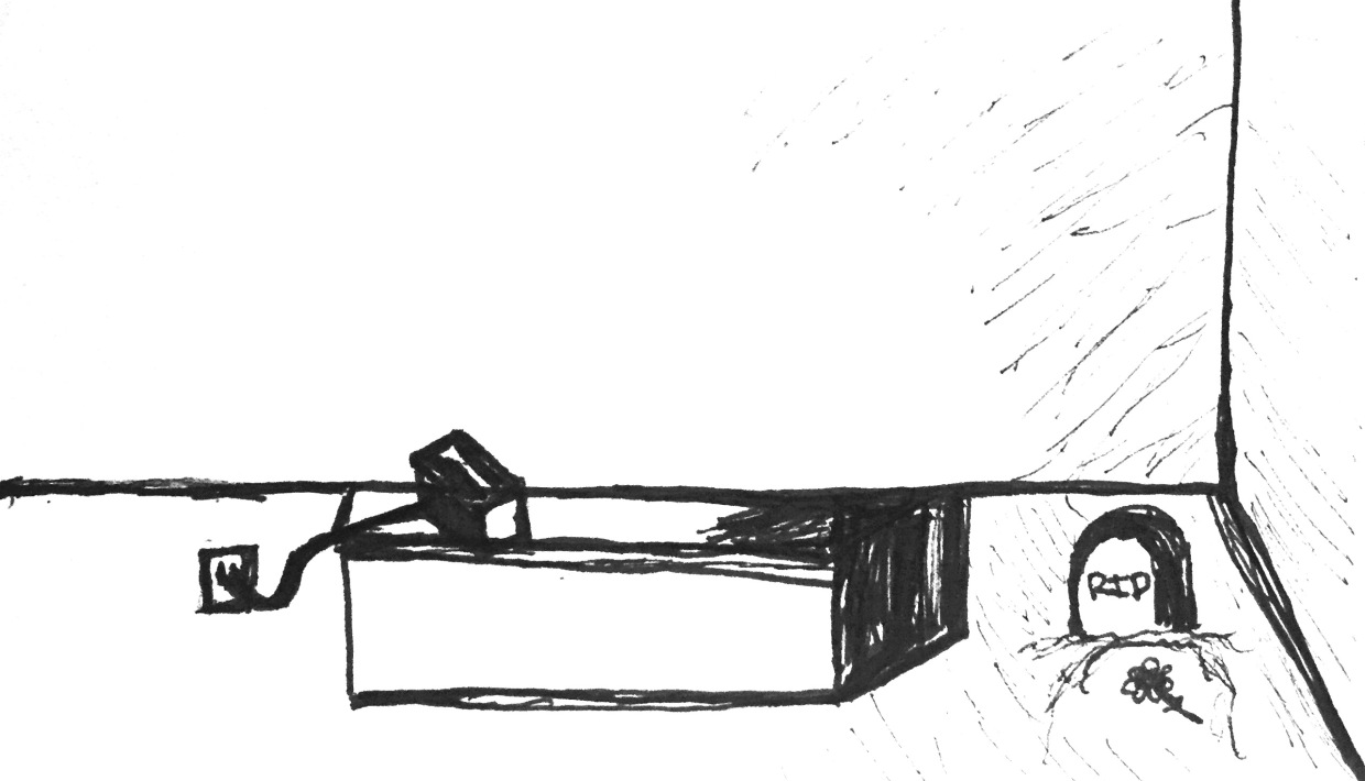
Subjectivity: Depicting a subject experiencing the passage of time through emotion, action, or movement.


In this three-panel sketch, we see Subjectivity at work, with intensification. The subject is seen waiting in the first pane, and then a stylization of toast as a clock signifies a passage of time (to reinforce/intensify the wristwatch from the first pane), and then in the final panel, we see a skull with attached cobwebs. This peak intensity, coupled with a toaster that still hasn’t produced toast, exaggerates the feeling of waiting – literally forever.
Intensity: Sequential exaggeration of particular attributes within a series of images.
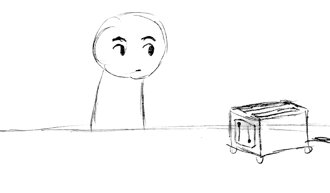


n this final sequence, a four-panel sketch, we see a similar use of intensification. The subject ages, and dies. The toast materializes only after the subject has passed.

"Yeah, well, that's just, like, your opinion, man."
iPhone 6 and 6 Plus are (basically) mini tablets with phone calling features
I went to the Apple store today to check out their latest and greatest. I found that both are too big for my taste. I feel like a phone should be something that I can easily use one-handed. Two hands, and I'm calling it a tablet.
Here's the reason I'm going to complain about this: People drop their phones. Even if your phone doesn't break, it can be pretty embarrassing. If someone cannot firmly grip the sides of their phone while using it, then it is an invitation for drop-tastic disaster.
I'm not a big guy. I'm under six feet tall, and for me, the iPhone 4 and 4s are the perfect size, and the iPhone 5, 5c and 5s are really pushing the limit. I'm honestly wondering if a product like the iPad Mini can survive in a world with five and a half inch iPhones. Neither product fits in my pocket, both require two hands to use (safely), and with a two year contract, the iPhone 6 Plus is one-hundred dollars less expensive.
Lastly, the iPhone 6 feels too slippery and curvy. My iPhone 4s has nice, crisp edges. I feel like I have a good grip on it. Same goes for my iPhone 5 (which was stolen over a year ago, but I digress), and this matters; I've rarely dropped something that I had a good grip on. The light, smoothness of the new iPhone is a turn-off, and I think that getting one would absolutely necessitate the purchase of a protective case. I'm not against getting a case, but this means adding additional volume to a device that is already too big for pockets or single-hand use.
I'm hoping that in another year, Apple releases the iPhone 6s (sounds like, "success") and a smaller iPhone 6c (sounds like, "Sexy"). Give me the features of the Plus (Apple Pay, TouchID, and Optical Image Stabilization), with the dimensions of an iPhone 5, and I'll be waiting in line for one.
Otherwise, you'll have to pry my iPhone 4s from my cold, dead hand -- because that's all I need to hold it when I'm sending a text, browsing the web, checking email, listening to music and podcasts, or looking up directions on Maps.