A selection of photos taken at William Temple House 2018 “Lifting Spirits” annual fundraiser gala.
Read MorePHOTOSHOP CALISTHENICS
“1) Use the selection tools + refine edge to isolate objects from the Culture Catalogue image, then copy and paste them into a New Document, so that each is on a new layer. Rename the layers, save as: lastname-isolated-objects.psd”
Click here to download a copy.
“2) Use Retouch and Repair tools to modify radically alter the castle while maintaining a ‘realist’ aesthetic. Save as lastname-weird-castle.psd”
Click here to download a copy.
“3) Recombine objects from the Culture Catalogue within the Castle image, using refine-edge to integrate the objects more seamlessly. Save as lastname-weird-castle-2.psd”
PHOTOSHOP INTRODUCTION
Week 3 – Day 2
Photoshop tutorial
First, make sure you change three defaults:
Auto-select/Layers/Show Transform Controls
SELECTION TOOLS
Marquee//Lasso//Wand
Modify Selections by holding down SHIFT to add to a selection or Option to subtract from a selection.
Note: By default, when copy/pasting, it is added to a new layer
Checkerboard pattern indicates a transparent background
When selecting an object on a white background, you may get a white edge.
Use Refine Edge:
Option under selection tool.
Brush based retouch and repair tools
Healing Brush
Patch Tool
Content-Aware
I started with this image:
Source: Flickr User – “tickr”
I then decided it was time to “patch” this castle to its former glory…
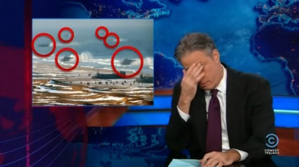
I expanded the vertical dimensions by more than 400%, and then proceeded to “build” more layers of bricks, up into the sky. I used the lens distortion tools to create an illusion of perspective. Finally, I decided to add a “window” by cloning and inverting one of the smaller doors. Overall, I am pleased with how convincing this image is, but there are a few “bugs” in the picture (redundant, duplicate patterns) that detract from the overall realism. Still, I think I’ve done a better job than North Korea, and their use of Photoshop.
We miss you, Jon.
Source: The Guardian
INTRO TO ADOBE ILLUSTRATOR
Week 1 – Day 2
Introduction to Adobe Illustrator and Vector Graphics
Illustrator is part of Adobe’s Creative software suite (now “Creative Cloud”). The primary focus of Illustrator is the use of and creation of vector graphics. Most graphics are rasterized (a grid of pixels with assigned values); vectors are “drawn” by software (or hardware, if supported) and are not limited by resolution. At our university’s Mac lab, we have preloaded versions of Illustrator, here’s a quick run-through:
There are lots of ways to launch the program. My preferred method is to use Spotlight search.
Command+[Spacebar]
This will open a search box (this is like Google for your computer), just start typing “illustrator” and you’ll get an auto-complete before you finish typing it. Just hit Enter when it fills in the remaining characters. BAM! You’re in.
Next, we need to create a new project:
File -> New ->
Name: Lastname-Intro [Geiger-Intro ART119]
Profile: Web
Size: 960 x 560
Units: Pixels
Orientation: Landscape
After creating this new document, save it.
File -> Save ->
Save as: Lastname-Intro.ai [Geiger-Intro-ART119.ai]
Default settings -> OK
Terms:
Artboard
Working area
Shape Tool
Used to create a vector object
Vector object
Vector Objects are defined with Paths and Points
Stroke
Defines the thickness of lines (vectors)
Fill
Defines the “filling” of an object (like Twinkies)
Arrange
Illustrator “stacks” objects in the order they were created. To change this order, go to the top menu:
Object -> Arrange -> Send to…(back/front) Bring to (back/front)
Align
Like with a text editor, aligns an object to different orientations (objects, Artboard, etc.)
Keyboard Shortcuts:
Option+LeftClick(on object)+drag
Drag to new area to create a duplicate
LeftClick+drag(over objects)
Bounding box selects multiple items
Command+S
Save current progress
In-class exercise: practice drawing your name. I wrote mine in cyrillic:
The letter “а” is tricky, and I didn’t quite get it right on the first try (“Матвей Гайгер” The first “a” looks like an “o”). This was all done with the pen tool, but switching back and forth between the curve and straight pen.
Project 1: Typographic Portraits
Timeline:
Mar 30: Project Intro, sketch ideas for next class (blog)
Apr 05: Work time in class following demonstrations
Apr 07: Work Time in class, following demonstrations
Apr 11: Review Typographic Portraits
Example: “Eruption” “Tilt-A-Whirl” “Balloon Darts” “Roller Bowler” “Cock Clock” “Exit” “Copernicus”.
Choose 3 of 6 provided character prompts. Use your name, first and/or last or nickname. Along with typographic and design…
“Hello my name is______ and I’m…”
Due Monday:
Sketches and ideas for project
Reflection on Open House (Blog)
Reflection on reading (Adobe Illustrator (Blog))


