Week 14 update: The Late Edition

The final push is now upon us. This past week I’ve been working nearly around the clock with my team, pushing to bring about our future vision. One of the most labor intensive, yet rewarding parts of this project has been the production of a newscast from the future. We’ve made countless script revisions, scraped stock images, sound, footage, and crafted motion graphics elements to bring this story to life. It’s been challenging, but I’m excited to see the final results.

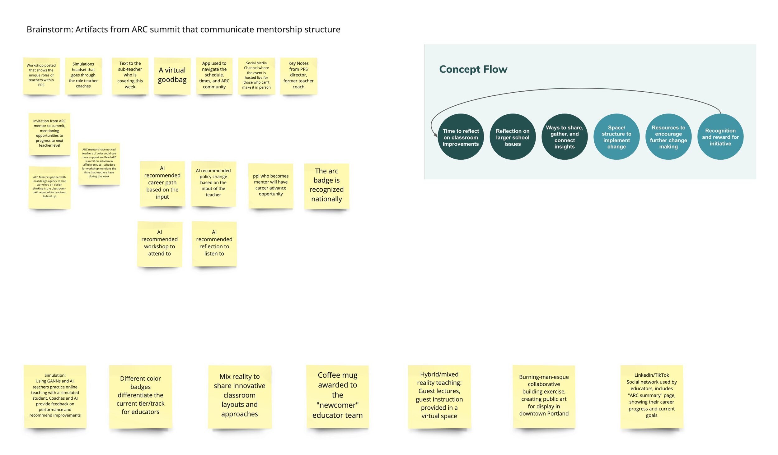
What’s working: our approach to generating a video is deeply grounded in research. We’re incorporating concepts generated with participants — public educators who so generously gave us their time and perspectives on the present and future state of teaching in American schools. We’re also building our story to represent several systems-level shifts, including national legislation, teachers union contracts, and individual school reforms. We used several different futuring frameworks to develop these narratives, including: cone of possibility, backcasting, STEEP+V, Multilevel Perspective mapping, affinity mapping, and worldview filters.

Concepts+ MCCC - Version 2 MLP and STEEP+V Sorting.jpg
MLP_Past.png
futurescone-cdb-4.png

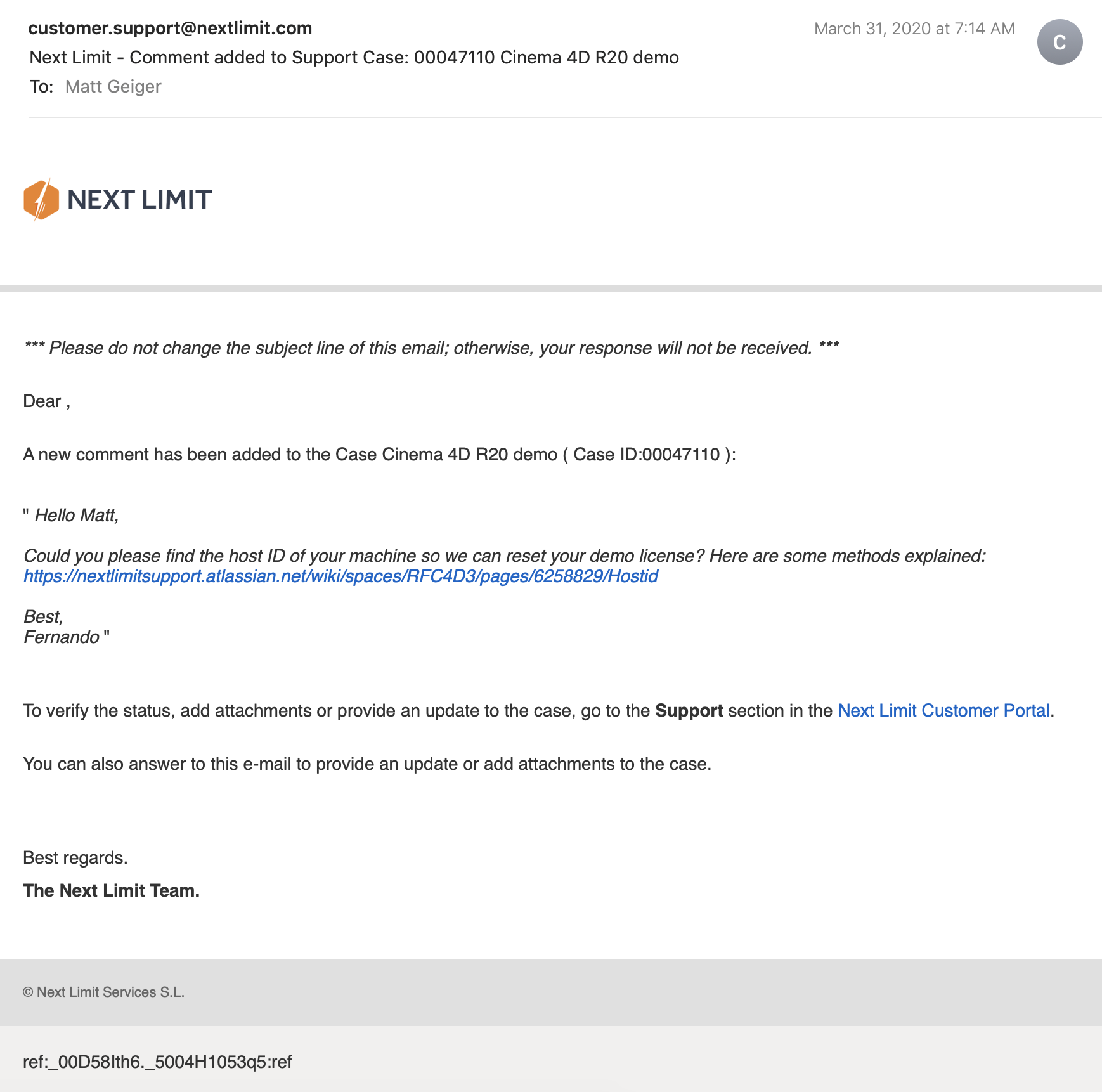
This process has been anything but precise. The future is something we build, not something we predict through careful measurements of trends. Understanding this truth has been very reassuring. Now that we are approaching a conclusion, I feel as though I have been on a long drive through undeveloped territory. The daylight of exploratory research gave way to the twilight of generative research and in the pitch of night we evaluated concepts. With only one headlight, we squinted off into the distance, to read the signs. Sometimes the precipitation of a pandemic obscured everything, but we relished the intermittent moments of clarity.

Those latter kinds of moment were by far the most exciting. “Oh, oh, what if…” was a common preamble to productive yet heady conversations with peers over zoom, as we scrambled together various visual representations in Miro and Figma. 

Concepts+ MCCC - Frame 26.jpg
Concepts+ MCCC - Frame 28.jpg

This workflow has been essential to synthesizing content and a visual language for our video, which we’ve been iterating on through various stages of prototyping. I’m concerned about the overall fidelity and recognize that this will be important to suspension of disbelief for our intended audience — policymakers and various stakeholders connected to PPS must find this artifact compelling enough to act and bring these concepts into a shared reality.

Concepts+ MCCC - Frame 29.jpg
Concepts+ MCCC - Frame 30.jpg
Concepts+ MCCC - Frame 31.jpg

On the technical side, video editing and motion graphics are computationally intensive tasks. I built a beefy workstation prior to starting at CMU, and this machine has been essential to so many tasks and assignments. Nevertheless, I’ve found that this work has strained my system’s capacity. I’ve purged files to make room for temporary caching and rendering outputs. I’ve reset my router in a desperate effort to speed up the transfer of data to Google Drive, and ran my system in a barebones state to maximize resources available to Adobe CC’s memory-hungry apps.

The stress I place upon the tools I use to design are complemented by the stress I’ve applied to myself. My sleep has been intermittent. I take short naps on the couch and found myself on more than one occasion this week working through the sounds of birds before the break of dawn. These late night hours are quiet and free of distraction, but tend to make the day that follows less than appealing. I’m staying awake through this last week of lectures, but finding my mind trailing off into thoughts about the timeline and how I might optimize frame rates for nominal render times. I’m obsessed with getting this video done, but know that this pace is not sustainable.

Kinetic-friendly spoon project Mega Post

That’s a wrap! It’s certainly been an interesting semester, but now I am ready to put it behind me. Reflecting on the spoon project, I have some final thoughts and observations. First, I want to thank the fine folks at CMU School of Design. From the amazing and hardworking faculty and graduate student cohort, I have had nothing less than inspiration and encouragement throughout this entire process, despite the obvious challenges of working remotely.

Rendering of sixth and final (?) spoon design. I pulled the kitchen design (Pierre Gilles) and bowl (Damogran Labs) from GrabCad.com. The spoon and coffee mug are mine.

Rendering of sixth and final (?) spoon design. I pulled the kitchen design (Pierre Gilles) and bowl (Damogran Labs) from GrabCad.com. The spoon and coffee mug are mine.

This project was divided into two parts: the first part focused on exploring different ways of prototyping and making. This was described to me as an informal way of A/B Testing for methods. The second part involved the deliberate iteration of prototypes through user testing — a challenge in the context of a global pandemic and social distancing. To make the most meaningful design choices possible given limited resources, I decided to leverage the power of physical simulation to supplement the making of physical prototypes.

There are a variety of 3D software tools that offer some degree of physical simulation. For this project, I selected Maxon Cinema 4D R20 (Educational License) and Blender as my two ways of making. I chose these because I already am familiar with Cinema 4D and understand know how to manage a workflow in that context, because Blender is open source and free for anyone to use, and both programs work under MacOS and Windows environments (my rendering workstation is a Hackintosh with multiple operating systems, which grants the flexibility to overcome certain technical limitations). My initial experiments with Cinema 4D were… not great.

My very first (and failed) attempt to simulate fluids in Cinema 4D. Carnegie Mellon University School of Design Prototyping for Interaction Spring 2020

As you can see, there are “physics” happening here, but they are not anything close to the physics of the real world. This is not “real world” physics, this is Asshole Physics:

Zachary "Spokker Jones" Gutierrez and I came up with the term "Asshole Physics" when we were discussing the game and the physics models it employed. Basically there's a lot of crap you can knock over and kick around, including dead bodies, buckets, cans, and little sections of drywall which are standing around in the middle of rooms for no obvious reason. Zachary casually mentioned, "I have made it a point to knock over every fucking thing in that game. I am living out my fantasies of being a giant asshole," and I responded by stealing his "asshole" comment and claiming that I made it up. Thus "Asshole Physics" was born.

Without more sophisticated plugins to simulate fluid, Cinema 4D R20 is only “out of the box” capable of non-newtonian semisolids. I can make stuff bump around and “squish.” I can have a 3D character micturating on the side of a building. I can create the appearance and illusion of something like a fluid, but with such restrictions, I could not realistically evaluate my spoon designs. I explored my options and found that Next Limit’s RealFlow plugin would meet my basic needs. Best of all, they offer a free 30-day trial! My initial excitement quickly waned after the plugin failed to install and activate on my system…

(This email chain is long and covers a week of back and forth with customer service. I am including the entire conversation as a way to recreate my experience. While this may not directly relate to the scope of this project, I still believe that there is value in documenting the unexpected problems that crop up when trying to do something new.)

Mail_02.png
Mail_03.png
Mail_04.png
Mail_05.png
Mail_06.png
Mail_07.png
Mail_08.png
Mail_09.png

It took a week to finally get everything sorted with the demo. During that time, I began to explore option B: Blender.

Blender is a free, powerful, open source 3D creation tool. Best of all, it includes the mantaflow fluid simulation engine (since version 2.8). I have worked with Cinema 4D on other projects, and have become fairly comfortable with the interface. Given my experience with Fusion 360, Inventor, and C4D, I knew that I would need to overcome a learning curve before I could use this software to meet my needs for this project. Fortunately, I was able to find a spectacular tutorial series for beginners.

If you want to read more about my experience with the tutorial, click here.

This tutorial was ideal because it involved exercises that helped me learn how to use the interface, and covered several different workflows. I was really impressed with Blender’s node-based material system and procedural textures. You can work stri…

This tutorial was ideal because it involved exercises that helped me learn how to use the interface, and covered several different workflows. I was really impressed with Blender’s node-based material system and procedural textures. You can work strictly with parametric modeling, or you can discretely modify mesh geometry to create highly organic and imperfect forms. I’m excited to work with Blender on future projects. It’s a very exciting time to be working in 3D.

While working through these tutorials, I began sketching and working in Fusion 360 to craft my first spoon designs for part 2 of this project. You can read more about this experience here.

Takeaways from Part 1

I really appreciated the responsiveness from the team at Next Limit. Clearly there are problems with the software’s implementation of their product’s copy protection. This is an all-too-common problem in the world of software. Programmers gotta eat just like everybody else, and we certainly should make sure that the talented and hardworking folks behind the code are able to put food on their table at the end of the day. Piracy can deprive a small business of the necessary revenue to keep the lights on, so I am absolutely sympathetic to this reality and what risks are involved when you release your software for demo purposes. Getting people to pay for something that they can easily get for free is a challenging proposition. At the same time, you cannot realistically expect to get customers to pay for software if they cannot try it first. Ultimately, this one week of back and forth with customer support was a critical loss. I never completed a side-by-side comparison of fluid simulations. While I did eventually succeed at installing and using RealFlow to do fluid simulations, (and was honestly impressed with how easy it was) I did not, however, have enough time to setup a comparable simulation to evaluate spoon designs. My trial expired about a week ago, and I see this aspect of the project as a lost opportunity. If Next Limit applied similar licensing practices as Maxon (verify it through .edu email address), they could offer an educational package of their RealFlow plugin.

Blender really came through for me. The learning curve was aggressive, but not impossible. While I found mantaflow to be a respectable and entirely capable fluid simulator, it was not without its own share of issues. I spent a lot of time making granular tweaks to improve the fidelity of my simulations, while also using the observations from my simulations to inform design decisions for my spoons in part 2 of this project.

Part 2: Design Iterations Based on User Testing

While this project required user testing and design iterations based on feedback, I decided to limit the user evaluations to address handle shape and the spoon’s overall dimensions. This was not an arbitrary decision or an excuse to focus on physical simulation of fluid dynamics (with user testing as an aside). No, this decision was based on the nature of the course from which it was assigned: Prototyping for Interaction Design. This semester I have have been focusing on designing for interaction (arguably, all designers do, at some point in their process, focus on this aspect). When thinking about the tools we use (to eat food) as a system, it is important to consider the touchpoints involved. The handle of a spoon is a non-trivial component. It can take on many forms, and naturally includes affordances. How someone holds a spoon, and how easy it is for them to use it are central to the evaluation of the design.

The iterations of design were highly generative in nature, inspired by both user evaluations and physical simulations, I maintained a homeomorphic continuity: treating the initial shape as an elastic form to be molded and reshaped to maximize performance. Knowing how a concave shape might be optimized to perform under rapid movement — I wanted to create something that would be useful, and the physical simulation of fluids facilitated a means of evaluation — is only one aspect of a more complicated interaction, and this test alone could not fully address human needs. When physical form is designed and directed to improve user interaction (and physical properties are given equal consideration), it is possible to create a truly useful tool. I realize that this is a very technical description, but it is easier to understand when properly visualized. I have rendered a compilation sequence to show how this spoon shape evolved to its final(?) form (I am still considering a physical prototyping stage for this project over the summer).

A sequence of fluid dynamics tests designed to evaluate fluid retention of concave forms. Carnegie Mellon University, School of Design, Prototyping for Interaction, Spring 2020.

Toward the latter half of this sequence, you will notice a change in colors (for both the liquids and spoons). I decided to differentiate the final rendering sequences as these were based on user evaluations. The colors chose for these final sequences are based on the color tags used for the user test:

These printouts are derived from DXF vector images exported from Fusion 360. The designs shown are oldest (top) to newest (bottom). The fifth design (blue) is rendered with a blue body and green liquid.

These printouts are derived from DXF vector images exported from Fusion 360. The designs shown are oldest (top) to newest (bottom). The fifth design (blue) is rendered with a blue body and green liquid.

I printed and mailed the paper prototype to a potential user suffering from ongoing hand tremors (my partner’s mother). I sent this without written instructions. Instead, I only provided different color tags to facilitate feedback. My user let me know that the red spoon handle was in the “Goldilocks” zone in terms of size and shape: not too big, not too small, not too curvy, not too straight. Using this feedback I constructed the sixth and final (?) form — see the first image of this post.

The user test included a direct side-by-side comparison with existing dinnerware.

The user test included a direct side-by-side comparison with existing dinnerware.

Before developing these simplified paper prototypes, I also experimented with ways of making more three-dimensional forms that could be sent in the mail. While this novel approach showed some potential, I was concerned with how user error might complicate or (even worse) bias feedback. Still, these paper prototypes helped me to better understand and interpret the scale of my 3D models.

PaperPrototype_01.jpg

Final Thoughts

This project still feels somewhat incomplete. Perhaps this is because the generative design process itself can always demand further iteration, or maybe it is because I have not yet created a physical prototype that can actually be tested as an eating instrument. Maybe it is only because there were still a few “rogue droplets” (grrrrrr) that I simply could not keep contained with the completion of my sixth iteration. Whatever the net effect might be from these various shortcomings, I am pleased with the learning opportunities that were presented throughout this exploration of design.

Were I to continue with this process, the next steps would be to 3D print the latest shape using a food-safe material (there are a few third-party vendors that offer this service). I would then ship that latest design for further user evaluation. I believe that there are still many additional iterations necessary before I could defend having created something that satisfies the criteria I set out with this project (i.e., a spoon that overcomes the challenges of involuntary muscle movements and essential tremors).

If I were to collaborate with others, I would also want to evaluate the ecological and economic impact of such a device. How might we go about manufacturing to appropriate scale? How might additional user tests with a wider audience influence the existing form? There remains many unanswered questions and a newfound respect for the power of generative design.

Fluid Simulation in Blender

“Throw off your fears let your heart beat freely at the sign that a new time is born.” — Minnie Riperton

I’ve completed my workflow design for fluid dynamics testing in Blender. Here’s a proof of concept:

Now I just need to figure out RealFlow in C4D…

Prototyping Cutlery

For one of my final projects this semester, I’m interested in creating a set of eating tools that help account for involuntary muscle movements (e.g., Parkinson's disease or tremors) and other mobility difficulties that limit the enjoyment and consumption of foods; I'm interested in exploring simple solid shapes, living hinges, and assembly forms derived from explicit advantages of additive manufacturing techniques.

[I want to make a really nifty spoon.]

Fabricating physical prototypes will be a challenge (…)

Seriously: fuck you, COVID-19.

This is not the only challenge, however. Finding access to food-safe materials, conducting a series of user tests, iterating forms, and self-directed research will also require creative workarounds to overcome the limitations of working while under “shelter-in-place” orders due to global pandemic.

I have decided to go 100% digital. instead of building various forms and testing their ability to hold fluids under rapid motion, I will instead conduct a series of simulated physics tests to evaluate forms. For the first part of this project, I am required to conduct an A/B test or evaluation. I have decided to conduct dual testing using different 3D programs.

Method 1:

Maxon Cinema 4D includes a variety of physical simulation abilities—including particles and fluid dynamics. I intend to leverage this software’s capacity to test various designs and forms. Tests will be designed to evaluate fluid retention under repeated multi-axial movements. Cutlery designs will be tested against traditional forms (e.g., standard soup spoons).

Method 2:

Blender is a free, open source platform for creating 3D models, rendering, animation, and more. Among the built-in features is a fluid simulator. Combined with rigid body and gravity physics, it should be possible to evaluate a variety of spoon shapes and (potentially) even different forms of cutlery.

Considerations:

By using two different simulations, it should be possible to more thoroughly evaluate a design’s fluid retention abilities.

Timeline:

Week 1 — Cinema 4D Workflow: Since I am already familiar with Cinema 4D, I have decided to begin this project by constructing my first simulation with this software. I will use Fusion 360 to generate original spoon designs, as well as a “traditional” spoon shape to compare performance.

Week 2 — Blender Workflow: Using the assets from week 1, I will spend week 2 developing and executing a comparable test running under Blender’s fluid simulation engine.

Resources:

Blender Tutorial - Realistic Fluid Simulation: https://www.youtube.com/watch?v=zmw-BTCbWMw

Cinema 4D Tutorial - Water simulation Animation: https://www.youtube.com/watch?v=JehbYBAZw7c

What does Day 1 look like?

Let’s just say I have a lot to learn.

Designese

Today’s quote: Лучших сосок не было и нет, готов сосать до старых лет. Продаются везде. Резинотрест.

I am still not certain what observations are valuable to record during this graduate program. What I am certain of, is that I will be learning a lot of new languages: the language of typography, CSS, HTML, Python, graphics, and the countless jargon of the Design community. I think I’ll call this strange new collection of languages “Designese.” It is the combined means by which designers communicate their ideas, and inject them into the world.

The morning class (Design Principles and Practices) was interesting. We began with an exercise where we abstracted our backgrounds by improvising with given materials and the classroom space itself.

I chose to represent myself with attributes of Portland’s bicycle culture, my love of Laserdisc movies, my career in electronics, and my fine arts education.

I chose to represent myself with attributes of Portland’s bicycle culture, my love of Laserdisc movies, my career in electronics, and my fine arts education.

The center represents CMU, and each student worked to recreate elements of their journey to this graduate program. Whiteboards contain written facts about the cohort and their connections to the field of design (right), and our pictographic expressi…

The center represents CMU, and each student worked to recreate elements of their journey to this graduate program. Whiteboards contain written facts about the cohort and their connections to the field of design (right), and our pictographic expression of the core principles of design (left).

It was a bit of a mess in the beginning, but eventually this random pile of madness transformed into a visual representation and collaborative sculpture of readymade objects. Bruce Hanington took two pages of observation notes during this exercise. This was quite an icebreaker, and I generally feel very good about collaborating in the future with this group.

Over lunch I discussed a few of my on-boarding concerns with Ema. I value Ema’s insights and experience as a grad student. It was Ema and Michelle who took me on a brief tour back in the spring (when I was waiting for the admissions decision). I wanted to know if I ought to be concerned by the lack of clear course outline. The syllabus makes the expectations clear, but are still relatively vague and lacking the kinds of specifics I am accustomed to. Generally speaking, I am used to more structure (my time in the military, working at Intel, and undergraduate studies were loaded with constraints and granular, rigid scheduling). This is new for me, but I also expect that this will lead to greater autonomy in a future career - we’re receiving lots of support, but are also expected to work independently, with very open-ended criteria and high standards for deliverables. It is a continual source of comfort to know that these are the people I will face these challenges with.

In the afternoon I had my first session with Andrew Twigg. He will be teaching two of our courses this semester. For introductions, we were spared having to repeat our backgrounds. Instead, Andrew only asked for our names, where we’re coming from, and our favorite food. I chose rice, because “Rice is great if you're really hungry and want to eat two thousand of something” (R.I.P. Mitch Hedberg). After reviewing the syllabus, we had our first lecture on the topic of typography. This included two slide presentations with a brief history on the development of written communication, from cave paintings to the fonts commissioned by billion dollar internationals in the 21st century. This included an almost anatomical dive into the creation of a modern font, what they are made of, and the names of their parts. We also explored the contextual relationship between size, shape, and arrangement of text. There was a lot terminology that is still foreign to me, but I believe I’ll be able to absorb these new concepts as we begin to play with (and act upon) these various components.

One of the slides was a soviet era advertisement for galoshes (at least, that’s what I could glean from a thread on mail.ru). The rough translation: “There were not, and are not better nipples, ready to suck through the old years. Sold everywhere: Reznotrest.” The word “сосать” (i.e.,“suck”) is a verb with similarly vulgar dual meaning to its English counterpart. I’m not sure if this was true when the image was originally constructed. It is probably not important or worthwhile to read into it that too much.

1762003319.jpg

My first deliverable is due this Thursday: 32 layout thumbnails and eight prints (on tabloid, 17 x 11 inch sheets) with font constraints on preselected text. How we arrange it will be up to us to decide, but should demonstrate Design Thinking and execution of enhanced visual communication matching to the context.