Week 15: Final Project Update

This will be my final update for the Studio II project. I feel a complex blend of emotions as I write this. I am relieved to be done. I am also sad to know that my time with this team has come to an end. I consider myself incredibly lucky to have spent so much time working with some truly amazing designers. I don’t know if I will ever experience anything like this again, but I hope so.

Remote collaboration has few perks, and I was lucky to be working with folks who helped to make this experience so much fun

Remote collaboration has few perks, and I was lucky to be working with folks who helped to make this experience so much fun

The work we have done this week feels different for many reasons. We had to prepare something for a large and diverse audience, not all of which knew or were familiar with the context of our work. Additionally, we also needed to use this time to tie up remaining loose ends—we needed to reach an end state where our process could feel somewhat conclusive.

Our efforts were just as collaborative as ever, as we divided up the labor of our remaining tasks. I was incredibly reassuring to know my team members strengths and capabilities. Knowing who was working on a particular task was reassuring. For my part, I was busy scrubbing through a timeline in After Effects, rapidly assembling visual representations and edited footage to make a convincing newscast from the future. Considering the constraints of remote collaboration, I’m very pleased with the final product.

I have continued to ruminate about over this notion that the future is something we cannot predict, but rather something we build through imperfect knowledge. I question the power our team has to influence this process, not because I lack the confidence in our shared abilities —as I said earlier and often, I’ve been working with an amazing team— but more of a concern around consequences of inspiration. Our process was far from perfect. The vagaries of a pandemic distorted every effort. The educators we sought to connect with were terribly busy. Our own team suffered from fatigue and sleeplessness as we juggled future careers and other academic expectations. The complexity of this topic is well beyond the scope of fifteen weeks of diligent inquiry.

I cannot speak for the entire team, but I know that for me personally our exploratory research was the most intimidating phase. It was immediately clear that we were engaging in a very difficult problem. Education intersects with so many other areas of study. It is a problem of policy, culture, funding, methodologies, and it is weighed down by a history of systemic inequality and racism. Generative research methods were the biggest surprise. I was astonished by what could be gleaned through a participatory process. Including educators in the generation of concepts was exciting, and I wish we had more time to engage in this work.

Our final concepts are a reflection of many perspectives and early prototypes generated by K-12 educators

Our final concepts are a reflection of many perspectives and early prototypes generated by K-12 educators

Every phase also felt too short. We needed to move on before we could fully digest what we were learning. Nevertheless, I stand behind the work we have done, because I know it represents the best we had to offer. I’ve known that design is a messy process long before my time at CMU, but I now have a much clearer sense of what it means to engage with that mess and to assemble something coherent. This work is not easy, and it is never, ever truly complete. The deadlines for a design project function like the layers of silt in a fossil record. The strata of every layer represents a progression with no clear ending or beginning. We can always dig deeper.

I hope these artifacts will inspire others as they have inspired us.

Screen Shot 2021-05-14 at 8.14.32 PM.png

Our team has assembled a project homepage. There you will find more comprehensive information about this work, the final outcome and documentation. Check it out!

Week 11: qualitative evaluation of concepts

Our online survey is now underway, and while this virtual format isn’t exactly like so-called “speed dating,” we are hoping that it will be able to serve a similar purpose for our research. Creating a meaningful online experience for our participants was a tall order, especially with such tight constrains. There are many risks when created a fully automated and hands-off system. Not being there to clarify or to address questions or concerns in realtime was something we needed to accept as a trade-off. In exchange, we have a dozen unique participants ranging from 2 years to 27 years of experience, and from various districts around the country.

So far, the majority of responses have been from an online community of English teachers, so our data is skewed toward this perspective. On the plus side, English teachers provide excellent written responses. To avoid the pitfalls of statistics and quantitative analysis, we designed an online survey with open text fields, and we framed our questions around hypothetical scenarios. This would provide us with reflection and insights into how teachers imagine these concepts for themselves, and what perceived deficiencies come up for them in thinking about these systems in action.

Screenshot of survey responses, exported into a CSV file

Screenshot of survey responses, exported into a CSV file

The last 24 hours in particular have been very exciting, as we finally gained access to online educator communities. This process has been slower than wanted, but we first needed to fully develop our survey before we could deploy it. This process in and of itself was a design challenge. 

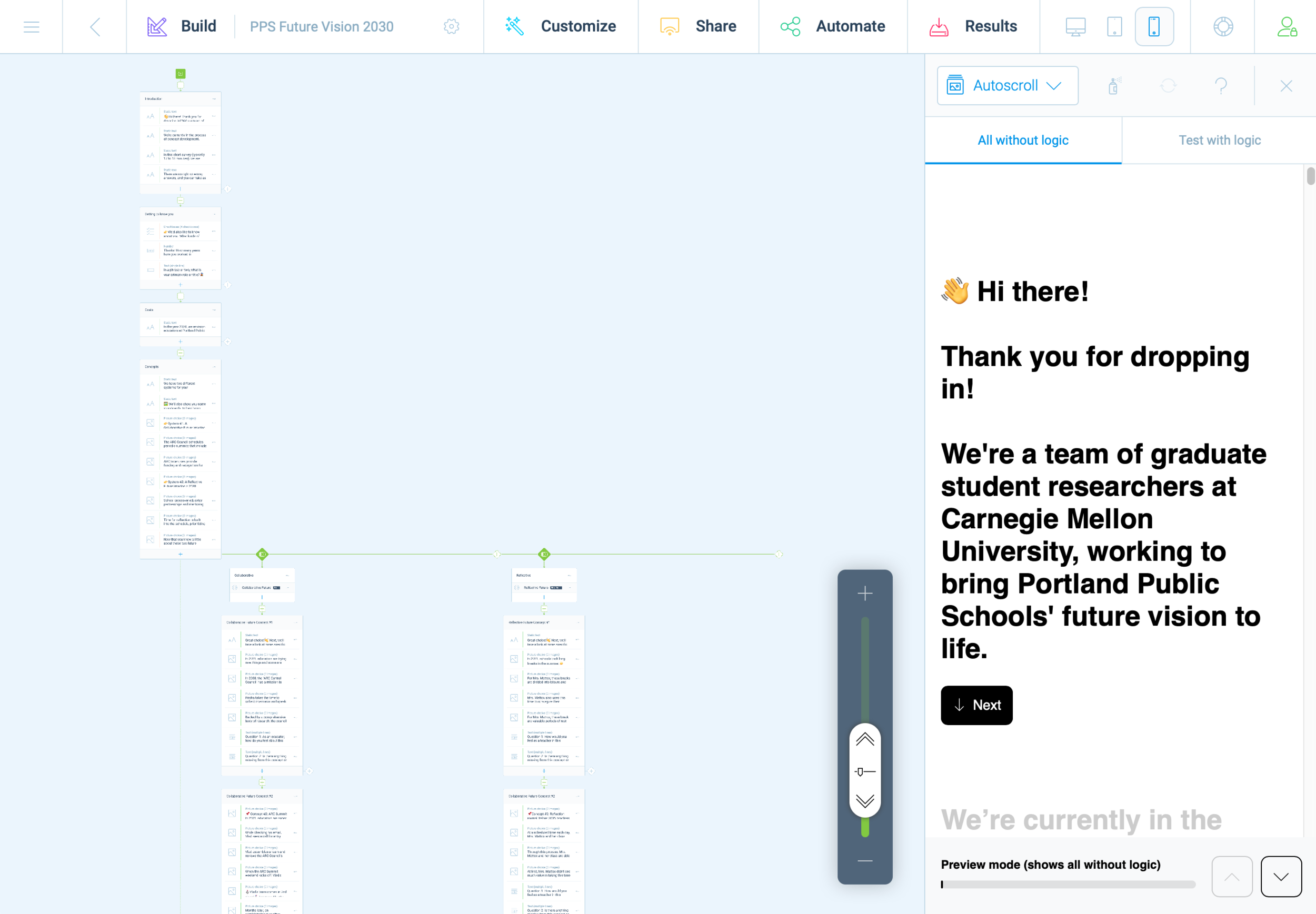
Last weekend, we decided to use the Tripetto platform. This gave us the same logic capabilities as TypeForm, but without any additional costs. It became clear almost immediately that we would need to prototype and refine our survey before receiving teacher feedback, and this effort was highly collaborative.

With multiple teammates, it was possible to divide this task into several areas that could be worked on independently and in parallel. We first decided on a basic structure  and strategized the division of labor. Carol worked on the text/content based on a logic diagram we crafted together. While Carol crafted this outline, I created a mockup version in Tripetto. Without access to finalized concept sketches, I took some poetic license.

Screenshot of 2nd iteration prototype survey

Screenshot of 2nd iteration prototype survey

As Carol and I worked together to refine the text copy, Cat and Chris worked together to create images and descriptive text for our participants. Once all of this content was ready for Tripetto, we began doing test runs, trying to break the experiences. This revealed some quirks with Tripetto’s logic functions and some of the less apparent features.

There are a few honorable mentions; Tripetto has a lot of subtle features that we often take for granted in other online experiences. Things like placeholder text, required fields, multiple choice radio buttons, checkboxes, multi and single-line text boxes. During the refinement phase, these features became essential and it was exciting to discover them—only after they were deemed essential enough to be worth the effort.

The minimalist UI of Tripetto made these features less evident, but not too hard to locate or execute. From start to finish, this experience felt a little shaky and uncertain but viable.

TripettoPrototypeFinal.png

I often found myself this week grinding away on the platform, slipping into a state of mind that Mihaly Csikszentmihalyi describes as “flow.” In other words, creating a survey on Tripetto wasn’t easy to use, but just challenging enough to keep me interested in working through obstacles. I think that what helped support this effort the most was building models within platforms where everyone on the team is already fluent. For us, this was primarily Miro, Google Docs, and Sheets.

Screenshot of two representations of the survey, carried across platforms (Miro and Sheets)

Screenshot of two representations of the survey, carried across platforms (Miro and Sheets)

First impressions matter, and we didn’t want to put out anything that wasn’t necessarily a work in progress. Even with this in mind, we did have a few last minute tweaks as we adapted our survey to maximize pulling power with other social media environments.

Arnold Wasserman’s desk critique was incredibly valuable for our team, as his feedback helped us to consider the importance of our survey as a communication tool. He recommended that we make the implicit, explicit, to directly communicate to our participants what we expected and why. We were encouraged to explain what questions we were asking, and to share this openly. This kind of transparency can be tedious, especially in text-based systems. I took this to task and simplified statements throughout the entire experience.

This gave the survey a personality all its own; like a casual and curious friend, we asked about specifics but with little pressure. We kept things open.

Open data cannot be calculated, it must be evaluated for patterns. Next week will be a scramble to synthesize patterns and new insights as we work to finalize system concepts into well defined parameters. We hope that through this process we will also identify opportunities to produce relevant and compelling artifacts (our final output/deliverable).

It still feels like a risk to be so far into a process and to still not have a clear idea of what it is we are making. We instead draw our assurances from what we have already made: an index of relevant articles, interview notes, countless diagrams and visual representations of high-level abstract concepts and maps at almost every level of visual fidelity imaginable, hundreds of presentation slides, dozens of pages of reflective text, and months worth of slack messages, shared links, and drafted emails. We created interactive digital workshop spaces and protocols for our participants, and archives with 256-bit encryption.

When looking at the collective volume of effort from this team, it’s difficult to imagine that we wouldn’t make something meaningful in the end. Is that too optimistic? Ask me in a month.

Bugs in the Blender

I have continued to have luck exploring the Fluid simulations in Blender, but this process has not been without its quirks. I recently encountered a strange issue related to Particle Radius settings

Particle Radius

The radius of one liquid particle in grid cells units. This value describes how much area is covered by a particle and thus determines how much area around it can be considered as liquid. A greater radius will let particles cover more area. This will result in more grids cell being tagged as liquid instead of just being empty.

Whenever the simulation appears to leak or gain volume in an undesired, non physically accurate way it is a good idea to adjust this value. That is, when liquid seems to disappear this value needs to be increased. The inverse applies when too much liquid is being produced.

What does this look like in practice? My most recent simulation actually seems to produce fluid as the scene progresses.

Nevertheless, I was able to gain critical insights into this form and will continue to iterate new designs. This is being done in conjunction with paper prototyping. These forms are less sophisticated, but still provide valuable information about how users will experience and interact with this flatware.

SpoonPrototype.jpg

Blender: Time To Make The Donuts

I’m very happy with the results of my first project in Blender.

White Frosting

White Frosting

Classic Pink

Classic Pink

And Nekkid!

And Nekkid!

After struggling with Cinema 4D, I decided to use a plugin rather than trying to cludge together some handcrafted fluid simulation. Unfortunately, I ran into a licensing problem with Next Limit’s RealFlow plugin. I’ve been emailing back and forth all week, and they finally got a fix for me — SUCCESS! While I waited to sort that out, I decided to give Blender a try. I began following this tutorial, but quickly found myself getting lost. I needed to become more familiar with the software and interface. I decided to follow a beginner’s tutorial to get my feet wet. I choose this particular video series because it employs procedurally generated elements, and covers all the basic modeling commands, node handling, and the complete stack of scene construction. And also: donuts are delicious. The world is terrifying, and we could all use something sweet.

I am honestly shocked that Blender is a free program. Many 3D programs are horrifically expensive; without student licensing, I could never afford to touch most of the 3D tools I’ve been learning over the years. Yet Blender seems to be very capable as a 3D program. I have only scratched the surface, but it is very impressive. Now that I have familiarized myself with Blender, and have a working fluid simulator plugin for C4D, I am in good shape to begin A/B testing.

Interactive Design Prototyping

THE TIME HAS COME TO…PUSH THE BUTTON

Wireless communication between Arduino #1 and #2

Wireless communication between Arduino #1 and #2

My current project in IxD Prototyping involves physical computing (i.e., “interactive systems that can sense and respond to the world around them.”) I have worked with Arduino before (Restricted Area, 2017) but this newest project is expected to have a daily use. In my head, I keep a long list of annoying technology interactions—this gets updated frequently. We are saturated with unsatisfying technology and devices that cause more problems than they solve. We have inconveniences stacked upon inconveniences, and if we were to step outside of this environment, you would inevitably conclude that most electronics are made to punish the buyers. I am looking to improve just one such interaction.

Back in 2012 I bought an HD video projector. If you love to watch movies, there is something magical about having “the big screen” at home. I love it. Do you know what I don’t love? Using an infrared remote control on a devices that is mounted above and behind me. Seriously, Epson: what where you guys (and yes, I’m assuming it was a team of men, with their dumb penises getting in the way of common sense) thinking?! The primary function of the remote control is to simply turn the projector on and off. I would gladly give up the remote control entirely if I could simply move the power button to the armrest of my couch. Instead, I must contort my arm in Kama Sutra fashion just to find the right angle to get the sensor to recognize the POWER-ON command from the remote.

Getty Images: the various methods for turning on an Epson HD Projector.

Getty Images: the various methods for turning on an Epson HD Projector.

My girlfriend’s method to bypass the projector is more elegant: she retrieves a step-stool from our utility closet and presses the ON/OFF button on the projector chassis. This works well, but … well, let’s just say, it ruins the mood. I began to explore other options, and realized that the primary issue is that IR remotes are directional. The IR sensor is part of the assembly, and cannot be relocated. Arduino is capable of IR communication, it is also capable of RF communication. Radio frequency is far less dependent on line-of-sight, especially within the context of indoor and residential use. Imagine what WiFi would be like if it worked over infrared. Consider also that Apple abandoned their IR remote interface for the Mac.

Enter the Arduino

I found a few open source projects that utilize IR and RF communication:

https://learn.sparkfun.com/tutorials/ir-communication/all

https://www.electroschematics.com/ir-decoder-encoder-part-2-diy-38-khz-irtr-module/

https://create.arduino.cc/projecthub/electropeak/use-an-ir-remote-transmitter-and-receiver-with-arduino-1e6bc8

https://learn.adafruit.com/using-an-infrared-library/hardware-needed

https://www.sparkfun.com/datasheets/Components/nRF24L01_prelim_prod_spec_1_2.pdf (PDF Warning)

https://www.deviceplus.com/arduino/nrf24l01-rf-module-tutorial/

https://forum.arduino.cc/index.php?topic=421081.0

https://howtomechatronics.com/tutorials/arduino/arduino-wireless-communication-nrf24l01-tutorial/

All of these resources are excellent. I want to call attention to one more link: https://create.arduino.cc/projecthub/muhammad-aqib/nrf24l01-interfacing-with-arduino-wireless-communication-0c13d4

I have a bone to pick with this one. Take a look at the wiring diagram:

Diagram created by /u/Muhammadaqibdutt

Diagram created by /u/Muhammadaqibdutt


Note the LED pin-out for the receiver. This diagram shows the positive leg of the LED connecting to Pin 3

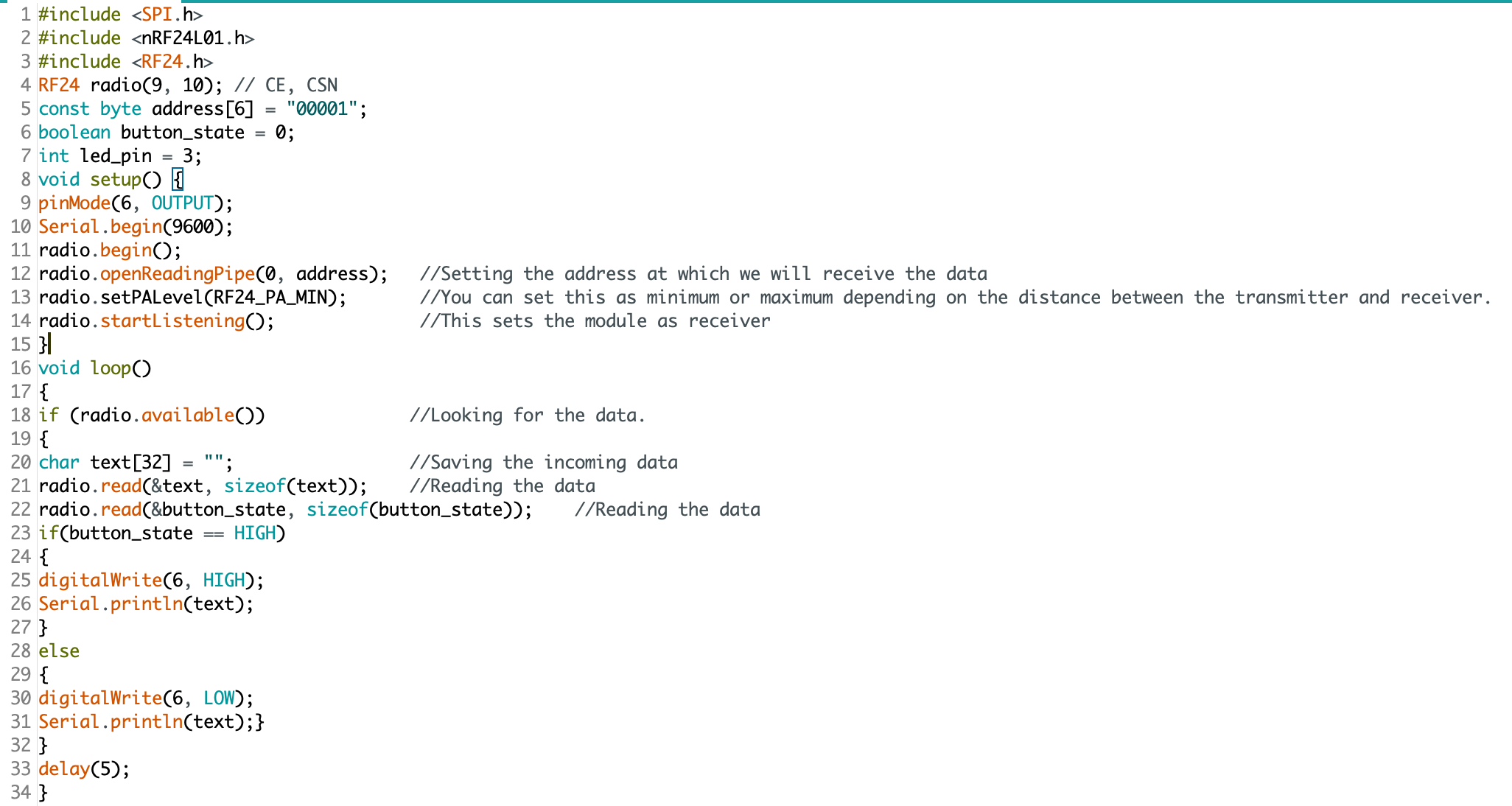
Now, lets take a look at the code:

SOURCE.png

The devil is in the details: “digitalWrite(6, HIGH)” condition turns the LED on. Pin 3 does nothing.

This made for some very “fun” troubleshooting. I’ve since ironed out all the kinks, and have successfully pirated the IR remote signal from an Epson brand projector (on loan from the Design Office at CMU), and have moved on to making an enclosure. Will I 3D print or laser cut? I have not yet decided.

Here is some sample code for my RF triggered IR emitter:

(NOTE: this code is just one half of the project, and by itself cannot do anything. You’ll also need IR and RF libraries to make this code work on your Arduino)

#include <SPI.h>
#include <nRF24L01.h>
#include <RF24.h>
#include <IRLibAll.h>
RF24 radio(9, 10); // CE, CSN
const byte address[6] = "00001";
boolean button_state = 0;
int led_pin = 3;
IRsend mySender;
void setup() {
  pinMode(6, OUTPUT);
  Serial.begin(9600);
  radio.begin();
  radio.openReadingPipe(0, address);   
  radio.setPALevel(RF24_PA_MIN);
  radio.startListening();
}
void loop()
{
  if (radio.available())
  {
    char text[32] = ""; 
    radio.read(&text, sizeof(text)); 
    radio.read(&button_state, sizeof(button_state));
    if (button_state == HIGH)
    {
      digitalWrite(6, HIGH);
      Serial.println(text);
      //Arduino Remote On/Off button code
      mySender.send(NEC, 0xffa25d);
    }
    else
    {
      digitalWrite(6, LOW);
      Serial.println(text);
    }
  }
  delay(5);
}

Evaluating Tools for Interaction Design

From paper to digital

UXTools.co has some very useful information about design tools - and they break these down into specific tasks, such as:

Just one of many intuitive rankings for useful design tool categories

Just one of many intuitive rankings for useful design tool categories

Which tool is best for information architecture? I cannot say for sure. There are many, many, many tools for designers to choose from. Knowing which tool is best for a particular task can save time and money. Let’s look at three:

This vector drawing app is part of an entire suite of tools offered by Adobe

This vector drawing app is part of an entire suite of tools offered by Adobe

Adobe Illustrator 2020

Strengths:

  • Compatibility - part of an “ecosystem” it works seamlessly with other Adobe apps

  • Established standards - works with a variety of file types, and produces files that can be used with a variety of other apps

  • Maturity - with more than three decades of development, it is not likely to go away anytime soon

  • Updates - the software is frequently updated (with both new features and bug fixes)

Weaknesses:

  • Price - Adobe products have always been expensive, and every version of Illustrator since Adobe CS6 has been priced as a subscription, billed annually or monthly

  • Interactivity - does not support interactive features. Elements are static

  • Collaboration - does not support simultaneous editing

I do not have personal experience with this app (yet) but here’s what stackshare.io has to say:

I do not have personal experience with this app (yet) but here’s what stackshare.io has to say:

Figma

Strengths:

  • Collaboration - while both Figma and Illustrator offer vector-based graphic design tools, only Figma is capable of collaboration in real-time. Multiple users can tweak and edit the same file simultaneously.

  • Endless design file versioning - file versioning is considered a “best practice” when working on a project. With Illustrator, this is done manually (users must be “good citizens” and use the “save as” option, adding _Vxx to the end of their file names. Figma does this automatically, and embeds the changes into metadata

  • Platform agnostic - Figma runs in browser. You can switch between machines to continue working on a variety of platforms. Illustrator works with a variety of platforms (Windows, MacOS, and iOS), but each system requires a separate installation

  • Responsive UI - simple changes to graphics elements update in real-time

  • Prototyping - Illustrator can produce graphics, but it cannot produce interactive prototypes.

  • Handoff - prototypes can easily be handed off to web developers to be converted into fully-functional assets.

  • Price - it is free for students

Weakness:

  • Standardization - Illustrator is generally regarded as an industry standard, and it supports “legacy” project files. Figma is much more modern, but not as backward compatible.

  • No access to API - Illustrator users can program functions directly. This is especially useful when a project requires several repetitive tasks

  • Popularity - “According to the StackShare community, Adobe Illustrator has a broader approval, being mentioned in 80 company stacks & 57developers stacks; compared to Figma, which is listed in 60 company stacks and 54 developer stacks.” - stackshare.io

Adobe’s offering for designers who need to prototype for interaction

Adobe’s offering for designers who need to prototype for interaction

Adobe Xd 2020

Strengths:

  • Compatibility - part of an “ecosystem” it works seamlessly with other Adobe apps.

  • Prototyping - intuitive interface allows designers to rapidly “wire” their screens through a variety of triggers.

  • Large library - offers a wide variety of animations, transitions, and triggers.

  • Platform specific templates - includes built-in templates for quickly establishing a project format. Users can work from a variety of pre-baked device settings (iPhones, Android, Web, Desktop).

  • Updates - the software is frequently updated (with both new features and bug fixes).

  • Web-based sharing - prototypes can be shared and launched in browser. Works with Adobe Cloud

Weaknesses:

  • Price - Adobe products have always been expensive, priced as a subscription, billed annually or monthly

  • Limited multimedia abilities - while the graphics components are fairly robust, the sound features are extremely limited

  • Collaboration - does not support simultaneous editing

Which tool is right for evaluating information architecture?

I do not know. I have decided that I will work with Figma, because I believe that their list of features are compelling and complete enough for my first IxD prototype project this semester. Additionally, Figma has gained significant industry presence. Knowing how to use this software could be beneficial to a variety of future careers.

Designese

Today’s quote: Лучших сосок не было и нет, готов сосать до старых лет. Продаются везде. Резинотрест.

I am still not certain what observations are valuable to record during this graduate program. What I am certain of, is that I will be learning a lot of new languages: the language of typography, CSS, HTML, Python, graphics, and the countless jargon of the Design community. I think I’ll call this strange new collection of languages “Designese.” It is the combined means by which designers communicate their ideas, and inject them into the world.

The morning class (Design Principles and Practices) was interesting. We began with an exercise where we abstracted our backgrounds by improvising with given materials and the classroom space itself.

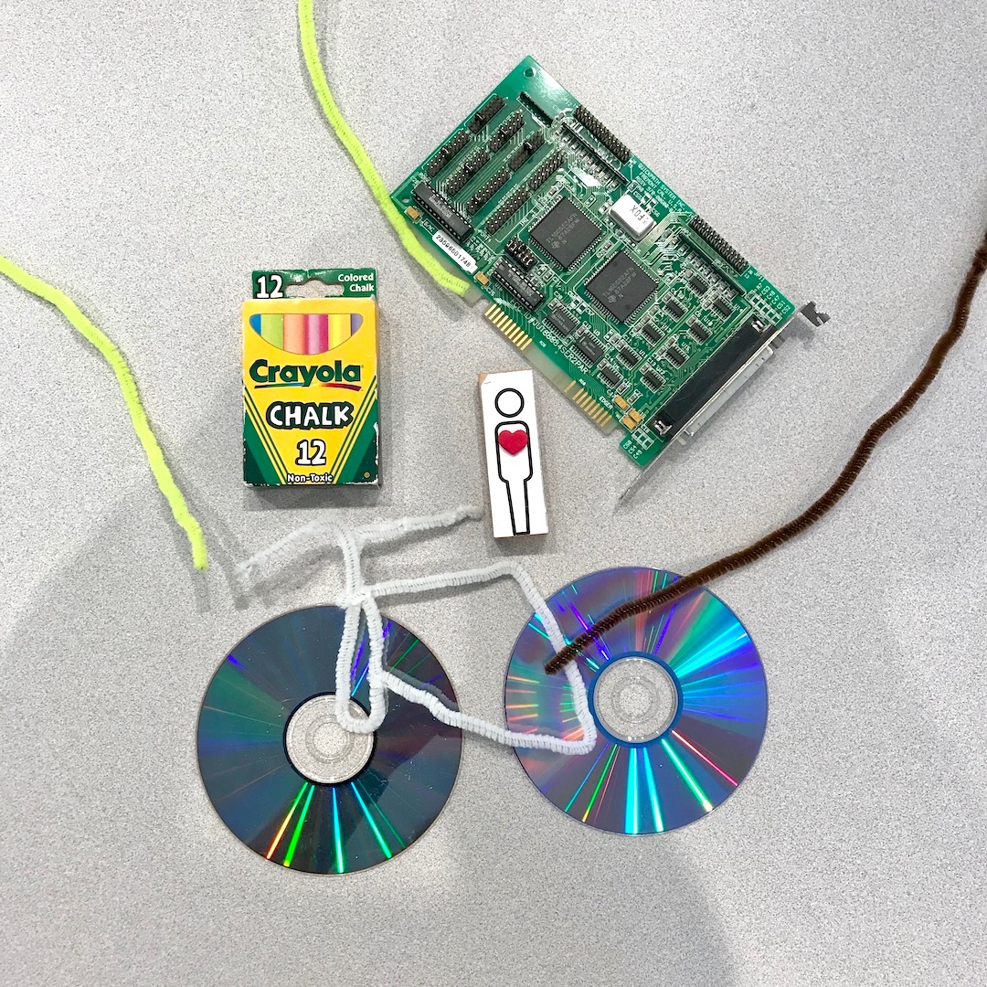
I chose to represent myself with attributes of Portland’s bicycle culture, my love of Laserdisc movies, my career in electronics, and my fine arts education.

I chose to represent myself with attributes of Portland’s bicycle culture, my love of Laserdisc movies, my career in electronics, and my fine arts education.

The center represents CMU, and each student worked to recreate elements of their journey to this graduate program. Whiteboards contain written facts about the cohort and their connections to the field of design (right), and our pictographic expressi…

The center represents CMU, and each student worked to recreate elements of their journey to this graduate program. Whiteboards contain written facts about the cohort and their connections to the field of design (right), and our pictographic expression of the core principles of design (left).

It was a bit of a mess in the beginning, but eventually this random pile of madness transformed into a visual representation and collaborative sculpture of readymade objects. Bruce Hanington took two pages of observation notes during this exercise. This was quite an icebreaker, and I generally feel very good about collaborating in the future with this group.

Over lunch I discussed a few of my on-boarding concerns with Ema. I value Ema’s insights and experience as a grad student. It was Ema and Michelle who took me on a brief tour back in the spring (when I was waiting for the admissions decision). I wanted to know if I ought to be concerned by the lack of clear course outline. The syllabus makes the expectations clear, but are still relatively vague and lacking the kinds of specifics I am accustomed to. Generally speaking, I am used to more structure (my time in the military, working at Intel, and undergraduate studies were loaded with constraints and granular, rigid scheduling). This is new for me, but I also expect that this will lead to greater autonomy in a future career - we’re receiving lots of support, but are also expected to work independently, with very open-ended criteria and high standards for deliverables. It is a continual source of comfort to know that these are the people I will face these challenges with.

In the afternoon I had my first session with Andrew Twigg. He will be teaching two of our courses this semester. For introductions, we were spared having to repeat our backgrounds. Instead, Andrew only asked for our names, where we’re coming from, and our favorite food. I chose rice, because “Rice is great if you're really hungry and want to eat two thousand of something” (R.I.P. Mitch Hedberg). After reviewing the syllabus, we had our first lecture on the topic of typography. This included two slide presentations with a brief history on the development of written communication, from cave paintings to the fonts commissioned by billion dollar internationals in the 21st century. This included an almost anatomical dive into the creation of a modern font, what they are made of, and the names of their parts. We also explored the contextual relationship between size, shape, and arrangement of text. There was a lot terminology that is still foreign to me, but I believe I’ll be able to absorb these new concepts as we begin to play with (and act upon) these various components.

One of the slides was a soviet era advertisement for galoshes (at least, that’s what I could glean from a thread on mail.ru). The rough translation: “There were not, and are not better nipples, ready to suck through the old years. Sold everywhere: Reznotrest.” The word “сосать” (i.e.,“suck”) is a verb with similarly vulgar dual meaning to its English counterpart. I’m not sure if this was true when the image was originally constructed. It is probably not important or worthwhile to read into it that too much.

1762003319.jpg

My first deliverable is due this Thursday: 32 layout thumbnails and eight prints (on tabloid, 17 x 11 inch sheets) with font constraints on preselected text. How we arrange it will be up to us to decide, but should demonstrate Design Thinking and execution of enhanced visual communication matching to the context.