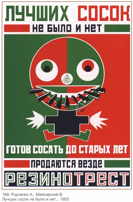
Today’s quote: Лучших сосок не было и нет, готов сосать до старых лет. Продаются везде. Резинотрест.
I am still not certain what observations are valuable to record during this graduate program. What I am certain of, is that I will be learning a lot of new languages: the language of typography, CSS, HTML, Python, graphics, and the countless jargon of the Design community. I think I’ll call this strange new collection of languages “Designese.” It is the combined means by which designers communicate their ideas, and inject them into the world.
The morning class (Design Principles and Practices) was interesting. We began with an exercise where we abstracted our backgrounds by improvising with given materials and the classroom space itself.
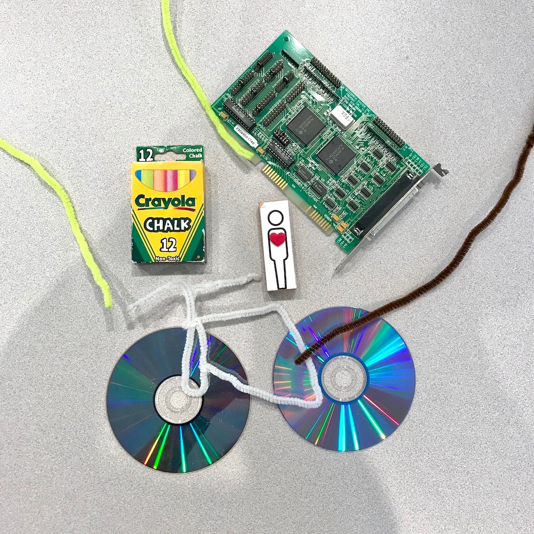
I chose to represent myself with attributes of Portland’s bicycle culture, my love of Laserdisc movies, my career in electronics, and my fine arts education.

The center represents CMU, and each student worked to recreate elements of their journey to this graduate program. Whiteboards contain written facts about the cohort and their connections to the field of design (right), and our pictographic expression of the core principles of design (left).
It was a bit of a mess in the beginning, but eventually this random pile of madness transformed into a visual representation and collaborative sculpture of readymade objects. Bruce Hanington took two pages of observation notes during this exercise. This was quite an icebreaker, and I generally feel very good about collaborating in the future with this group.
Over lunch I discussed a few of my on-boarding concerns with Ema. I value Ema’s insights and experience as a grad student. It was Ema and Michelle who took me on a brief tour back in the spring (when I was waiting for the admissions decision). I wanted to know if I ought to be concerned by the lack of clear course outline. The syllabus makes the expectations clear, but are still relatively vague and lacking the kinds of specifics I am accustomed to. Generally speaking, I am used to more structure (my time in the military, working at Intel, and undergraduate studies were loaded with constraints and granular, rigid scheduling). This is new for me, but I also expect that this will lead to greater autonomy in a future career - we’re receiving lots of support, but are also expected to work independently, with very open-ended criteria and high standards for deliverables. It is a continual source of comfort to know that these are the people I will face these challenges with.
In the afternoon I had my first session with Andrew Twigg. He will be teaching two of our courses this semester. For introductions, we were spared having to repeat our backgrounds. Instead, Andrew only asked for our names, where we’re coming from, and our favorite food. I chose rice, because “Rice is great if you're really hungry and want to eat two thousand of something” (R.I.P. Mitch Hedberg). After reviewing the syllabus, we had our first lecture on the topic of typography. This included two slide presentations with a brief history on the development of written communication, from cave paintings to the fonts commissioned by billion dollar internationals in the 21st century. This included an almost anatomical dive into the creation of a modern font, what they are made of, and the names of their parts. We also explored the contextual relationship between size, shape, and arrangement of text. There was a lot terminology that is still foreign to me, but I believe I’ll be able to absorb these new concepts as we begin to play with (and act upon) these various components.
One of the slides was a soviet era advertisement for galoshes (at least, that’s what I could glean from a thread on mail.ru). The rough translation: “There were not, and are not better nipples, ready to suck through the old years. Sold everywhere: Reznotrest.” The word “сосать” (i.e.,“suck”) is a verb with similarly vulgar dual meaning to its English counterpart. I’m not sure if this was true when the image was originally constructed. It is probably not important or worthwhile to read into it that too much.
My first deliverable is due this Thursday: 32 layout thumbnails and eight prints (on tabloid, 17 x 11 inch sheets) with font constraints on preselected text. How we arrange it will be up to us to decide, but should demonstrate Design Thinking and execution of enhanced visual communication matching to the context.