Brooklyn Laboratory Charter School - Designing For An Academic Year Under The Context of COVID-19

This summer has only just begun and I am now involved in two separate projects related to educational institutions and their response to COVID-19. Working with Dezudio and members of my CMU Design cohort, we are consulting a handful of teams to help them develop their strategy and documentation for Brooklyn Laboratory Charter Schools (LAB).

In the first week of this project, Brooklyn Lab teams presented their strategies for the 2020/2021 school year. There was a lot of information to sort through, and many different ways to interpret the key terms (e.g., “A” and “B” shifts, virtual, online, in-person, “brick and mortar,” traditional, etc). Additionally, all stakeholders are confronted with multiple layers of complexity. This impedes decision making and increases stress for all involved. I believe that it is highly appropriate to view these policies through the lens of a navigation system.

For students and their parents, this navigation involves when, where, how, and with whom they will receive an education. For instructors and staff, there is a question of when and where they will be in performing their most common tasks, and how they will interact with the students they serve, as well as when and where they will conduct their professional obligations beyond the classroom. For administrators and their efforts to support a highly modified school year format, there is a clear need for mapping, to help them maintain “the big picture.”

To achieve successful navigation, we may want to leverage the familiar look and feel of MTA maps, and adopt a language to reflect this navigation mindset. Instead of calling different delivery formats “shifts” we can call them “tracks” with different activities as “stations.” This metaphor can help reduce the cognitive load for stakeholders, enabling them to make decisions faster, and with more clarity.


Maps are useful for reducing cognitive load; navigating a city this size requires abstraction and timed decision making, and maps provide scaffolding for making those decisions.

Maps are useful for reducing cognitive load; navigating a city this size requires abstraction and timed decision making, and maps provide scaffolding for making those decisions.


I agree with Klaus’ assessment of the classroom diagrams: simple shapes and colors can be used to identify the most common categories (students, teachers, etc.), with a key to help reinforce the symbols’ meaning. I’ve included some sketches and prototypes from last week to show what these concepts might look like.

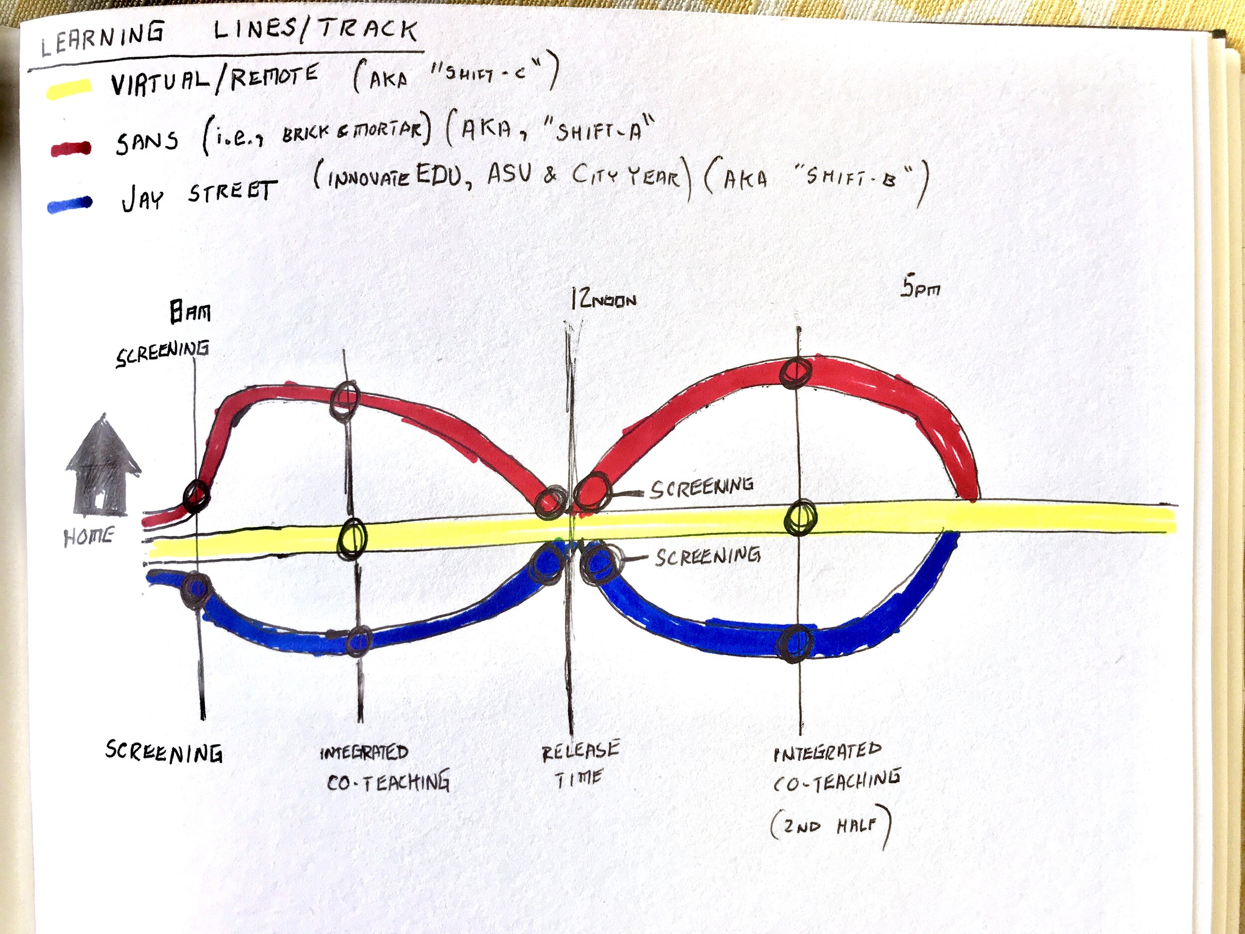
Concept sketch to explain the multiple channels; a student’s schedule might include a combination of in-person, alternative location, and online/in-home instruction.

Concept sketch to explain the multiple channels; a student’s schedule might include a combination of in-person, alternative location, and online/in-home instruction.

Using familiar conventions as metaphor will help parents, teachers, and students understand these new policies.

Using familiar conventions as metaphor will help parents, teachers, and students understand these new policies.

Maintaining high standards of rigorous academics is a challenge even under the most ideal conditions. Mapping the relationship between leadership, teachers, students, and the different education delivery formats.

Maintaining high standards of rigorous academics is a challenge even under the most ideal conditions. Mapping the relationship between leadership, teachers, students, and the different education delivery formats.

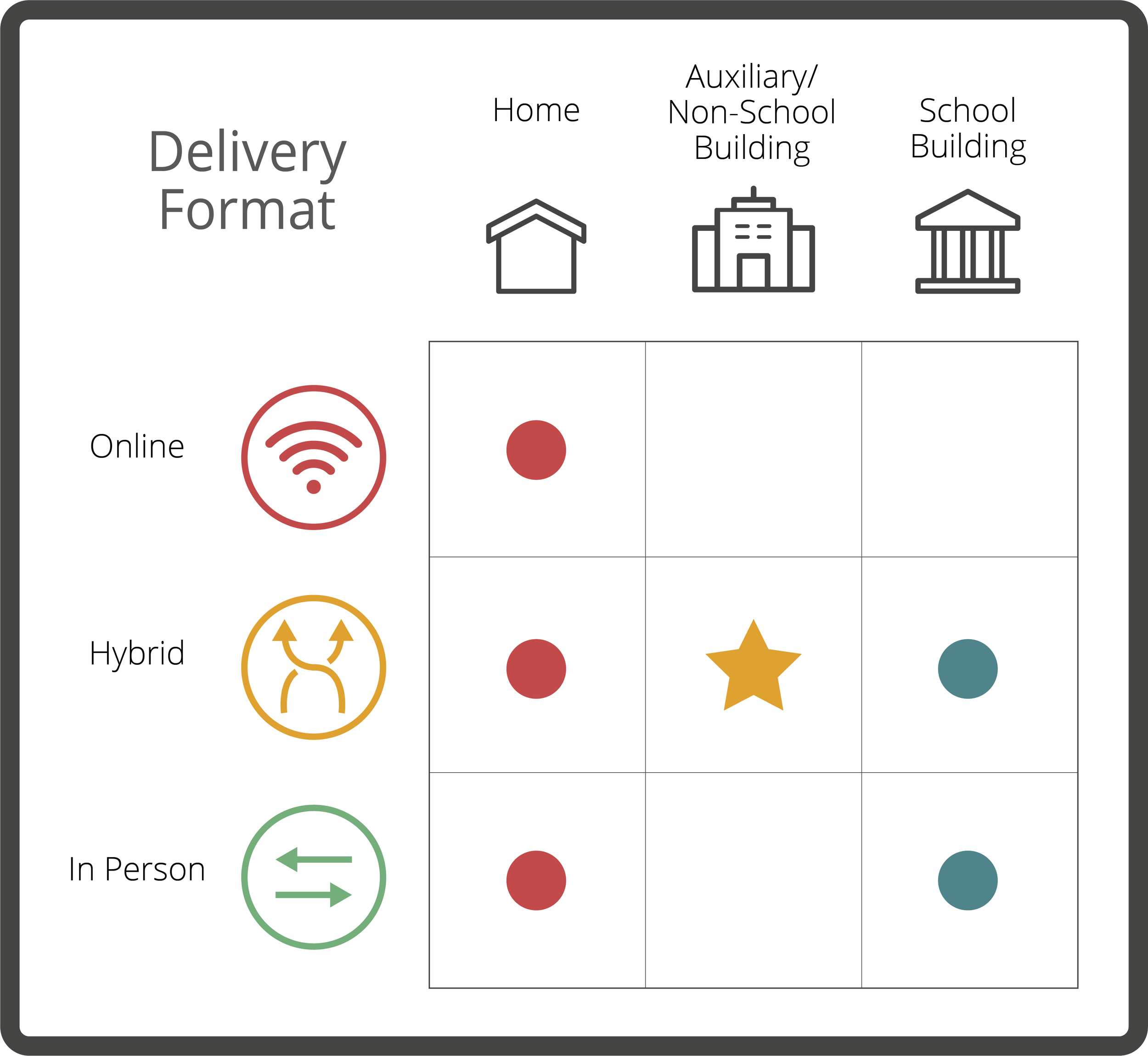
A key with simple colors and shapes can help readers understand the meaning of words like “Hybrid.”

A key with simple colors and shapes can help readers understand the meaning of words like “Hybrid.”

Kinetic-friendly spoon project Mega Post

That’s a wrap! It’s certainly been an interesting semester, but now I am ready to put it behind me. Reflecting on the spoon project, I have some final thoughts and observations. First, I want to thank the fine folks at CMU School of Design. From the amazing and hardworking faculty and graduate student cohort, I have had nothing less than inspiration and encouragement throughout this entire process, despite the obvious challenges of working remotely.

Rendering of sixth and final (?) spoon design. I pulled the kitchen design (Pierre Gilles) and bowl (Damogran Labs) from GrabCad.com. The spoon and coffee mug are mine.

Rendering of sixth and final (?) spoon design. I pulled the kitchen design (Pierre Gilles) and bowl (Damogran Labs) from GrabCad.com. The spoon and coffee mug are mine.

This project was divided into two parts: the first part focused on exploring different ways of prototyping and making. This was described to me as an informal way of A/B Testing for methods. The second part involved the deliberate iteration of prototypes through user testing — a challenge in the context of a global pandemic and social distancing. To make the most meaningful design choices possible given limited resources, I decided to leverage the power of physical simulation to supplement the making of physical prototypes.

There are a variety of 3D software tools that offer some degree of physical simulation. For this project, I selected Maxon Cinema 4D R20 (Educational License) and Blender as my two ways of making. I chose these because I already am familiar with Cinema 4D and understand know how to manage a workflow in that context, because Blender is open source and free for anyone to use, and both programs work under MacOS and Windows environments (my rendering workstation is a Hackintosh with multiple operating systems, which grants the flexibility to overcome certain technical limitations). My initial experiments with Cinema 4D were… not great.

My very first (and failed) attempt to simulate fluids in Cinema 4D. Carnegie Mellon University School of Design Prototyping for Interaction Spring 2020

As you can see, there are “physics” happening here, but they are not anything close to the physics of the real world. This is not “real world” physics, this is Asshole Physics:

Zachary "Spokker Jones" Gutierrez and I came up with the term "Asshole Physics" when we were discussing the game and the physics models it employed. Basically there's a lot of crap you can knock over and kick around, including dead bodies, buckets, cans, and little sections of drywall which are standing around in the middle of rooms for no obvious reason. Zachary casually mentioned, "I have made it a point to knock over every fucking thing in that game. I am living out my fantasies of being a giant asshole," and I responded by stealing his "asshole" comment and claiming that I made it up. Thus "Asshole Physics" was born.

Without more sophisticated plugins to simulate fluid, Cinema 4D R20 is only “out of the box” capable of non-newtonian semisolids. I can make stuff bump around and “squish.” I can have a 3D character micturating on the side of a building. I can create the appearance and illusion of something like a fluid, but with such restrictions, I could not realistically evaluate my spoon designs. I explored my options and found that Next Limit’s RealFlow plugin would meet my basic needs. Best of all, they offer a free 30-day trial! My initial excitement quickly waned after the plugin failed to install and activate on my system…

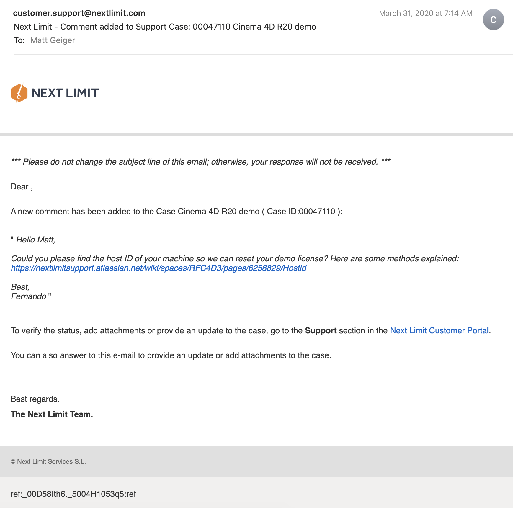
(This email chain is long and covers a week of back and forth with customer service. I am including the entire conversation as a way to recreate my experience. While this may not directly relate to the scope of this project, I still believe that there is value in documenting the unexpected problems that crop up when trying to do something new.)

Mail_02.png
Mail_03.png
Mail_04.png
Mail_05.png
Mail_06.png
Mail_07.png
Mail_08.png
Mail_09.png

It took a week to finally get everything sorted with the demo. During that time, I began to explore option B: Blender.

Blender is a free, powerful, open source 3D creation tool. Best of all, it includes the mantaflow fluid simulation engine (since version 2.8). I have worked with Cinema 4D on other projects, and have become fairly comfortable with the interface. Given my experience with Fusion 360, Inventor, and C4D, I knew that I would need to overcome a learning curve before I could use this software to meet my needs for this project. Fortunately, I was able to find a spectacular tutorial series for beginners.

If you want to read more about my experience with the tutorial, click here.

This tutorial was ideal because it involved exercises that helped me learn how to use the interface, and covered several different workflows. I was really impressed with Blender’s node-based material system and procedural textures. You can work stri…

This tutorial was ideal because it involved exercises that helped me learn how to use the interface, and covered several different workflows. I was really impressed with Blender’s node-based material system and procedural textures. You can work strictly with parametric modeling, or you can discretely modify mesh geometry to create highly organic and imperfect forms. I’m excited to work with Blender on future projects. It’s a very exciting time to be working in 3D.

While working through these tutorials, I began sketching and working in Fusion 360 to craft my first spoon designs for part 2 of this project. You can read more about this experience here.

Takeaways from Part 1

I really appreciated the responsiveness from the team at Next Limit. Clearly there are problems with the software’s implementation of their product’s copy protection. This is an all-too-common problem in the world of software. Programmers gotta eat just like everybody else, and we certainly should make sure that the talented and hardworking folks behind the code are able to put food on their table at the end of the day. Piracy can deprive a small business of the necessary revenue to keep the lights on, so I am absolutely sympathetic to this reality and what risks are involved when you release your software for demo purposes. Getting people to pay for something that they can easily get for free is a challenging proposition. At the same time, you cannot realistically expect to get customers to pay for software if they cannot try it first. Ultimately, this one week of back and forth with customer support was a critical loss. I never completed a side-by-side comparison of fluid simulations. While I did eventually succeed at installing and using RealFlow to do fluid simulations, (and was honestly impressed with how easy it was) I did not, however, have enough time to setup a comparable simulation to evaluate spoon designs. My trial expired about a week ago, and I see this aspect of the project as a lost opportunity. If Next Limit applied similar licensing practices as Maxon (verify it through .edu email address), they could offer an educational package of their RealFlow plugin.

Blender really came through for me. The learning curve was aggressive, but not impossible. While I found mantaflow to be a respectable and entirely capable fluid simulator, it was not without its own share of issues. I spent a lot of time making granular tweaks to improve the fidelity of my simulations, while also using the observations from my simulations to inform design decisions for my spoons in part 2 of this project.

Part 2: Design Iterations Based on User Testing

While this project required user testing and design iterations based on feedback, I decided to limit the user evaluations to address handle shape and the spoon’s overall dimensions. This was not an arbitrary decision or an excuse to focus on physical simulation of fluid dynamics (with user testing as an aside). No, this decision was based on the nature of the course from which it was assigned: Prototyping for Interaction Design. This semester I have have been focusing on designing for interaction (arguably, all designers do, at some point in their process, focus on this aspect). When thinking about the tools we use (to eat food) as a system, it is important to consider the touchpoints involved. The handle of a spoon is a non-trivial component. It can take on many forms, and naturally includes affordances. How someone holds a spoon, and how easy it is for them to use it are central to the evaluation of the design.

The iterations of design were highly generative in nature, inspired by both user evaluations and physical simulations, I maintained a homeomorphic continuity: treating the initial shape as an elastic form to be molded and reshaped to maximize performance. Knowing how a concave shape might be optimized to perform under rapid movement — I wanted to create something that would be useful, and the physical simulation of fluids facilitated a means of evaluation — is only one aspect of a more complicated interaction, and this test alone could not fully address human needs. When physical form is designed and directed to improve user interaction (and physical properties are given equal consideration), it is possible to create a truly useful tool. I realize that this is a very technical description, but it is easier to understand when properly visualized. I have rendered a compilation sequence to show how this spoon shape evolved to its final(?) form (I am still considering a physical prototyping stage for this project over the summer).

A sequence of fluid dynamics tests designed to evaluate fluid retention of concave forms. Carnegie Mellon University, School of Design, Prototyping for Interaction, Spring 2020.

Toward the latter half of this sequence, you will notice a change in colors (for both the liquids and spoons). I decided to differentiate the final rendering sequences as these were based on user evaluations. The colors chose for these final sequences are based on the color tags used for the user test:

These printouts are derived from DXF vector images exported from Fusion 360. The designs shown are oldest (top) to newest (bottom). The fifth design (blue) is rendered with a blue body and green liquid.

These printouts are derived from DXF vector images exported from Fusion 360. The designs shown are oldest (top) to newest (bottom). The fifth design (blue) is rendered with a blue body and green liquid.

I printed and mailed the paper prototype to a potential user suffering from ongoing hand tremors (my partner’s mother). I sent this without written instructions. Instead, I only provided different color tags to facilitate feedback. My user let me know that the red spoon handle was in the “Goldilocks” zone in terms of size and shape: not too big, not too small, not too curvy, not too straight. Using this feedback I constructed the sixth and final (?) form — see the first image of this post.

The user test included a direct side-by-side comparison with existing dinnerware.

The user test included a direct side-by-side comparison with existing dinnerware.

Before developing these simplified paper prototypes, I also experimented with ways of making more three-dimensional forms that could be sent in the mail. While this novel approach showed some potential, I was concerned with how user error might complicate or (even worse) bias feedback. Still, these paper prototypes helped me to better understand and interpret the scale of my 3D models.

PaperPrototype_01.jpg

Final Thoughts

This project still feels somewhat incomplete. Perhaps this is because the generative design process itself can always demand further iteration, or maybe it is because I have not yet created a physical prototype that can actually be tested as an eating instrument. Maybe it is only because there were still a few “rogue droplets” (grrrrrr) that I simply could not keep contained with the completion of my sixth iteration. Whatever the net effect might be from these various shortcomings, I am pleased with the learning opportunities that were presented throughout this exploration of design.

Were I to continue with this process, the next steps would be to 3D print the latest shape using a food-safe material (there are a few third-party vendors that offer this service). I would then ship that latest design for further user evaluation. I believe that there are still many additional iterations necessary before I could defend having created something that satisfies the criteria I set out with this project (i.e., a spoon that overcomes the challenges of involuntary muscle movements and essential tremors).

If I were to collaborate with others, I would also want to evaluate the ecological and economic impact of such a device. How might we go about manufacturing to appropriate scale? How might additional user tests with a wider audience influence the existing form? There remains many unanswered questions and a newfound respect for the power of generative design.

Bugs in the Blender

I have continued to have luck exploring the Fluid simulations in Blender, but this process has not been without its quirks. I recently encountered a strange issue related to Particle Radius settings

Particle Radius

The radius of one liquid particle in grid cells units. This value describes how much area is covered by a particle and thus determines how much area around it can be considered as liquid. A greater radius will let particles cover more area. This will result in more grids cell being tagged as liquid instead of just being empty.

Whenever the simulation appears to leak or gain volume in an undesired, non physically accurate way it is a good idea to adjust this value. That is, when liquid seems to disappear this value needs to be increased. The inverse applies when too much liquid is being produced.

What does this look like in practice? My most recent simulation actually seems to produce fluid as the scene progresses.

Nevertheless, I was able to gain critical insights into this form and will continue to iterate new designs. This is being done in conjunction with paper prototyping. These forms are less sophisticated, but still provide valuable information about how users will experience and interact with this flatware.

SpoonPrototype.jpg

Spoonfuls of updates

This week was packed full of progress on multiple projects. I received feedback for my group’s birth control information app “MyGallery.” Our work was even featured on CMU’s Design page.

Crafting an iconographic representation for the withdrawal method was my proudest moment.

Crafting an iconographic representation for the withdrawal method was my proudest moment.

I’ve continued to explore fluid simulations with Blender. I’ve ran into some technical hurdles: Blender 2.82 uses a variety of protocols to leverage GPUs for rendering and computation. It offers an AI-driven denoiser (Optix), CUDA path tracing, and OpenCL. My MacBook Pro has an AMD Radeon Pro 5500M GPU as well as the option to plug in a Radeon Frontier Edition (first generation Vega) eGPU on Thunderbolt 3. Plenty of GPU compute power in either configuration, but there is a snag: MacOS 10.15 (Catalina) has deprecated OpenCL in favor of Metal 2+. CUDA and Optix are proprietary to nVidia GPUs. Apple hasn’t shipped a Mac with nVidia GPUs since Kepler launched (GeForce 700 series). Blender supports AMD ProRender, but I found it was terribly unstable.

I could easily slip into a tangent about how unfortunate the breakup between Apple and nVidia truly is, but I will spare you.

My current workflow involves queuing some tasks to my desktop, running Windows 10. The GPUs are dual Radeon VIIs. Unfortunately, I found that rendering on Blender is unstable when both GPUs render in parallel. No problem, since I can free up the other GPU for Folding@Home (a hobby of mine that has exploded in response to COVID-19). Who would have guessed that a global pandemic would boost a distributed computing project to exascale?

Despite these obstacles of platform compatibility, I have made significant progress on my simulation-based research. It is difficult to understate how exciting this project has been for me. For some context: the ASCI Red supercomputer (at the Sandia National Laboratories) was built in 1996, and was the fastest supercomputer in the world until 2000. It was the first computer to achieve true terascale computing (one trillion floating point operations per second). I built my first terascale computer in 2013. This was shortly after leaving my job at Intel. There was something very gratifying about building a computer with a CPU I helped manufacture. GLaDOS G4 (you can see the project here, scroll down to “Everything Else”) was built with a GeForce GTX 780 GPU and Intel Core i7 4770k overclocked to 4.5 GHz. It ran nearly silent and fit inside an up cycled Apple Power Mac G4 (microATX equivalent) case.

The ASCI Red supercomputer was designed to simulate nuclear weapons tests. Today, I am using a system roughly ten times more powerful to simulate soup spilling out of a spoon. I was inspired to approach this problem by two projects. The first was a 2013 project from Portland State University (my alma mater) to make a coffee cup for zero-gravity environments. they used drop cages and 3D printing to iterate several designs until they had a shape that held liquid. “It wasn’t needed, but it was requested.”

The other project hit me right in the heart.

The S’up Spoon is the embodiment of good design. The design was inspired by deep empathy for a user’s problem, and the solution involves as little design as possible. There are few technologies in this world that we trust enough to put in our mouths. If you can make it in this space, you can make it (almost) anywhere. During the fall semester, Moira and I visited the Carnegie Museum of Art. They had an exhibition on accessibility design, and I was brought to tears by stories of innovation and vibrant improvements to quality of life for people with disabilities. Technology, at its very best empowers people to realize their fullest potential. We can easily get lost in the exhilaration of the complex, but this impulse must not dampen our ability to appreciate the elegance of simplicity. Some problems are best solved by form. I saw many incredible solutions in that exhibition, but this spoon has really stuck with me.

My goal is not to make something better, but perhaps a little bit different. The shape of the S’up spoon is intuitive, and if we had never seen a spoon before, we might conclude that it is the better design over more traditional forms. It is however, under our current cultural context, a strange thing to behold. It looks more like a wizard’s pipe or a warrior’s horn. It is beautiful and ergonomic. I do not intend to elevate those specifications. Instead, my goal is to make a spoon that is inconspicuous while still achieving similar results for users who suffer from motor movement difficulties.

How has my first design faired under simulation?

While I can certainly see the appeal of a long hollow channel, I’ve become increasingly concerned with how this shape my be difficult to keep clean. I can imagine objects getting wedged toward the back depending on what is being consumed. I have began to work on a second iteration with a more shallow channel. Still, this first iteration does fairly well. It is managing to retain most of the 15ml (i.e., 1 tablespoon) of fluid under rapid movement.

I enjoyed this simulation so much that decided to make a rendering:

I have not yet gotten back into Cinema 4D to evaluate RealFlow. Despite the challenges regarding compatibility, I am truly impressed with how powerful this open source software has become with this latest release.

Now that I have established this workflow, I can easily switch out revised designs to test under identical conditions. I’m still not sold on the current handle shape, and I think I can improve liquid retention by tweaking the angle of the lips. The flat bottom (Chinese style spoon) does fairly well, with it’s obtuse angle walls. Next, I will try a concave structure with a wider base for the handle and a more aggressive descending angle.

Prototyping – Part 2

Working with Blender has continued to go well.

I have also been looking at some of the existing solutions in this space:

KFS Easy Eat

http://www.eating-help.com

Liftware, by verily

https://www.liftware.com

EliSpoon

https://elispoon.com

Ornamin - Supportive Cutlery (Parkinson’s)

https://www.ornamin.co.uk/shop/cutlery-set?number=SW24

S’up Spoon

https://www.youtube.com/watch?v=C8nNlWw6KbA

Apex Medicine Spoon

https://www.riteaid.com/shop/apex-medicine-spoon-0233706

I have been sketching and studying these forms in consideration for my own designs.

Sketch.jpg
Sketch 1.jpg
Some shapes are unappealing because of their associations. These still deserve consideration, as they function well in this space.

Some shapes are unappealing because of their associations. These still deserve consideration, as they function well in this space.


This week I will begin iterating designs in Fusion 360. Hopefully, I will finally be able to make use of my RealFlow trial license. I’m curious to see how the “out of the box” settings function with these geometries.

Fluid Simulation in Blender

“Throw off your fears let your heart beat freely at the sign that a new time is born.” — Minnie Riperton

I’ve completed my workflow design for fluid dynamics testing in Blender. Here’s a proof of concept:

Now I just need to figure out RealFlow in C4D…

Blender: Time To Make The Donuts

I’m very happy with the results of my first project in Blender.

White Frosting

White Frosting

Classic Pink

Classic Pink

And Nekkid!

And Nekkid!

After struggling with Cinema 4D, I decided to use a plugin rather than trying to cludge together some handcrafted fluid simulation. Unfortunately, I ran into a licensing problem with Next Limit’s RealFlow plugin. I’ve been emailing back and forth all week, and they finally got a fix for me — SUCCESS! While I waited to sort that out, I decided to give Blender a try. I began following this tutorial, but quickly found myself getting lost. I needed to become more familiar with the software and interface. I decided to follow a beginner’s tutorial to get my feet wet. I choose this particular video series because it employs procedurally generated elements, and covers all the basic modeling commands, node handling, and the complete stack of scene construction. And also: donuts are delicious. The world is terrifying, and we could all use something sweet.

I am honestly shocked that Blender is a free program. Many 3D programs are horrifically expensive; without student licensing, I could never afford to touch most of the 3D tools I’ve been learning over the years. Yet Blender seems to be very capable as a 3D program. I have only scratched the surface, but it is very impressive. Now that I have familiarized myself with Blender, and have a working fluid simulator plugin for C4D, I am in good shape to begin A/B testing.

Prototyping Cutlery

For one of my final projects this semester, I’m interested in creating a set of eating tools that help account for involuntary muscle movements (e.g., Parkinson's disease or tremors) and other mobility difficulties that limit the enjoyment and consumption of foods; I'm interested in exploring simple solid shapes, living hinges, and assembly forms derived from explicit advantages of additive manufacturing techniques.

[I want to make a really nifty spoon.]

Fabricating physical prototypes will be a challenge (…)

Seriously: fuck you, COVID-19.

This is not the only challenge, however. Finding access to food-safe materials, conducting a series of user tests, iterating forms, and self-directed research will also require creative workarounds to overcome the limitations of working while under “shelter-in-place” orders due to global pandemic.
I have decided to go 100% digital. instead of building various forms and testing their ability to hold fluids under rapid motion, I will instead conduct a series of simulated physics tests to evaluate forms. For the first part of this project, I am required to conduct an A/B test or evaluation. I have decided to conduct dual testing using different 3D programs.

Method 1:

Maxon Cinema 4D includes a variety of physical simulation abilities—including particles and fluid dynamics. I intend to leverage this software’s capacity to test various designs and forms. Tests will be designed to evaluate fluid retention under repeated multi-axial movements. Cutlery designs will be tested against traditional forms (e.g., standard soup spoons).

Method 2:

Blender is a free, open source platform for creating 3D models, rendering, animation, and more. Among the built-in features is a fluid simulator. Combined with rigid body and gravity physics, it should be possible to evaluate a variety of spoon shapes and (potentially) even different forms of cutlery.

Considerations:

By using two different simulations, it should be possible to more thoroughly evaluate a design’s fluid retention abilities.

Timeline:

Week 1 — Cinema 4D Workflow: Since I am already familiar with Cinema 4D, I have decided to begin this project by constructing my first simulation with this software. I will use Fusion 360 to generate original spoon designs, as well as a “traditional” spoon shape to compare performance.

Week 2 — Blender Workflow: Using the assets from week 1, I will spend week 2 developing and executing a comparable test running under Blender’s fluid simulation engine.

Resources:

Blender Tutorial - Realistic Fluid Simulation: https://www.youtube.com/watch?v=zmw-BTCbWMw

Cinema 4D Tutorial - Water simulation Animation: https://www.youtube.com/watch?v=JehbYBAZw7c

What does Day 1 look like?

Let’s just say I have a lot to learn.

Interactive Design Prototyping

THE TIME HAS COME TO…PUSH THE BUTTON

Wireless communication between Arduino #1 and #2

Wireless communication between Arduino #1 and #2

My current project in IxD Prototyping involves physical computing (i.e., “interactive systems that can sense and respond to the world around them.”) I have worked with Arduino before (Restricted Area, 2017) but this newest project is expected to have a daily use. In my head, I keep a long list of annoying technology interactions—this gets updated frequently. We are saturated with unsatisfying technology and devices that cause more problems than they solve. We have inconveniences stacked upon inconveniences, and if we were to step outside of this environment, you would inevitably conclude that most electronics are made to punish the buyers. I am looking to improve just one such interaction.

Back in 2012 I bought an HD video projector. If you love to watch movies, there is something magical about having “the big screen” at home. I love it. Do you know what I don’t love? Using an infrared remote control on a devices that is mounted above and behind me. Seriously, Epson: what where you guys (and yes, I’m assuming it was a team of men, with their dumb penises getting in the way of common sense) thinking?! The primary function of the remote control is to simply turn the projector on and off. I would gladly give up the remote control entirely if I could simply move the power button to the armrest of my couch. Instead, I must contort my arm in Kama Sutra fashion just to find the right angle to get the sensor to recognize the POWER-ON command from the remote.

Getty Images: the various methods for turning on an Epson HD Projector.

Getty Images: the various methods for turning on an Epson HD Projector.

My girlfriend’s method to bypass the projector is more elegant: she retrieves a step-stool from our utility closet and presses the ON/OFF button on the projector chassis. This works well, but … well, let’s just say, it ruins the mood. I began to explore other options, and realized that the primary issue is that IR remotes are directional. The IR sensor is part of the assembly, and cannot be relocated. Arduino is capable of IR communication, it is also capable of RF communication. Radio frequency is far less dependent on line-of-sight, especially within the context of indoor and residential use. Imagine what WiFi would be like if it worked over infrared. Consider also that Apple abandoned their IR remote interface for the Mac.

Enter the Arduino

I found a few open source projects that utilize IR and RF communication:

https://learn.sparkfun.com/tutorials/ir-communication/all

https://www.electroschematics.com/ir-decoder-encoder-part-2-diy-38-khz-irtr-module/

https://create.arduino.cc/projecthub/electropeak/use-an-ir-remote-transmitter-and-receiver-with-arduino-1e6bc8

https://learn.adafruit.com/using-an-infrared-library/hardware-needed

https://www.sparkfun.com/datasheets/Components/nRF24L01_prelim_prod_spec_1_2.pdf (PDF Warning)

https://www.deviceplus.com/arduino/nrf24l01-rf-module-tutorial/

https://forum.arduino.cc/index.php?topic=421081.0

https://howtomechatronics.com/tutorials/arduino/arduino-wireless-communication-nrf24l01-tutorial/

All of these resources are excellent. I want to call attention to one more link: https://create.arduino.cc/projecthub/muhammad-aqib/nrf24l01-interfacing-with-arduino-wireless-communication-0c13d4

I have a bone to pick with this one. Take a look at the wiring diagram:

Diagram created by /u/Muhammadaqibdutt

Diagram created by /u/Muhammadaqibdutt


Note the LED pin-out for the receiver. This diagram shows the positive leg of the LED connecting to Pin 3

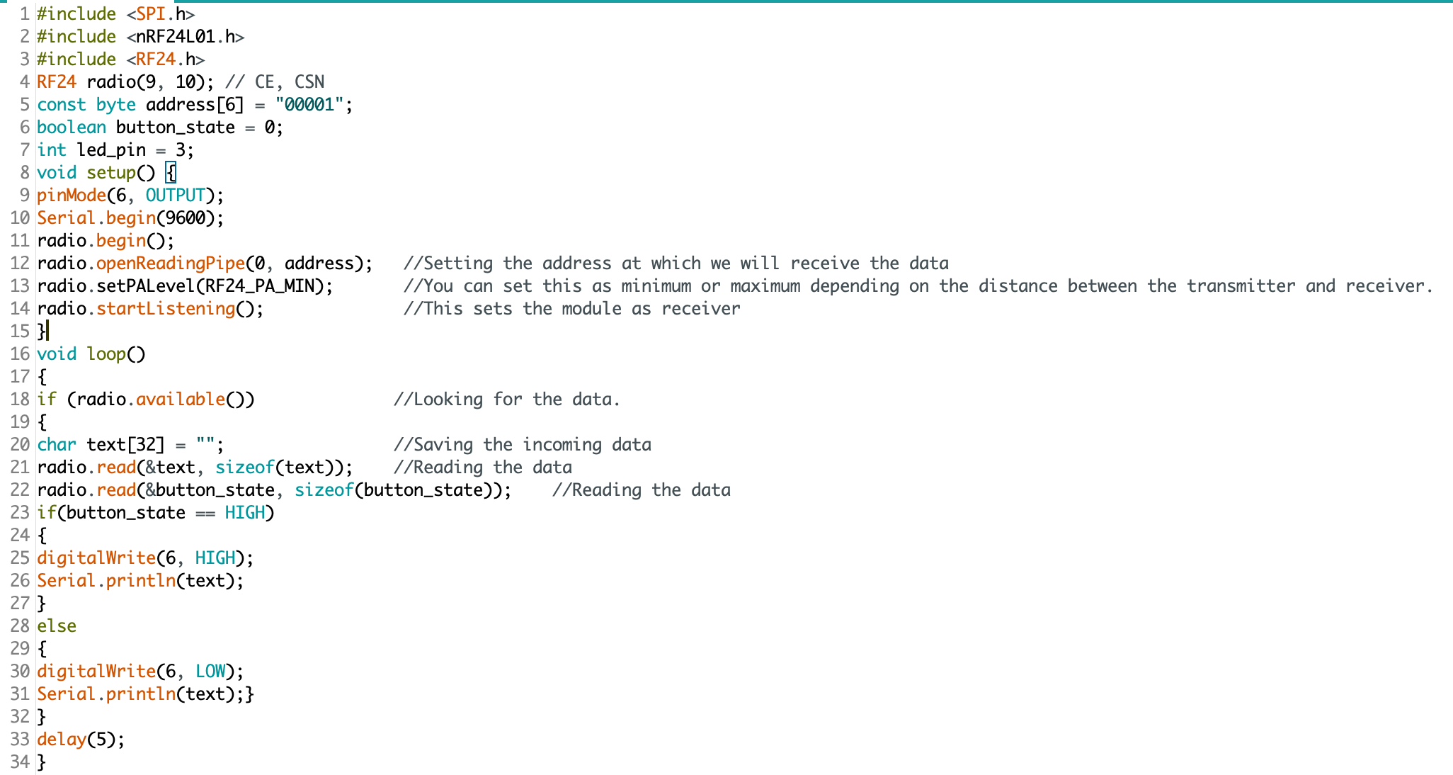
Now, lets take a look at the code:

SOURCE.png

The devil is in the details: “digitalWrite(6, HIGH)” condition turns the LED on. Pin 3 does nothing.

This made for some very “fun” troubleshooting. I’ve since ironed out all the kinks, and have successfully pirated the IR remote signal from an Epson brand projector (on loan from the Design Office at CMU), and have moved on to making an enclosure. Will I 3D print or laser cut? I have not yet decided.

Here is some sample code for my RF triggered IR emitter:

(NOTE: this code is just one half of the project, and by itself cannot do anything. You’ll also need IR and RF libraries to make this code work on your Arduino)

#include <SPI.h>
#include <nRF24L01.h>
#include <RF24.h>
#include <IRLibAll.h>
RF24 radio(9, 10); // CE, CSN
const byte address[6] = "00001";
boolean button_state = 0;
int led_pin = 3;
IRsend mySender;
void setup() {
  pinMode(6, OUTPUT);
  Serial.begin(9600);
  radio.begin();
  radio.openReadingPipe(0, address);   
  radio.setPALevel(RF24_PA_MIN);
  radio.startListening();
}
void loop()
{
  if (radio.available())
  {
    char text[32] = ""; 
    radio.read(&text, sizeof(text)); 
    radio.read(&button_state, sizeof(button_state));
    if (button_state == HIGH)
    {
      digitalWrite(6, HIGH);
      Serial.println(text);
      //Arduino Remote On/Off button code
      mySender.send(NEC, 0xffa25d);
    }
    else
    {
      digitalWrite(6, LOW);
      Serial.println(text);
    }
  }
  delay(5);
}

Notes from class presentations

Considering approaches and interventions

This week, groups in our class presented their initial findings from researching their chosen field of interest. I recorded some of my ideas and observations during class session and thought it would be worthwhile to include a couple of them here:

Ema, Kate, Nick, and Yue: Food Systems

This group is exploring the relationships that college freshmen have with their food, through the context of campus food vending services. There are many places to eat on campus. We have a food truck, cafés, several eating areas in the University Center, as well as residential halls. There is a disconnect between the staff and the food they serve. This is compounded by the disconnect students experience by not preparing meals themselves. The team has proposed a series of interventions, designed to create more student engagement and a sense of ownership.

My thoughts: Freshmen are going through a series of drastic changes in their life. This presents a unique opportunity to change habits early in adult life — people are more likely to adopt new habits during periods of change. I am also curious about the idea of a student-led cleaning weekly session. Could this produce an opportunity to build empathy with the staff? Could it create a greater sense of joint ownership?

Amanda: Civics and Tech

Amanda is interested in how to instruct political radicals to leverage technologies to mobilize and affect meaningful political and social change. She has several different avenues to explore along this subject:

  • Political engagement through digital and physical spaces

  • Who are their stakeholders and what are your thoughts on their understanding of them and discoveries they made?

  • Mass mobilization and online activists

  • Students

  • Politically-minded

  • Radicals

  • High focus on community

  • Interested in both digital and analog engagement

The *How* remains unclear (this is more or less true for all of the groups at this stage), but I do have some thoughts, given that we began this process as a single group:

What are your thoughts on their use of the 4MAT System (McCarthy) to propose ways of planning and executing effective learning experiences?

I agree with the method of starting with the WHY quadrant of the 4MAT chart. I do wonder if you will meet an obstacle due to knowledge gaps. “Why” can be harder to justify if the intended audience does not already understand “WHAT.” I wonder if there is a way to leverage the audience’s curiosity, and to help them learn of their own knowledge gaps. How then would you proceed from that discovery, to compel them to consider the “WHY.” One other thing that comes to mind is the alternate reality game, “YEAR ZERO” (https://en.wikipedia.org/wiki/Campaign_timeline_of_Year_Zero). Originally launched in 2007, it anticipated a future America in the year 2022 (we are getting close now), where America’s government has fallen, replaced by a Christian-dominionist, fascist government (this seems more likely now, which is terrifying). A resistance group uses digital technologies to try to fight back against an oppressive regime, leading to a series of clandestine information sharing methods. Have you considered alternate reality games? It could spark some creative methods for teaching this subject.

Tackling the challenges for our learners

Bridging knowledge gaps.

Working with a team of three other designers, we began to see points of divergence for our goals. Amanda’s focus on online activism and leveraging new technologies was compelling, but she was driven to do this work independently. Nandini and Michelle were also interested in the digital realm, but were not sure about the framing for citizenship.

One of the key challenges for addressing citizenship in the 21st century is the fundamental misunderstanding by the public of how we interact with these new technologies. Twitter, Facebook, Instagram, etc. have removed the traditional political boundaries and geographic limitations of culture and ideas.

This is our stake-holder map, there are many like it, but this one is ours.

This is our stake-holder map, there are many like it, but this one is ours.

The advantage of this style of mapping is that we do not need to work from the current state toward feasible solutions. While the appearance may be linear, we actually developed our ideas for bridging the gaps by first looking forward, to a preferred state. Herbert A. Simon succinctly described the field of design as “changing existing circumstances into preferred ones,” which is exactly what we are plotting with this map. We then can backcast from the preferred state, and identify patterns and opportunities for intervention.

This tool is simple as it is effective. For weeks we had been looking at how technology was affecting citizens’ perception of reality (bots, trolls, hackers, fake news, hoaxes, disinformation campaigns, post-truth, etc.) but we had not adequately considered how bidirectional that perception was. In late 2013, a hacktivist documentary titled, TPB AFK (The Pirate Bay, Away From Keyboard) was released. This film chronicled the political and social aspects of digital sharing, and the rise of Sweden’s “Pirate Party.” Having won seats in parliament in 2009, The Pirate Party of Sweden was a recognized political group. Since then, other nations (e.g., Germany and Iceland) have also elected members from this movement.

The philosophy of the Pirate Party is best understood from their belief that “the internet is real.” They do not make the distinction between interactions “IRL” (In Real Life) and “online.” Instead, they use the term “AFK” (Away From Keyboard) to describe that state. In American politics, we can see the disruption all around us from this misunderstanding. People have been tricked into believing that their online activities are somehow contained, safely behind a prophylactic digital barrier. It’s “on the internet” and therefore not real. Except that it is. Imagine the mayhem that would exist if people believed that their personal vehicles and the roads on which they travelled were somehow a totally self-contained reality, separate from everything else.

Our goal therefor is not to leverage technology to help citizens become more engaged IRL, or AFK, but to help them understand that they are still citizens, even (and especially) when occupying digital spaces.

Decoding a learning experience: notes from class presentation

We have not yet finished in-class presentations, but I wanted to take a moment to record what has been seen so far:

“The Learning Network” Provides current events in the format of lesson plans. Their goal — to expand reach to students. This is achieved through a combination of online lesson plans, quizzes, and student opinions.

Want to learn to play racquetball? Hillary described her initial interest as “like playing tennis, but indoors” — which makes sense, considering that we are living through winter in Pittsburgh. She discovered that Pickleball players (who are mostly 50+ year olds) are obsessed with this sport, and have countless posts on YouTube. Racquetball videos on YouTube, by comparission, are exceptionally rare (very few videos, the top pick being an upload from 10 years ago). Key takeaway: learn the moves before learning the rules.

Michelle Chou presented a sustainable seafood guide. App and website: Seafoodwatch.org, a resource created by the Monterey Bay Aquarium. Users can enter a search for the type of seafood they want to eat. The guide then provides information and recommendations (environmental impact, overfishing, etc.) Categories include: Best Choices, Good Alternatives, Avoid.

Kate played a showreel for the barbican Digital Revolution Exhibition. This traveling exhibition seeks to inform the public on how digital culture permeates modern-day life. The most impactful exhibit (I think) was an exploration into “Digital archaeology” (the history of human computer interaction).

Next, we looked at an online tool designed to teach DSLR users how to be more effective at digital photography: http://photography-mapped.com/. Most DSLR owners shoot in Auto-Mode, and never touch the manual settings. This interactive website explains the different functions of a DSLR. One of the key features of the siteShows instant feedback to help develop understanding.

There were more presentations (I might come back and post more from my notes), but you may have already noticed a pattern: new technology is what makes all of these learning experiences possible. These experiences may happen online or in-person, but all of them are leveraging technology to enhance people’s learning. Some of these experiences were not even possible a few decades ago.

Decoding a learning experience: a case study of factitious

One major area of concern going into the 2020 election is the role of social media in spreading disinformation. While I firmly believe that social media companies (e.g., Facebook and Twitter) need to take a more proactive role in combating fake news (and other propaganda), users and community stakeholders can also help to fight against the tide. One helpful tool is an online game, factitious.

The rules are simple: players are presented with a headline, text, and images — is it real or fake? The correct answer will be rewarded with points, while incorrect answers will provide helpful tips for how to spot a fake. Why is this game important? One of the hard-learned lessons from the 2016 election year was that people often share a news story without ever vetting the contents. Even worse, many Facebook users were willing to share a news story without ever having read the article.

What works: the game is simple, informative, entertaining, and free to the public. What could be better: the game is low stakes, and while that certainly encourages players to give it a try, it doesn’t have any replay value, or real incentives for competition. This could be improved.

Related links:

https://www.brookings.edu/blog/order-from-chaos/2018/05/09/how-misinformation-spreads-on-social-media-and-what-to-do-about-it/

https://www.brookings.edu/research/how-to-combat-fake-news-and-disinformation/

https://www.cits.ucsb.edu/fake-news/protecting-ourselves-teach

https://www.poynter.org/ifcn/anti-misinformation-actions/

Evaluating Tools for Information Architecture

OmniGraffle for Mac

From the website:

OmniGraffle is a comprehensive, yet easy to use diagramming and drawing application. Drag and drop to create wireframes, flow charts, network diagrams, UI mockups, family trees, office layouts, and more. OmniGraffle 7 comes with plenty of features to get started in Standard. OmniGraffle Pro has everything in Standard, plus features suited specifically for folks that make a living designing or working with graphics—things like Shared Layers, Artboard Layers, Non-Destructive Shape Combinations, Blending Modes and Fill Effects, Visio support, SVG export, and more.

Weaknesses:

  • Price - even their educational license for students costs $89.99. They do offer a free trial, but it only works for 14 days

  • Compatibility - not easy to transfer projects to other platforms (i.e., Visio)

  • Learning curve - many reviews complain that it is difficult to learn how to use

xSort for Mac

From the website:

  • Visual environment simulating a table with cards (and outline view).

  • Supports open, semi-open and closed exercises.

  • Supports sub-groups (participants can put groups inside groups).

  • Control every aspect of the exercise(sorting type, cards placement, etc.).

  • Statistical results (cluster tree, distance table, etc.) updated in real time.

  • Displays individually all the info related to an individual session.

  • Easily select the sessions you want to use based on different criterias.

  • Create, read, print and export reports with a single click.

  • Lock the document so that a participant may do only one session.

  • Fully integrated with Mac (Intel and PowerPC-based Macs).

  • Price - Free

Weaknesses:

  • 32-bit only (does not work with latest version of MacOS

  • No support

  • Has not been updated in years

PowerMapper Desktop

From the website:

  • Platforms - Macintosh and Windows

  • Webcrawl - Automatically maps websites

  • Agnostic - Works in-browser and on the cloud

  • Light system requirements - works well on older computers

Weaknesses:

  • Price - $150 per license and no educational license is offered, updates require annual subscription of $37.25

  • Limited use - primarily designed for website analytics

Evaluating Tools for Interaction Design

From paper to digital

UXTools.co has some very useful information about design tools - and they break these down into specific tasks, such as:

Just one of many intuitive rankings for useful design tool categories

Just one of many intuitive rankings for useful design tool categories

Which tool is best for information architecture? I cannot say for sure. There are many, many, many tools for designers to choose from. Knowing which tool is best for a particular task can save time and money. Let’s look at three:

This vector drawing app is part of an entire suite of tools offered by Adobe

This vector drawing app is part of an entire suite of tools offered by Adobe

Adobe Illustrator 2020

Strengths:

  • Compatibility - part of an “ecosystem” it works seamlessly with other Adobe apps

  • Established standards - works with a variety of file types, and produces files that can be used with a variety of other apps

  • Maturity - with more than three decades of development, it is not likely to go away anytime soon

  • Updates - the software is frequently updated (with both new features and bug fixes)

Weaknesses:

  • Price - Adobe products have always been expensive, and every version of Illustrator since Adobe CS6 has been priced as a subscription, billed annually or monthly

  • Interactivity - does not support interactive features. Elements are static

  • Collaboration - does not support simultaneous editing

I do not have personal experience with this app (yet) but here’s what stackshare.io has to say:

I do not have personal experience with this app (yet) but here’s what stackshare.io has to say:

Figma

Strengths:

  • Collaboration - while both Figma and Illustrator offer vector-based graphic design tools, only Figma is capable of collaboration in real-time. Multiple users can tweak and edit the same file simultaneously.

  • Endless design file versioning - file versioning is considered a “best practice” when working on a project. With Illustrator, this is done manually (users must be “good citizens” and use the “save as” option, adding _Vxx to the end of their file names. Figma does this automatically, and embeds the changes into metadata

  • Platform agnostic - Figma runs in browser. You can switch between machines to continue working on a variety of platforms. Illustrator works with a variety of platforms (Windows, MacOS, and iOS), but each system requires a separate installation

  • Responsive UI - simple changes to graphics elements update in real-time

  • Prototyping - Illustrator can produce graphics, but it cannot produce interactive prototypes.

  • Handoff - prototypes can easily be handed off to web developers to be converted into fully-functional assets.

  • Price - it is free for students

Weakness:

  • Standardization - Illustrator is generally regarded as an industry standard, and it supports “legacy” project files. Figma is much more modern, but not as backward compatible.

  • No access to API - Illustrator users can program functions directly. This is especially useful when a project requires several repetitive tasks

  • Popularity - “According to the StackShare community, Adobe Illustrator has a broader approval, being mentioned in 80 company stacks & 57developers stacks; compared to Figma, which is listed in 60 company stacks and 54 developer stacks.” - stackshare.io

Adobe’s offering for designers who need to prototype for interaction

Adobe’s offering for designers who need to prototype for interaction

Adobe Xd 2020

Strengths:

  • Compatibility - part of an “ecosystem” it works seamlessly with other Adobe apps.

  • Prototyping - intuitive interface allows designers to rapidly “wire” their screens through a variety of triggers.

  • Large library - offers a wide variety of animations, transitions, and triggers.

  • Platform specific templates - includes built-in templates for quickly establishing a project format. Users can work from a variety of pre-baked device settings (iPhones, Android, Web, Desktop).

  • Updates - the software is frequently updated (with both new features and bug fixes).

  • Web-based sharing - prototypes can be shared and launched in browser. Works with Adobe Cloud

Weaknesses:

  • Price - Adobe products have always been expensive, priced as a subscription, billed annually or monthly

  • Limited multimedia abilities - while the graphics components are fairly robust, the sound features are extremely limited

  • Collaboration - does not support simultaneous editing

Which tool is right for evaluating information architecture?

I do not know. I have decided that I will work with Figma, because I believe that their list of features are compelling and complete enough for my first IxD prototype project this semester. Additionally, Figma has gained significant industry presence. Knowing how to use this software could be beneficial to a variety of future careers.

Prototyping for IxD - Case Study

Information Architecture: Frankie Bunz

Pittsburgh, PA

One other component worth considering in the context of the customer journey and user experience (see my previous post), is the Information Architecture of the food menu. Let’s take another look at the menu:

There are a total of three menus at Frankie Bunz: one in the window, one on the ordering counter, and a handwritten banner inside the restaurant.

There are a total of three menus at Frankie Bunz: one in the window, one on the ordering counter, and a handwritten banner inside the restaurant.

The Food

There are eight standardized options:

The Frankie Bunz

The Don

The Hyman Roth

The Fredo’s Frank

The Sonny Special

The Henry Hill

The Mr. Miyagi Doggie

The Grateful Dog

The Chairman of the Dog

Customers choosing a standard dog still have the option to add additional toppings (more about this later), and must choose from one of four bun types*:

White

Wheat

Pretzel

Onion

*The only exception is the “Mr. Miyagi Doggie” which is an Asian Fusion spin on the classic corndog - featuring a tempura batter and side of slaw with special “dragon sauce.”

There is also an option to “B.Y.O.D” (Build Your Own Dog) with six dog options:

Smith’s Natural Skin Casing Hot Dog

Jubilee Farms All Beef Hot Dog

Hebrew National

Spicy Beef Dog

Turkey Dog

Veggie Dog

Toppings

There are two categories of toppings*:

“Frankie’s Fresh”

Premium

*The premium incurs a $1 charge per selection.

There are eleven “Frankie’s Fresh” toppings:

Ketchup

Mustard (Yellow, Dark, and Honey)

Siracha Mayo

Fresh Sauerkraut

Pickles

Onions (sweet vidalia)

Hot Peppers

Relish (sweet and dill)

And there are seven Premium toppings:

Chili Sauce

Bacon (candied)

Avocado

American cheese

Shredded, aged cheddar

Swiss

Pepper Jack

Sandwiches

If hot dogs are not your thing, they also offer large sides as well as grilled cheese sandwiches.

Grilled cheese sandwiches offer three options for bread:

White

Wheat

Sourdough

and four options for cheese*:

American

Swiss

Aged Cheddar

Pepper Jack

*Customers may select any combination, up to and including all four on the same sandwich

Customers may add any of the fourteen (fresh and premium) toppings offered for hotdogs to their grilled cheese (see above).*

*Customers can also add any choice of the six dogs (see above) for $2

There are also five standardized grilled cheese (with choice of bread), offered as a “daily special” Monday through Friday.

Sides

The only side offered are their fries.

There are four options to select from:

Regular

With melted cheese

“Da Woiks” (i.e., chili cheese fries with bacon)

"Poutini” (i.e., cheese curds, house gravy, and scallions)

Drinks

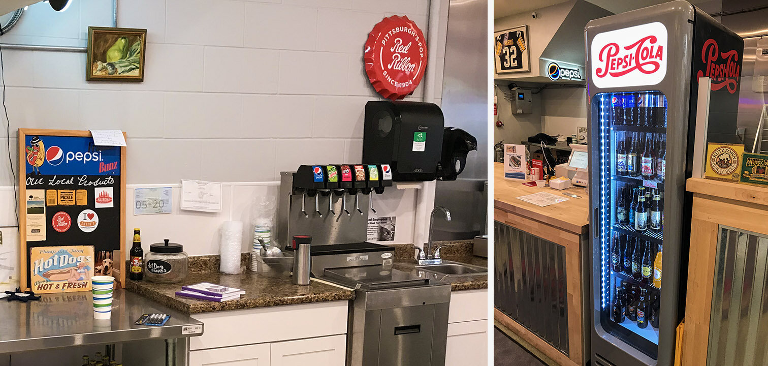
There are six fountain drinks (one cup size) and sixteen bottled drinks available. I won’t list them here; they offer Pepsi products, and you can see the options for yourself:

Drinks.jpg

Information Architecture

As you can see, there are many, many choices for customers to make. However, the choices have a logical flow and can be reduced to discrete categories with a linear progression.

A minimum of five choices must be made to complete an order.

A minimum of five choices must be made to complete an order.

Design For Service - Case Study

Case Study: Frankie Bunz, Pittsburgh, PA

I moved to Pittsburgh in August, 2019. Since moving here, I have eaten at only a handful of restaurants; Frankie Bunz (i.e., mobster-themed hot dogs) is easily one of my favorite local places to grab a bite. It is in Squirrel Hill, on Murray Avenue.

I have a weakness for anthropomorphic food.

I have a weakness for anthropomorphic food.

While this restaurant does offer some dine-in seating, it is primarily designed for grabbing food to go. In evaluating their services, I opted to dine in.

Customer Journey: Phase 1 - discovery

Customers are most likely to be attracted to this restaurant if they are on foot. The sidewalk immediately outside of Frankie Bunz advertises daily specials. There is a full menu in the window, as well as flyers promoting their most recently added items.

Their vegetarian chili (not pictured) is also quite good. Last week they were advertising egg rolls.

Their vegetarian chili (not pictured) is also quite good. Last week they were advertising egg rolls.

Customer Journey: Phase 2 - Entry

When you walk into Frankie Bunz, it immediately becomes clear that they do not have a large seating capacity, but they still provide an inviting atmosphere. Additionally, they provide a large banner-type version of their menu.

The interior is somewhat “cozy” and prioritizes a space for ordering and waiting over dine-in seating.

The interior is somewhat “cozy” and prioritizes a space for ordering and waiting over dine-in seating.

Customer Journey: Phase 3 - Ordering

I arrived for a late lunch (this first week of the semester has started out with many plates for me to spin, including this evaluation), and the only other customers were take-out or app-based delivery workers (e.g., Grubhub). The ordering and checkout process is reasonably frictionless. They use a touchscreen POS machine with contactless (Apple, Google, Samsung, etc.) and chip-reading capabilities.

Customers can either choose one of the standardized hotdogs, or build their own. The staff takes the order, unless the customer is ordering via a delivery app. Customers ordering a standardized hotdog (e.g., “Fredo’s Frank” or “The Don”) are still asked what kind of bun they’d like. Options include: wheat, white, pretzel, and onion roll. In addition to their buns, they also offer a tempura battered, fried dog on a stick (i.e., a “corndog” minus the cornmeal); they call it the “Mr Miyagi Doggie” and it includes an Asian Fusion slaw and special “dragon sauce.”

Customer Journey: Phase 4 - Payment

Despite the cluttered appearance of the equipment, the system works fairly well. On the left, there is a mobile phone that receives app-based orders, while the customer-facing touchscreen provides simple instructions to complete the transaction. The…

Despite the cluttered appearance of the equipment, the system works fairly well. On the left, there is a mobile phone that receives app-based orders, while the customer-facing touchscreen provides simple instructions to complete the transaction. The order information, prices, total, tip amount, and tax are easily presented without complexity.

The only substantial flaw with this setup is the counterintuitive chip-reader.

The icon on the lower right corner of the bezel doesn’t clarify the card orientation, so the owners added a post-it note, which adds to the confusion. Also: you cannot have my credit card number. 😘

The icon on the lower right corner of the bezel doesn’t clarify the card orientation, so the owners added a post-it note, which adds to the confusion. Also: you cannot have my credit card number. 😘

The arrow is pointing away from the slot, but this doesn’t necessarily clarify card orientation. The affordances of the device allow for both correct and incorrect insertion. In total, this card-reading device allows no less than eight card orientations and interactions (four in the card slot, and four in the slider), and only one of these actions is correct. To be generous, there is at least an 87.5% chance for error, even with written instructions. This is terrible design.

Despite this minor annoyance, the process is still supported by staff, and any errors can be quickly observed and corrected.

Customer Journey: Phase 5 - Fulfillment

Once the order is placed and the payment confirmed, customers have a brief waiting period while their meal is prepared. The open floor plan is reassuring, and promotes trustworthiness with customers: you can see your meal being prepared, and know that their kitchen is clean and safe.

There is nothing to hide. Even their supply room is open and visible.

There is nothing to hide. Even their supply room is open and visible.

While waiting for food, customers have a few options to occupy their time: there is a television, artwork, and a gender-neutral restroom.

By Executive Order, all hot dog artwork in the 21st century must be in 3D.

By Executive Order, all hot dog artwork in the 21st century must be in 3D.

Customer Journey: Phase 6 - Value

To extract value from the transaction, customers must receive and consume their food. I think this was worth the wait.

Order: one vegetarian hotdog on a pretzel bun, with onions, brown mustard and ketchup, and a side of shoestring fries.

Order: one vegetarian hotdog on a pretzel bun, with onions, brown mustard and ketchup, and a side of shoestring fries.

Visual Communication Fundamentals Project: Anti-Affordances Video

Feels like forever since I’ve updated my blog. I have been learning to use Cinema 4D to create realistic 3D animations - it has been quite an adventure. I’ll be backdate posting some content about my process, but for now, I wanted to get this uploaded:


Human Factors of Paqui's One Chip Challenge

This is an evaluation of human factors applied to a novelty food item: Paqui’s “One Chip Challenge.”

Consider these human factors:

Physical Factors

Packaging:

- Casket shaped box, with thumb-sized semicircular cutouts

- Single envelope, with tear-open notch for easy opening

Cognitive Factors

Graphics:

- Grim Reaper and red skull imagery to emphasize spicy content

- Interior and exterior text warn users of what to expect

Emotional Factors

Experience:

- The anticipation of something spicy

- Discomfort, pain, endorphins

- Relief and a sense of accomplishment