Prototyping for IxD - Case Study

Information Architecture: Frankie Bunz

Pittsburgh, PA

One other component worth considering in the context of the customer journey and user experience (see my previous post), is the Information Architecture of the food menu. Let’s take another look at the menu:

There are a total of three menus at Frankie Bunz: one in the window, one on the ordering counter, and a handwritten banner inside the restaurant.

There are a total of three menus at Frankie Bunz: one in the window, one on the ordering counter, and a handwritten banner inside the restaurant.

The Food

There are eight standardized options:

The Frankie Bunz

The Don

The Hyman Roth

The Fredo’s Frank

The Sonny Special

The Henry Hill

The Mr. Miyagi Doggie

The Grateful Dog

The Chairman of the Dog

Customers choosing a standard dog still have the option to add additional toppings (more about this later), and must choose from one of four bun types*:

White

Wheat

Pretzel

Onion

*The only exception is the “Mr. Miyagi Doggie” which is an Asian Fusion spin on the classic corndog - featuring a tempura batter and side of slaw with special “dragon sauce.”

There is also an option to “B.Y.O.D” (Build Your Own Dog) with six dog options:

Smith’s Natural Skin Casing Hot Dog

Jubilee Farms All Beef Hot Dog

Hebrew National

Spicy Beef Dog

Turkey Dog

Veggie Dog

Toppings

There are two categories of toppings*:

“Frankie’s Fresh”

Premium

*The premium incurs a $1 charge per selection.

There are eleven “Frankie’s Fresh” toppings:

Ketchup

Mustard (Yellow, Dark, and Honey)

Siracha Mayo

Fresh Sauerkraut

Pickles

Onions (sweet vidalia)

Hot Peppers

Relish (sweet and dill)

And there are seven Premium toppings:

Chili Sauce

Bacon (candied)

Avocado

American cheese

Shredded, aged cheddar

Swiss

Pepper Jack

Sandwiches

If hot dogs are not your thing, they also offer large sides as well as grilled cheese sandwiches.

Grilled cheese sandwiches offer three options for bread:

White

Wheat

Sourdough

and four options for cheese*:

American

Swiss

Aged Cheddar

Pepper Jack

*Customers may select any combination, up to and including all four on the same sandwich

Customers may add any of the fourteen (fresh and premium) toppings offered for hotdogs to their grilled cheese (see above).*

*Customers can also add any choice of the six dogs (see above) for $2

There are also five standardized grilled cheese (with choice of bread), offered as a “daily special” Monday through Friday.

Sides

The only side offered are their fries.

There are four options to select from:

Regular

With melted cheese

“Da Woiks” (i.e., chili cheese fries with bacon)

"Poutini” (i.e., cheese curds, house gravy, and scallions)

Drinks

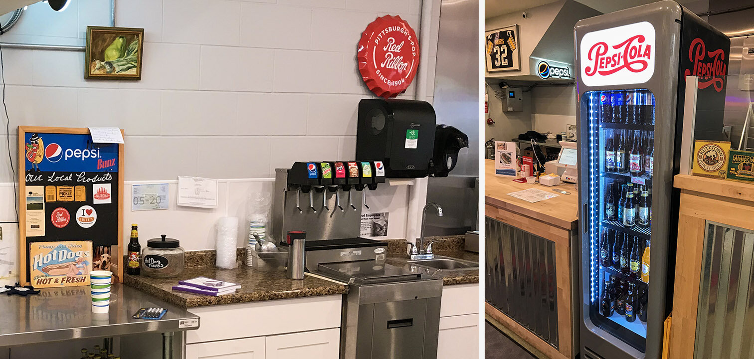
There are six fountain drinks (one cup size) and sixteen bottled drinks available. I won’t list them here; they offer Pepsi products, and you can see the options for yourself:

Drinks.jpg

Information Architecture

As you can see, there are many, many choices for customers to make. However, the choices have a logical flow and can be reduced to discrete categories with a linear progression.

A minimum of five choices must be made to complete an order.

A minimum of five choices must be made to complete an order.
Design For Service - Case Study

Case Study: Frankie Bunz, Pittsburgh, PA

I moved to Pittsburgh in August, 2019. Since moving here, I have eaten at only a handful of restaurants; Frankie Bunz (i.e., mobster-themed hot dogs) is easily one of my favorite local places to grab a bite. It is in Squirrel Hill, on Murray Avenue.

I have a weakness for anthropomorphic food.

I have a weakness for anthropomorphic food.

While this restaurant does offer some dine-in seating, it is primarily designed for grabbing food to go. In evaluating their services, I opted to dine in.

Customer Journey: Phase 1 - discovery

Customers are most likely to be attracted to this restaurant if they are on foot. The sidewalk immediately outside of Frankie Bunz advertises daily specials. There is a full menu in the window, as well as flyers promoting their most recently added items.

Their vegetarian chili (not pictured) is also quite good. Last week they were advertising egg rolls.

Their vegetarian chili (not pictured) is also quite good. Last week they were advertising egg rolls.

Customer Journey: Phase 2 - Entry

When you walk into Frankie Bunz, it immediately becomes clear that they do not have a large seating capacity, but they still provide an inviting atmosphere. Additionally, they provide a large banner-type version of their menu.

The interior is somewhat “cozy” and prioritizes a space for ordering and waiting over dine-in seating.

The interior is somewhat “cozy” and prioritizes a space for ordering and waiting over dine-in seating.

Customer Journey: Phase 3 - Ordering

I arrived for a late lunch (this first week of the semester has started out with many plates for me to spin, including this evaluation), and the only other customers were take-out or app-based delivery workers (e.g., Grubhub). The ordering and checkout process is reasonably frictionless. They use a touchscreen POS machine with contactless (Apple, Google, Samsung, etc.) and chip-reading capabilities.

Customers can either choose one of the standardized hotdogs, or build their own. The staff takes the order, unless the customer is ordering via a delivery app. Customers ordering a standardized hotdog (e.g., “Fredo’s Frank” or “The Don”) are still asked what kind of bun they’d like. Options include: wheat, white, pretzel, and onion roll. In addition to their buns, they also offer a tempura battered, fried dog on a stick (i.e., a “corndog” minus the cornmeal); they call it the “Mr Miyagi Doggie” and it includes an Asian Fusion slaw and special “dragon sauce.”

Customer Journey: Phase 4 - Payment

Despite the cluttered appearance of the equipment, the system works fairly well. On the left, there is a mobile phone that receives app-based orders, while the customer-facing touchscreen provides simple instructions to complete the transaction. The…

Despite the cluttered appearance of the equipment, the system works fairly well. On the left, there is a mobile phone that receives app-based orders, while the customer-facing touchscreen provides simple instructions to complete the transaction. The order information, prices, total, tip amount, and tax are easily presented without complexity.

The only substantial flaw with this setup is the counterintuitive chip-reader.

The icon on the lower right corner of the bezel doesn’t clarify the card orientation, so the owners added a post-it note, which adds to the confusion. Also: you cannot have my credit card number. 😘

The icon on the lower right corner of the bezel doesn’t clarify the card orientation, so the owners added a post-it note, which adds to the confusion. Also: you cannot have my credit card number. 😘

The arrow is pointing away from the slot, but this doesn’t necessarily clarify card orientation. The affordances of the device allow for both correct and incorrect insertion. In total, this card-reading device allows no less than eight card orientations and interactions (four in the card slot, and four in the slider), and only one of these actions is correct. To be generous, there is at least an 87.5% chance for error, even with written instructions. This is terrible design.

Despite this minor annoyance, the process is still supported by staff, and any errors can be quickly observed and corrected.

Customer Journey: Phase 5 - Fulfillment

Once the order is placed and the payment confirmed, customers have a brief waiting period while their meal is prepared. The open floor plan is reassuring, and promotes trustworthiness with customers: you can see your meal being prepared, and know that their kitchen is clean and safe.

There is nothing to hide. Even their supply room is open and visible.

There is nothing to hide. Even their supply room is open and visible.

While waiting for food, customers have a few options to occupy their time: there is a television, artwork, and a gender-neutral restroom.

By Executive Order, all hot dog artwork in the 21st century must be in 3D.

By Executive Order, all hot dog artwork in the 21st century must be in 3D.

Customer Journey: Phase 6 - Value

To extract value from the transaction, customers must receive and consume their food. I think this was worth the wait.

Order: one vegetarian hotdog on a pretzel bun, with onions, brown mustard and ketchup, and a side of shoestring fries.

Order: one vegetarian hotdog on a pretzel bun, with onions, brown mustard and ketchup, and a side of shoestring fries.