Notes on "Wicked Problems in Design Thinking" by Richard Buchanan

The concept of capital-D Design is amorphous and continues to expand in scope, from specialized trades (Graphic Design, Industrial Design), to a generalized “liberal art of technological culture” (page 5).

The author describes this strange journey from silos of specialization to a generalized approach of research in the 20th century.

To quote John Dewey (The Quest for Certainty) :

The key takeaway from the Dewey’s block quotes seems to suggest that Science, art, and technology’s interactions in the 20th century transformed from a method for gaining knowledge through proscribed process, to one of gradual expansion of knowledge through incremental, evolutionary precision. This is achieved by planned set of linear operations. But what remains poorly understood is the relationships between art, technology, and science as a set of specialized knowledge. Science is a product of a process, and is easily mistaken for truth, rather than the outcome of process.

There is too much reverence for this process, and when this “recipe” is applied to technology, we run the hazard of advancing (through technology) inferior solutions to human problems (e.g., making a better mousetrap is given precedent over improving our understanding of rodents and what attracts them). Dewey describes this “circular relationship (page 7) between arts of production and science.”

“Instead of meaning knowledge of how to make and use artifacts or the artifacts themselves, technology for Dewey is an art of experimental thinking” The author suggestions (page 8) that technology can be produced through science, but that art (liberal art context), “lies behind and provides the basis for creating other types of products.”

Observations:

From last week’s reading, the author described Edison’s experimentation through iteration is slow and sloppy. It does not follow the same set of steps typically found in the scientific method. But it is another approach to development of technology.

In the syllabus, Jonathan Chapman described design as, “the process of turning existing situations into preferred ones.” This is a quote by Herbert Simon. Herbert Simon is mentioned (On page 9), and his text is quoted from The Science of the Artificial.

The proper study of mankind is the science of design, not only as the professional component of a technical education but as a core discipline for every liberally educated man.”

Design as a multidisciplinary practice can be categorized in four different ways (page 9):

  • Symbolic and visual communication (graphic design)

  • Material objects (product/industrial design)

  • Activities and organized services (Interaction Design/UX)

  • Complex systems or environments for living, working, playing (urban/city planning, architecture, sustainability, etc.)

The author then explains how these discrete categories could not remain compartmentalized, and quickly expanded, overlapped, and evolved into other fields (architecture is a good example).

The author suggests that this pattern grew beyond categories, and into a set of placements.

Placements are constrained, but can exist within different circumstances (contexts).

Categories lock the ways we think about problems, and limit us to thinking in those older (and possibly outdated) paradigms. Placement allows for novel approaches to existing problems, outside of their original contexts.

The author assert (on page 13), that placements are primary, and categories are secondary. Scientists and designers often struggle to communicate within a meaningful framework, because designers rarely work within the boundaries of any one discipline - scientists are typically specialized to specific fields (page 14).

From page 15: it is tempting to divide design thinking into two steps: problem definition, problem solution. This suggests a linear process (which is clearly not true). The author also makes their first mention of “wicked problems.” And on page 16 the author suggests that designers often are confronted with “wicked problems” because design is a universal field, related to all human experience.


Weekend update

Went to the Carnegie Museum of Art this weekend to see their exhibit on Accessibility. This sparked a lot of new ideas about how to focus on solving human problems through empathy. The variety of solutions was truly impressive (concerts for the deaf, eating utensils, mobility assistance and augmentation, navigation technology for the visually impaired, and so much more!)

Just like eyewear has become a personal accessory, prosthetic limbs can also be made fashionable.

Just like eyewear has become a personal accessory, prosthetic limbs can also be made fashionable.

Opportunities for selfies cannot be dismissed.

Opportunities for selfies cannot be dismissed.

Why putting on the brakes is not enough

Pittsburgh Public.jpeg

Jack Dorsey, CEO of Twitter, knows his platform allows for bad craziness to spread like cancer, but fuck it! He’s still getting rich. Who cares if his platform amplified the worst voices in this country, and did so at the shared expense of everyone else? Right? Anyone who still works for Twitter should seriously reconsider what they are doing with their lives. Imagine getting paid to provide Nazis a global megaphone. How do you sleep at night, @Jack?

Thoughts on Ruined by Design, by Mike Monteiro:


I’ve finished reading Mike Monteiro’s book, Ruined By Design, and his message is clear: “as designers, we need to think of ourselves as gatekeepers.” This means we must refuse to put harmful designs (in any form) into the world. He uses the analogy of the Hippocratic Oath, and a doctor’s pledge to “first, do no harm,” and argues for designers to adopt a code of ethics.

I can hardly disagree with the notion that designers, like many other professions, ought to operate under a set of values. But is this enough? No. It is not enough to *not* do unethical design. It’s a good start, but it is not enough. For every harmful act, for every data breach, for every easily preventable hack, for every racist and hateful Tweet, for every man-made environmental catastrophe, and for every preventable tragedy brought upon us in the name of “innovative technology” and “disruption,” there is another mile we all travel on this dark highway. Refusing to do something harmful is a neutral act, and ought to be perceived as part of a neutral position. If you are someone who remains “neutral” on climate change, staggering wealth inequality, or the very real threats of fascism and white nationalism, then you’re not really part of the solution - you’re just a speed bump.

We need to reverse this, and Mike Monteiro is passionately calling for us to start by putting on the brakes. It’s not enough, but it is an essential first step. What we desperately need is positive change. We are going down this road at the speed of internal, infernal combustion. We are going faster than hot chrome and sweaty sex. Running in the red.

Almost everyone (aside from a handful of oligarchs and their Fox News sycophants) agrees that we should (at the very least) slow down. And if you suggest we stop, do you know how you will be labeled? You will be called a “far-left radical.” As if wanting every hard working family in this country to live with some basic level of dignity is a communist plot! As if wanting Twitter and the rest of Silicon Valley to actually be held responsible for what they put out into the world is “too liberal” or “too PC.” Well, call me liberal, but I cannot see the value in letting racist assholes have a platform to make terroristic threats against hospitals. Seriously: Fuck you, Jack Dorsey.

Why are these matters controversial at all? Maybe it is because the only thing more grotesque than this horrify status quo is: ourselves. We have been ignoring hard truths for such a long time that we often fail to see how far off we have wandered. It’s after midnight. The road is dark. The engine is running in the red. Why? From wealth inequality, to endless wars, to climate change, we live in a world where crisis is the status quo. Why?

(?)

What the author correctly identified is that this is because it is designed that way. We can’t fix this by simply refusing to go further down this road; we need to actively work against the designs that lead to ruin. We need to take the wheel. And if we crash, we need to pile up the debris and preserve only that which functions as a warning sign: to tell future generations not to go down that same path ever again. I’ll let Mike have the last word on this.

If we want positive search results, we should do positive things. If we want to reassure the users of our products that they can trust us, we should do positive things. There’s a reason I wrote these last three chapters in this order. Community breeds standards; standards breed accountability; accountability breeds trust; licensure validates that trust. It’s a journey. It may be a long journey, but that doesn’t mean it’s not worth taking.

Do positive things.

Monteiro, Mike. Ruined by Design: How Designers Destroyed the World, and What We Can Do to Fix It (p. 206). Mule Books.

Designese

Today’s quote: Лучших сосок не было и нет, готов сосать до старых лет. Продаются везде. Резинотрест.

I am still not certain what observations are valuable to record during this graduate program. What I am certain of, is that I will be learning a lot of new languages: the language of typography, CSS, HTML, Python, graphics, and the countless jargon of the Design community. I think I’ll call this strange new collection of languages “Designese.” It is the combined means by which designers communicate their ideas, and inject them into the world.

The morning class (Design Principles and Practices) was interesting. We began with an exercise where we abstracted our backgrounds by improvising with given materials and the classroom space itself.

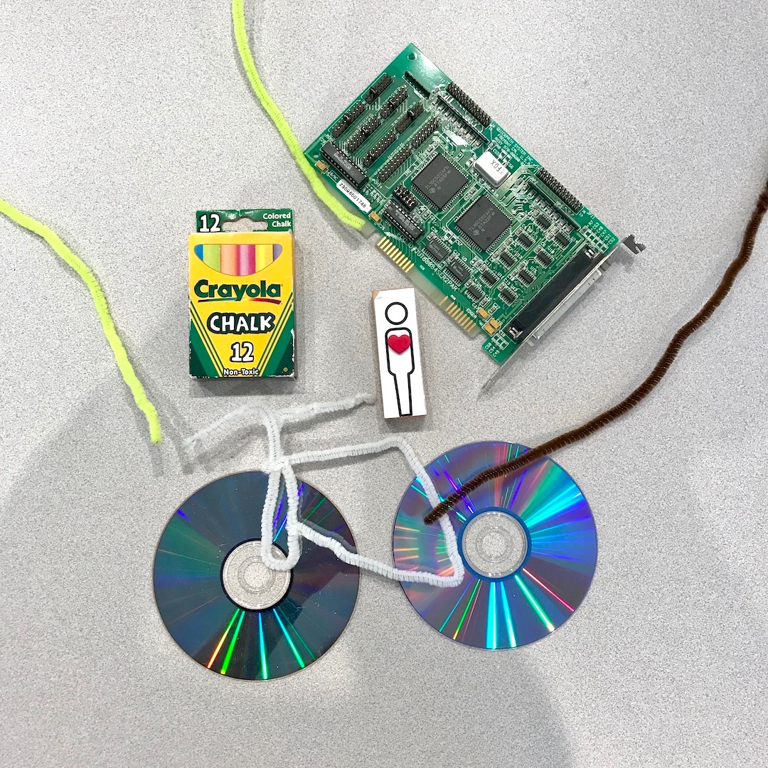
I chose to represent myself with attributes of Portland’s bicycle culture, my love of Laserdisc movies, my career in electronics, and my fine arts education.

I chose to represent myself with attributes of Portland’s bicycle culture, my love of Laserdisc movies, my career in electronics, and my fine arts education.

The center represents CMU, and each student worked to recreate elements of their journey to this graduate program. Whiteboards contain written facts about the cohort and their connections to the field of design (right), and our pictographic expressi…

The center represents CMU, and each student worked to recreate elements of their journey to this graduate program. Whiteboards contain written facts about the cohort and their connections to the field of design (right), and our pictographic expression of the core principles of design (left).

It was a bit of a mess in the beginning, but eventually this random pile of madness transformed into a visual representation and collaborative sculpture of readymade objects. Bruce Hanington took two pages of observation notes during this exercise. This was quite an icebreaker, and I generally feel very good about collaborating in the future with this group.

Over lunch I discussed a few of my on-boarding concerns with Ema. I value Ema’s insights and experience as a grad student. It was Ema and Michelle who took me on a brief tour back in the spring (when I was waiting for the admissions decision). I wanted to know if I ought to be concerned by the lack of clear course outline. The syllabus makes the expectations clear, but are still relatively vague and lacking the kinds of specifics I am accustomed to. Generally speaking, I am used to more structure (my time in the military, working at Intel, and undergraduate studies were loaded with constraints and granular, rigid scheduling). This is new for me, but I also expect that this will lead to greater autonomy in a future career - we’re receiving lots of support, but are also expected to work independently, with very open-ended criteria and high standards for deliverables. It is a continual source of comfort to know that these are the people I will face these challenges with.

In the afternoon I had my first session with Andrew Twigg. He will be teaching two of our courses this semester. For introductions, we were spared having to repeat our backgrounds. Instead, Andrew only asked for our names, where we’re coming from, and our favorite food. I chose rice, because “Rice is great if you're really hungry and want to eat two thousand of something” (R.I.P. Mitch Hedberg). After reviewing the syllabus, we had our first lecture on the topic of typography. This included two slide presentations with a brief history on the development of written communication, from cave paintings to the fonts commissioned by billion dollar internationals in the 21st century. This included an almost anatomical dive into the creation of a modern font, what they are made of, and the names of their parts. We also explored the contextual relationship between size, shape, and arrangement of text. There was a lot terminology that is still foreign to me, but I believe I’ll be able to absorb these new concepts as we begin to play with (and act upon) these various components.

One of the slides was a soviet era advertisement for galoshes (at least, that’s what I could glean from a thread on mail.ru). The rough translation: “There were not, and are not better nipples, ready to suck through the old years. Sold everywhere: Reznotrest.” The word “сосать” (i.e.,“suck”) is a verb with similarly vulgar dual meaning to its English counterpart. I’m not sure if this was true when the image was originally constructed. It is probably not important or worthwhile to read into it that too much.

1762003319.jpg

My first deliverable is due this Thursday: 32 layout thumbnails and eight prints (on tabloid, 17 x 11 inch sheets) with font constraints on preselected text. How we arrange it will be up to us to decide, but should demonstrate Design Thinking and execution of enhanced visual communication matching to the context.

Gummi Bears

I’m spread pretty thin between projects, but wanted to post some new renderings. One of the benefits of Fusion 360 is the materials customization built into their rendering pipeline. And I think this project does a good job of highlighting this feature.

I’m kicking myself for not rendering at a higher resolution, but this lighting test did a fantastic job of demonstrating refraction with a slightly rough surface.

I’m kicking myself for not rendering at a higher resolution, but this lighting test did a fantastic job of demonstrating refraction with a slightly rough surface.

While the angle and lighting are more traditional (i.e., less creative) for a rendering shot, I’m including it because of the shadows and light transmittance between materials. This is the kind of thing that only looks convincing with ray tracing. R…

While the angle and lighting are more traditional (i.e., less creative) for a rendering shot, I’m including it because of the shadows and light transmittance between materials. This is the kind of thing that only looks convincing with ray tracing. Raster engines cannot accurately simulate light passing and reflecting off of materials like this.

I have a render running in the cloud right now for a scene with roughly 250 of these gummies piled on top of one another. With so many surfaces and ray transformations and generations coming from such a complex model, I cannot render it to useable resolutions locally. You can see the rest of my renderings and download the models for yourself on GrabCad.

Mac Mini 2018 in Fusion 360

This month cruised by fast. I have been spending the bulk of my time in Fusion 360, both for class projects, as well as personal exploration of the software. Here are some recent renderings:

Apple updated the Mac Mini last month, adding an optional 6-core Intel Coffee Lake (Core i7 8700B) processor configuration, Thunderbolt 3 (USB Type C interface), and a “Space Gray” makeover. using photos from Apple’s product page, I reconstructed th…

Apple updated the Mac Mini last month, adding an optional 6-core Intel Coffee Lake (Core i7 8700B) processor configuration, Thunderbolt 3 (USB Type C interface), and a “Space Gray” makeover. using photos from Apple’s product page, I reconstructed the IO layout and customized material and appearance settings. You can download my model here.

Opposite angle, to show off that sweet white LED!

Opposite angle, to show off that sweet white LED!

For anyone getting into CAD, I also recommend GrabCAD.com, where you can download (and contribute) 3D models for free! I was able to accelerate my workflow by downloading prebuilt models of the ethernet, USB, and HDMI ports.

A Robot Took Your Job

Last week I returned from my trip to Memphis (thanks, Andy! Hope Meara’s potty training is going well!) and I’ve been playing catchup ever since. I’m getting back into Fusion 360 with some more challenging projects. This week we covered how to use joints in assemblies. This is pretty wild stuff. You can download models from GrabCAD.com and upload them Fusion 360. It auto-magically converts models to work natively (with mixed results) in the work space. From there, you can define joints and move parts in real time! We did this in class using an industrial robot model. Of course, this meant the robots needed to fight…

Four robots go in, four robots come out. Because they are metal, and very strong, and even knives won’t kill them!!

Four robots go in, four robots come out. Because they are metal, and very strong, and even knives won’t kill them!!

This wasn’t the actual assignment. Instead we needed to create a render scene involving an earlier model from this class being assembled by robots. I was grinding away at this all day yesterday, and finally got around to rendering it. Because of the complexity of the scene, it’s taking quite some time to bake in all of those rays at HD+ resolution. Here’s the object being assembled for reference:

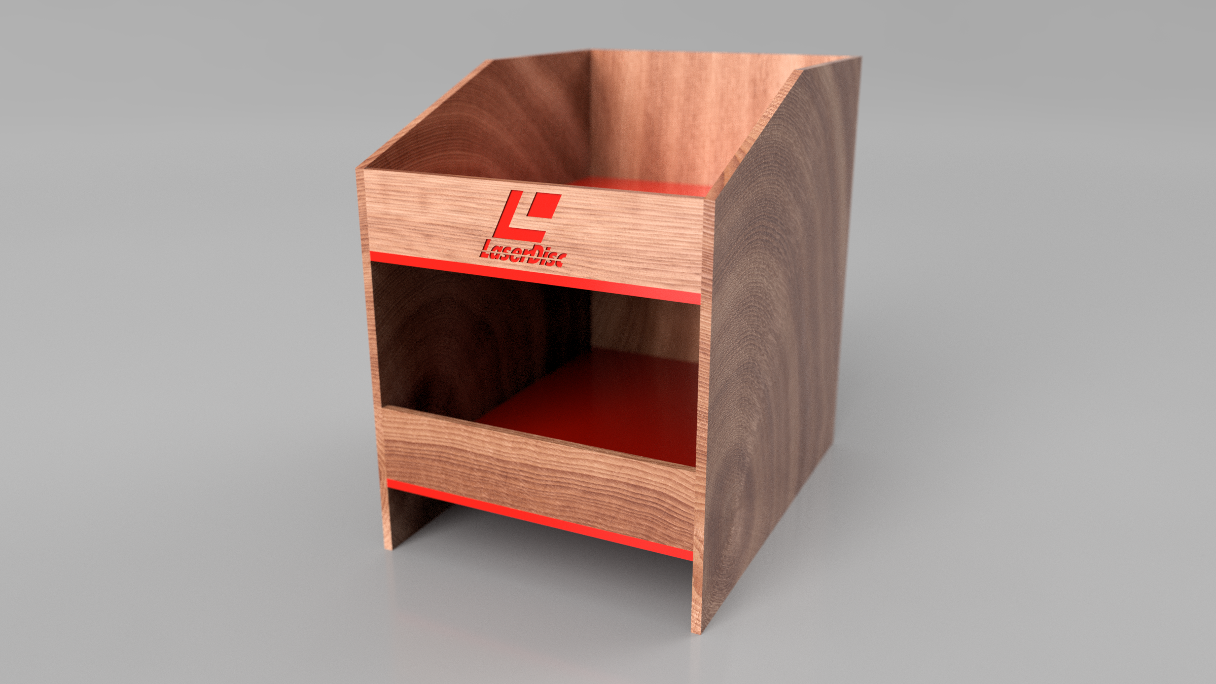
This is based on an existing design from a vinyl shelf I bought to keep my Laserdisc collection in prime display condition. I fantasized about having an actual product made for Laserdisc, and what that might look like. You gotta with red trim right?…

This is based on an existing design from a vinyl shelf I bought to keep my Laserdisc collection in prime display condition. I fantasized about having an actual product made for Laserdisc, and what that might look like. You gotta with red trim right? Because LASERS!!

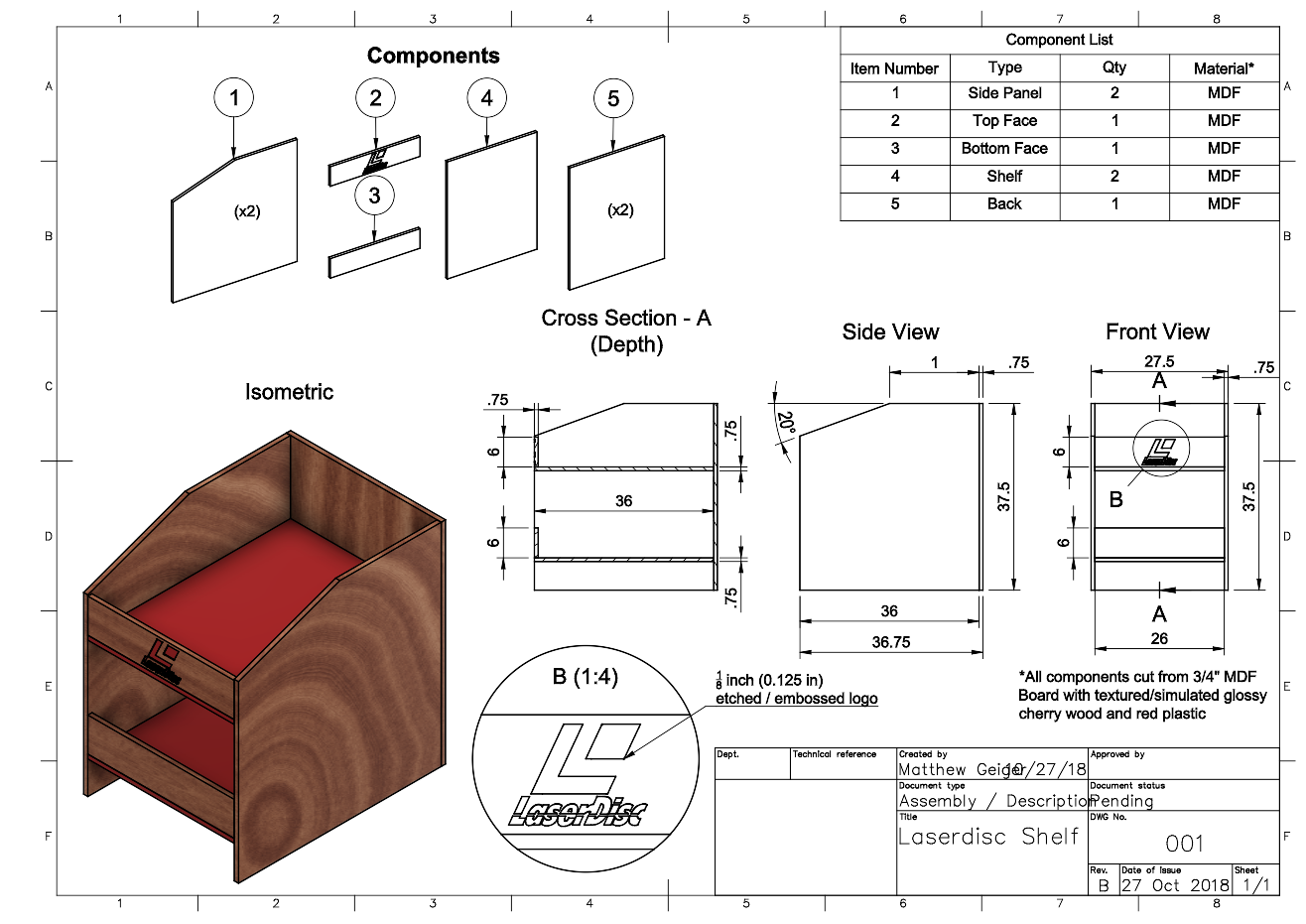
Here’s a technical drawing, if you want to build your own. This will probably hold about 250 titles, based on my experience with my current shelf ( tweaked the dimensions to give it a bit more depth and room to breathe between stacks.

Here’s a technical drawing, if you want to build your own. This will probably hold about 250 titles, based on my experience with my current shelf ( tweaked the dimensions to give it a bit more depth and room to breathe between stacks.

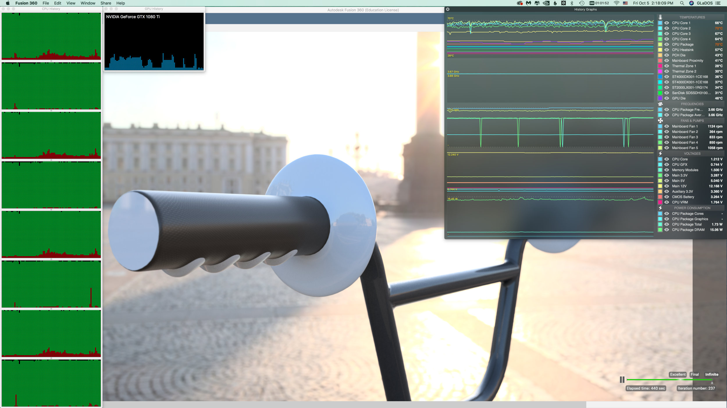
i’ve been taking this class as an opportunity to not only learn the software, but also to push the limits of what the software can do. For me, this practice is like cartography. I’m mapping the borders by extending to the edge in all things. With this project, I wanted to not only torture test the rendering pipeline, but also test the limits of my beefy Hackintosh. As noted previously, my CPU appears to be the main bottleneck. But I wanted to see what it takes to exceed memory requirements. For this design and ray tracing session I’m utilizing ~25 GB of memory, and cooking my poor little quad-core Haswell® chip.

Nothing cooks like CAD! Note that the temperatures reflect a system with AIO liquid cooled CPU, and nine total fans, packed into an old PowerMac G4 case. Even when protein folding on both GPU and CPU, the system usually has a CPU core temperature ce…

Nothing cooks like CAD! Note that the temperatures reflect a system with AIO liquid cooled CPU, and nine total fans, packed into an old PowerMac G4 case. Even when protein folding on both GPU and CPU, the system usually has a CPU core temperature ceiling of about 70˚ C.

It’s been over four hours as of writing this, and the rendering has not yet reached “final” quality. Scene complexity is a huge factor in rendering time.

Dead Star Escape Playtests at XOXOFest 2018

XOXOFest gave me an opportunity to conduct some playtests for DEAD STAR ESCAPE! It’s a four-player tabletop, where space pirates try to escape from a black hole! I got some excellent feedback on this project and still have a lot of work ahead of me, but it was really exciting to see a game play through from start to finish with new players. The play mechanics and rules are ironed out, but I still need to update the prototype and enhance some layout and other misc. concerns.

DSE.jpeg
DSE2.jpeg

XOXOFest 2018!

I had suuuuch a blast at my first XOXOFest! Swag was great - tokens for drinks at an extraterrestrial speakeasy, interactive installations, projects for future selves, morning fun runs, VR and AR demos at Mozilla, Adobe Creative Jam, FANTASTIC SPEAKERS (Cameron Esposito, Monica Dinculescu, Natalie Wynn, John Hodgman, Jean Grae, and more!), Indie Games Arcade and tabletop games blew my mind!

Don’t hate me for my swag, hate me for my awesome Ziggy Stardust shirt!

Don’t hate me for my swag, hate me for my awesome Ziggy Stardust shirt!

Taking seats before the opening

Taking seats before the opening

Those user agreements (we don’t read), and how they stack up

Those user agreements (we don’t read), and how they stack up

One of the proudest moments… Nude Burt Reynolds projected onto a huge screen

One of the proudest moments… Nude Burt Reynolds projected onto a huge screen

Sometimes it just has to be said

Sometimes it just has to be said

Adam Conover talks about why we should Preach to the Choir

Adam Conover talks about why we should Preach to the Choir

Augmented

Augmented

The best win state I have ever seen in a game - a tasty cocktail

The best win state I have ever seen in a game - a tasty cocktail

New Content!

I've added new work under the Sculpture section of my Art + Design page. It was a bittersweet experience to work at the metal shop in Neuberger Hall. We were the final Jewelry/Metalsmithing class for the foreseeable future. These facilities are now closed, and will soon be torn down. Big shout-out to everyone in the class: so many awesome pieces were made, and I was truly humbled by the innovation and creativity these folks applied to every project. Specific mention: Professor Gunnar Adamovics, who was always there for help, advice, tools, materials, general assistance, tutorials, and more. Also, kudos to the fine folks at Free Geek Portland, they provided me with extra cheap silicon (Core2Duo® CPUs for FIVE FRICKIN' DOLLARS!!!!!!? WHAAAT?). I went with a humble Pentium 4® in the end.

PHOTOSHOP CALISTHENICS

Reference can be found here.

“1) Use the selection tools + refine edge to isolate objects from the Culture Catalogue image, then copy and paste them into a New Document, so that each is on a new layer.  Rename the layers, save as: lastname-isolated-objects.psd”

Click here to download a copy.

“2) Use Retouch and Repair tools to modify radically alter the castle while maintaining a ‘realist’ aesthetic.  Save as lastname-weird-castle.psd

geiger_weird-castle.png

Click here to download a copy.

“3) Recombine objects from the Culture Catalogue within the Castle image, using refine-edge to integrate the objects more seamlessly.  Save as lastname-weird-castle-2.psd”

geiger_weird-castle-v2.png

PHOTOSHOP INTRODUCTION

Week 3 – Day 2

Photoshop tutorial 

First, make sure you change three defaults:

Auto-select/Layers/Show Transform Controls 

SELECTION TOOLS

Marquee//Lasso//Wand

screen-shot-2016-04-13-at-6-16-52-pm1.png

Modify Selections by holding down SHIFT to add to a selection or Option to subtract from a selection.

Note: By default, when copy/pasting, it is added to a new layer

Checkerboard pattern indicates a transparent background

When selecting an object on a white background, you may get a white edge.

Use Refine Edge:

Option under selection tool.

Brush based retouch and repair tools

            Healing Brush

            Patch Tool

            Content-Aware

I started with this image:

Source: Flickr User – “tickr”

Source: Flickr User – “tickr”

I then decided it was time to “patch” this castle to its former glory…

I expanded the vertical dimensions by more than 400%, and then proceeded to “build” more layers of bricks, up into the sky. I used the lens distortion tools to create an illusion of perspective. Finally, I decided to add a “window” by cloning and inverting one of the smaller doors. Overall, I am pleased with how convincing this image is, but there are a few “bugs” in the picture (redundant, duplicate patterns) that detract from the overall realism. Still, I think I’ve done a better job than North Korea, and their use of Photoshop.

We miss you, Jon.

We miss you, Jon.

Source: The Guardian

Source: The Guardian


PROJECT-1: WEEKEND UPDATE

I’ve taken the criticisms into careful consideration, and here are the latest image updates:

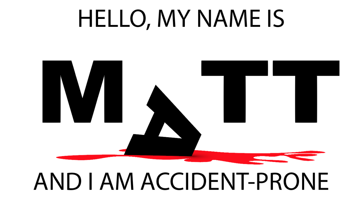
I spent a lot of time figuring out how to use perspective to give the blood spatter a solid “floor,” but the letters felt too flat against that perspective surface. Carl had some input on this, and the end solution was to include a 3D Extrude stylization filter to give depth and dimension to the letter “A”. There is a nice contrast with the flat letters in the background, and a slightly more gray value is applied to the background letters to emphasize this.The blood was given more detail by using the Wrinkle Tool. Overall, this is a pleasing change and I’m much happier with the results than earlier versions.

hat kind of magician would I be without a rabbit? The peer critique included an earlier, rougher version of this critter, but I’ve refined it to a point where it is a welcome distraction and not just a proof of concept. The sparse grayscale image really Pops thanks to the included red bowtie. This was created as a series of shape (Rectangle Tool) and a thicker brush setting for the outline. A heavy use of Gradient was applied to multiple Layers of the top-hat to give it a more three-dimensional appearance. Abracadabra!

The lion’s share of time went into this third image. Carl had an interesting suggestion to give the background a crumpled paper appearance. I scoured the web for a few options on how to do this. One suggested using a gradient tool in Photoshop and importing that image into Illustrator like so:

This wasn’t a bad approach, but it didn’t really “look right” in Illustrator. The better solution I found came from a multistep approach involving actual crumpled paper (Read here). I started by crumpling a folded piece of paper, and then scanning a highDPI image of it and saving the PNG for use in Illustrator. I then used the Image Trace tool to assign shapes their corresponding values (4 shades of gray). The end effect was more convincing because it was derived from the genuine object. Next, I created improved letter “clippings” for the ransom note stylization by choosing a variety of fonts and color combinations, grouped with rectangles that were altered using Transform to give them a more natural appearance.

The final steps involved creating a severed finger – because just one pool of blood in a project is never enough. I started with the Rectangle tool and created two segments, for the third segment (the fingertip), I used a pair of Ellipse tool shapes (fingertip and fingernail), which I altered with the Pen Tool. I then used a gradient fill to give the nail some depth, but struggled to find a gradient to give the finger segments an illusion of depth. I decided to hold off on that detail and used a regular color fill from the Skin Tone Library (color swatch). I then rotated the segments to give the finger a more curled appearance, and the Pen Tool to create the creases in the skin.

Solution for creating depth: I layered four stacks of cloned finger (object groups) on top of one another and then used the Eraser to create a gradation of shadows (Stylization and Drop Shadow)to create a rounder appearance. The end effect is consistently cartoonish with the rest of the image.

Finally, I created a “blood soaked paper” effect by changing the fill color of the surrounding Image Trace generated shapes and the Wrinkle Tool to give it a more distressed appearance. The one effect I want but haven’t been able to figure out is how to “crinkle” the ransom note letters themselves. They feel a bit too flat, and out of place, but after a few failed attempts with the Knife Tool to create segments I’ve decided to error on the side of caution. If I come up with a solution by Monday, I’ll be sure to update the results here.


PROJECT 1 UPDATE

Minimal Realism:

” When I look at a wildlife or nature subject, I don’t see the feathers in the wings, I just count the wings. I see exciting shapes, color combinations, patterns, textures…”

Illustrator Demo

Type Text “CARL”

Object -> Make Outline

DON’T FORGET TO: Ungroup Text

Knife Tool -> Cut “waves” through the text.

Color the top half “Fill” Brown

Color the bottom half “Fill” Blue

Brush Pallet (icon looks like books on a shelf (i.e., library))

            Using the brush tool change the outline of the letters to give a more “watery” look. Change stroke size to amplify effect.

Texture Pallet

            Just like the brush library, you can fill an object with a variety of textures.

Command: Paste in place

This creates a copy of an object directly on top of the original; useful because you do not need to align the new object.

How to make triangles:

Use the Polygon tool, and then rightclick for a menu to select “sides”, change to: 3


Create object from center:

Hold down the option key

How to create “Distressing” shapes

Use the “Warp Tools”. The Icon looks somewhat like a tulip.


PNG Export: (For blog)

            Use Artboard

            300 DPI (High)

Background color: White

Critique Notes:

As of Wednesday evening this was the status of my three images:

My peers had some excellent suggestions.

Image one (accident-prone), is too flat. Consider moving the other letters of the text “back” into the image to create more depth

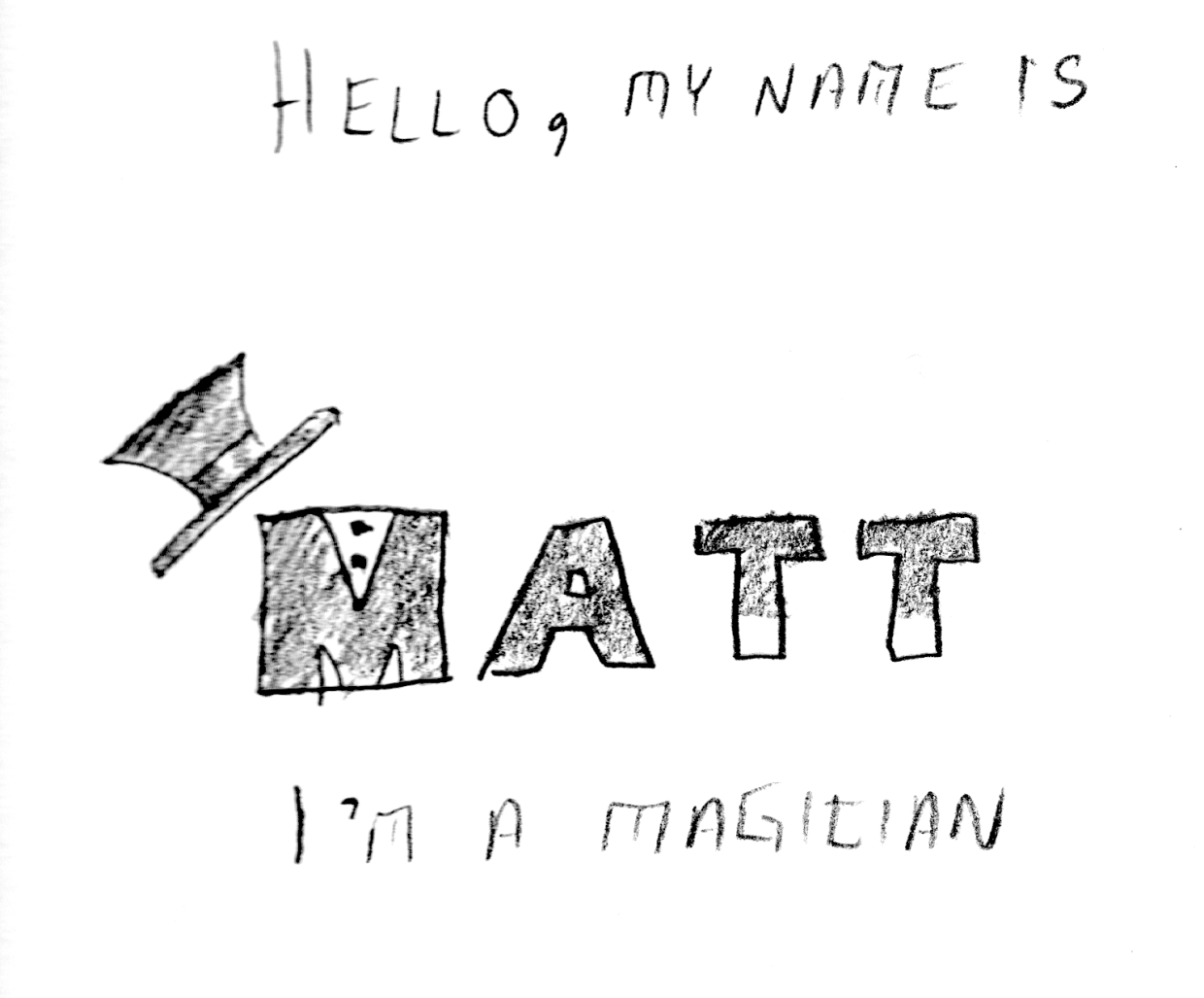
Image two (magician), needs more color. Black and white images are less interesting in this context, and more stylization of the letters would really help. Just as adding a gradient to the “wand tips” gave greater depth, consider adding more depth to this image as well.

Image three (hostage). This is an early start, and needs more work. Particularly, the texture on the letter “A” isn’t working well. The concept is interesting, but more details will make this a successful piece.

PROJECT 1: TYPOGRAPHIC PORTRAIT

The first day of the week and we’ve hit the ground running on this first project. It’s almost the end of class and I’m just now getting to the 2nd (of three) portraits. I asked for help on my first iteration, because it seemed like something was missing. I had followed the basic draft pretty closely, but it felt bare and uninteresting.

After talking with the professor, it was clear that I needed to express a greater range of tools. This was my second iteration:

Better, but not great. I added an organic shape and used the gradient tool to create a shadow effect. Still, the image felt a little too flat. One more tweak:

This simple vertical offset creates a bit more motion and surprise. I’m not sure what more I could add or subtract at this point. On to my second portrait…

In order to create a three-dimensional “floor” I used the perspective grid tool:

It isn’t really easy to see what I’m experimenting with just by looking at the image, but I have several elements that are grouped into logical objects. The “wand tips”are made using the rectangle Shape Tool, arranged above the Text and then individually grouped with their respective “T”s. Same for the “shirt buttons” on the “M”, as well as the top-hat. I’m not sure if this one would benefit from color or not. Perhaps I can use the gradient tool to give the “wand” more of a cylindrical appearance?

ADOBE ILLUSTRATOR READING RESPONSE – ART 119

Over the weekend I had a chance to sit down and read over the first two chapters of Adobe Illustrator guide. I think I may have just confused myself. One of the key challenges is the fact that I have very little experience with Adobe’s Creative Suite. It’s like a whole new language. Furthermore, I do not have this software at home, and thus cannot easily relate to these new sets of terms. It is hard to apply knowledge when everything about it is purely theoretical. Last but not least: this was just a ton of new information.

At least there were pictures.

Clear as mud, but at least you can see it. Page 33 (Artboard printing)

Clear as mud, but at least you can see it. Page 33 (Artboard printing)

llustrator is a massive heap of skeuomorphisms, and this only makes sense for those who began their careers in print making prior to the advent of computers in Graphics Design. This can be a huge challenge for newcomers, but this challenge is hardly unique to Illustrator. True story: a seventeen-year-old in one of my freshmen courses once described the save button in MS Word as a “purple truck”.

Beep! Beep! I’m a truck!

Beep! Beep! I’m a truck!

See, the thing was, she’d never even seen a floppy disk before. This graphic held no contextual meaning for her. She never experienced the joy of inserting a 3.5-inch piece of plastic into a clunky (yet essential) device to save her document. By the time she was old enough for K-12, the iMac was standard, and those computers (controversially) never shipped with a floppy drive.

“No floppy, no problem! You’ve got the World-Wide Web, son!” source:betanews.com

“No floppy, no problem! You’ve got the World-Wide Web, son!” source:betanews.com

she accepted the function (saving her document was important, after all), but couldn’t make the connection between function and form. I’m not telling this story because it is funny (I still laugh when I think about her), but because I can now relate to her better after reading about Adobe Illustrator’s Tool Bar and Control Panel. Some of the symbols are easy to recognize, despite the fact that I’ve never actually used them in real life:

Page 3 – The tearoff toolbar

Page 3 – The tearoff toolbar

I’ve never used a fountain pen. I’ve had a classmate spatter ink on me accidentally with one, but that’s really about it. Generally speaking, I “get” pens. I’m fond of needlepoint over ballpoint, but that’s not the graphic here. What if I’d never seen a fountain pen before? How’d I ever hope to recognize the function?

I’m sure I’ll catch up, and with enough practice become proficient with this tool set. I just wonder how many “purple truck” moments I’ll have along the way.


PROJECT 1: TYPOGRAPHIC PORTRAIT

Our first project in Digital Media / Time Design is a “Typographic Portrait.” What is a typographic portrait? It’s a combination of visual communication through stylization, combining graphical and textual elements. Here is the professor’s example:

Image by Carl Diehl, art119.wordpress.com

Image by Carl Diehl, art119.wordpress.com

As you can see from the above example, the name represents visual elements implying both “land” and “water”. The earth-tone brown is combined with wavy aquamarine/teal. Since amphibians are able to live both underwater and on dry land, this graphical representation is appropriate.

Our first step is to select from six options and perform a similar stylization on our own name:

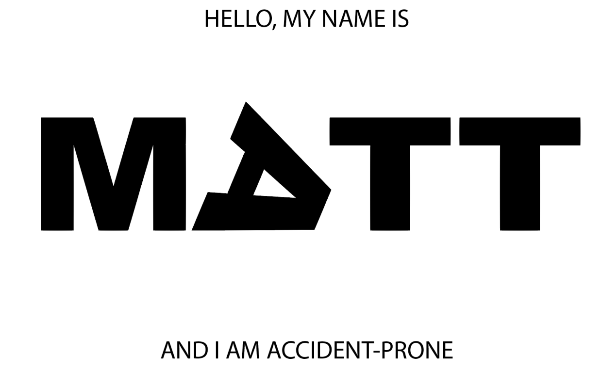
Hello my name is Matt … I’m a magician

I’m accident-prone

I’m losing my temper

I’m visiting Portland

I’m afraid of the dark

Hello my name is _________ (fill in the blank)

Each image has some advantage. I tend to think that it is better to make work that is provocative than safe. The “ransom note” lettering is fun, but includes a dark humor component, the “magician” is playful but a bit on the nose, the “marksman” is very literal, but exists within the context of America’s gun violence epidemic (a controversial subject, to say the least), and the “Portland” is a bit more esoteric, and depends on a person’s familiarity with the sketch comedy of Portlandia‘s “Put a bird on it”. We’ll see what the professor has to say during today’s lab.

INTRO TO ADOBE ILLUSTRATOR

Week 1 – Day 2

Introduction to Adobe Illustrator and Vector Graphics

Illustrator is part of Adobe’s Creative software suite (now “Creative Cloud”). The primary focus of Illustrator is the use of and creation of vector graphics. Most graphics are rasterized (a grid of pixels with assigned values); vectors are “drawn” by software (or hardware, if supported) and are not limited by resolution. At our university’s Mac lab, we have preloaded versions of Illustrator, here’s a quick run-through:

There are lots of ways to launch the program. My preferred method is to use Spotlight search.

Command+[Spacebar]

This will open a search box (this is like Google for your computer), just start typing “illustrator” and you’ll get an auto-complete before you finish typing it. Just hit Enter when it fills in the remaining characters. BAM! You’re in.

Next, we need to create a new project:

File -> New ->

Name: Lastname-Intro [Geiger-Intro ART119]

Profile: Web

Size: 960 x 560

Units: Pixels

Orientation: Landscape

After creating this new document, save it.

File -> Save ->

Save as: Lastname-Intro.ai [Geiger-Intro-ART119.ai]

Default settings -> OK

Terms:

Artboard

Working area


Shape Tool

Used to create a vector object


Vector object

            Vector Objects are defined with Paths and Points


Stroke

            Defines the thickness of lines (vectors)


Fill

            Defines the “filling” of an object (like Twinkies)


Arrange

            Illustrator “stacks” objects in the order they were created. To change this order, go to the top menu:

Object -> Arrange -> Send to…(back/front) Bring to (back/front)

Align

            Like with a text editor, aligns an object to different orientations (objects, Artboard, etc.)


Keyboard Shortcuts:

Option+LeftClick(on object)+drag

            Drag to new area to create a duplicate

LeftClick+drag(over objects)

            Bounding box selects multiple items

Command+S

            Save current progress

In-class exercise: practice drawing your name. I wrote mine in cyrillic:

The letter “а” is tricky, and I didn’t quite get it right on the first try (“Матвей Гайгер” The first “a” looks like an “o”). This was all done with the pen tool, but switching back and forth between the curve and straight pen.

Project 1: Typographic Portraits

Timeline:

Mar 30: Project Intro, sketch ideas for next class (blog)

Apr 05: Work time in class following demonstrations

Apr 07: Work Time in class, following demonstrations

Apr 11: Review Typographic Portraits


Example: “Eruption” “Tilt-A-Whirl” “Balloon Darts” “Roller Bowler” “Cock Clock” “Exit” “Copernicus”.


Choose 3 of 6 provided character prompts. Use your name, first and/or last or nickname. Along with typographic and design…


“Hello my name is______ and I’m…”


Due Monday:

Sketches and ideas for project

Reflection on Open House (Blog)

Reflection on reading (Adobe Illustrator (Blog))