Playing Catch-up

Thinking fast vs. looking back

Season 2, episode 1 is easily the most famous episode of the 1950s TV series, I Love Lucy. Ethel and Lucy go to work at a chocolate factory, while Fred and Ricky take on their respective housework. Whether or not you’re familiar with this comedy, chances are you probably know (or are about to know) where this is headed.

I Love Lucy, “Job Switching” (Season 2, Episode 1), 1952

I Love Lucy, “Job Switching” (Season 2, Episode 1), 1952

Lucy and Ethel are assigned with the task of wrapping chocolates on an assembly line. Having already disappointed the foreman with their poor performance from earlier in the episode, this is their last chance to avoid being fired. Their task is simple, and repetitive: wrap the chocolates as they come down the belt, and don’t let any chocolates through unwrapped. At first the speed is manageable, but it quickly speeds up, and the quantity of chocolates increases dramatically — and that’s what makes this episode so damn funny. Lucy and Ethel panic. They begin setting chocolates aside, but eventually resort to stuffing the chocolates into their blouses and mouths. At the end of the episode, Fred and Ricky realize that they are terrible housekeepers, and decide that they want Lucy and Ethel to return to their traditional roles. As a token of appreciation, Ricky gives Lucy a gift: a box of chocolates.

What does any of this have to do with LxD, civic engagement, elections, or the unaddressed hazards of 21st century technology? Not much. It is however, a great analogy for my schedule last week. I managed to stay on top of things through the first few weeks of the semester, but then the belt sped up, and I had too many “chocolates” without the capacity to wrap them. I’m now looking back, instead of writing and reflecting in the moment. This shift in perspective has been fruitful, I along with the rest of my team have made significant strides toward our goal of developing a learning experience.

What is still missing are my posts on Medium and this personal blog. I want to document this process, but am doing so one week later. The next two posts (06-11 February) are dated to correspond with the class schedule and for their prompts. This is done for clarity, and not a deception. The advantage of writing from this vantage point is that I now have the benefit of knowing how these ideas unfolded. I can write about what was done, and how it changed things.

Notes from class presentations

Considering approaches and interventions

This week, groups in our class presented their initial findings from researching their chosen field of interest. I recorded some of my ideas and observations during class session and thought it would be worthwhile to include a couple of them here:

Ema, Kate, Nick, and Yue: Food Systems

This group is exploring the relationships that college freshmen have with their food, through the context of campus food vending services. There are many places to eat on campus. We have a food truck, cafés, several eating areas in the University Center, as well as residential halls. There is a disconnect between the staff and the food they serve. This is compounded by the disconnect students experience by not preparing meals themselves. The team has proposed a series of interventions, designed to create more student engagement and a sense of ownership.

My thoughts: Freshmen are going through a series of drastic changes in their life. This presents a unique opportunity to change habits early in adult life — people are more likely to adopt new habits during periods of change. I am also curious about the idea of a student-led cleaning weekly session. Could this produce an opportunity to build empathy with the staff? Could it create a greater sense of joint ownership?

Amanda: Civics and Tech

Amanda is interested in how to instruct political radicals to leverage technologies to mobilize and affect meaningful political and social change. She has several different avenues to explore along this subject:

  • Political engagement through digital and physical spaces

  • Who are their stakeholders and what are your thoughts on their understanding of them and discoveries they made?

  • Mass mobilization and online activists

  • Students

  • Politically-minded

  • Radicals

  • High focus on community

  • Interested in both digital and analog engagement

The *How* remains unclear (this is more or less true for all of the groups at this stage), but I do have some thoughts, given that we began this process as a single group:

What are your thoughts on their use of the 4MAT System (McCarthy) to propose ways of planning and executing effective learning experiences?

I agree with the method of starting with the WHY quadrant of the 4MAT chart. I do wonder if you will meet an obstacle due to knowledge gaps. “Why” can be harder to justify if the intended audience does not already understand “WHAT.” I wonder if there is a way to leverage the audience’s curiosity, and to help them learn of their own knowledge gaps. How then would you proceed from that discovery, to compel them to consider the “WHY.” One other thing that comes to mind is the alternate reality game, “YEAR ZERO” (https://en.wikipedia.org/wiki/Campaign_timeline_of_Year_Zero). Originally launched in 2007, it anticipated a future America in the year 2022 (we are getting close now), where America’s government has fallen, replaced by a Christian-dominionist, fascist government (this seems more likely now, which is terrifying). A resistance group uses digital technologies to try to fight back against an oppressive regime, leading to a series of clandestine information sharing methods. Have you considered alternate reality games? It could spark some creative methods for teaching this subject.

Tackling the challenges for our learners

Bridging knowledge gaps.

Working with a team of three other designers, we began to see points of divergence for our goals. Amanda’s focus on online activism and leveraging new technologies was compelling, but she was driven to do this work independently. Nandini and Michelle were also interested in the digital realm, but were not sure about the framing for citizenship.

One of the key challenges for addressing citizenship in the 21st century is the fundamental misunderstanding by the public of how we interact with these new technologies. Twitter, Facebook, Instagram, etc. have removed the traditional political boundaries and geographic limitations of culture and ideas.

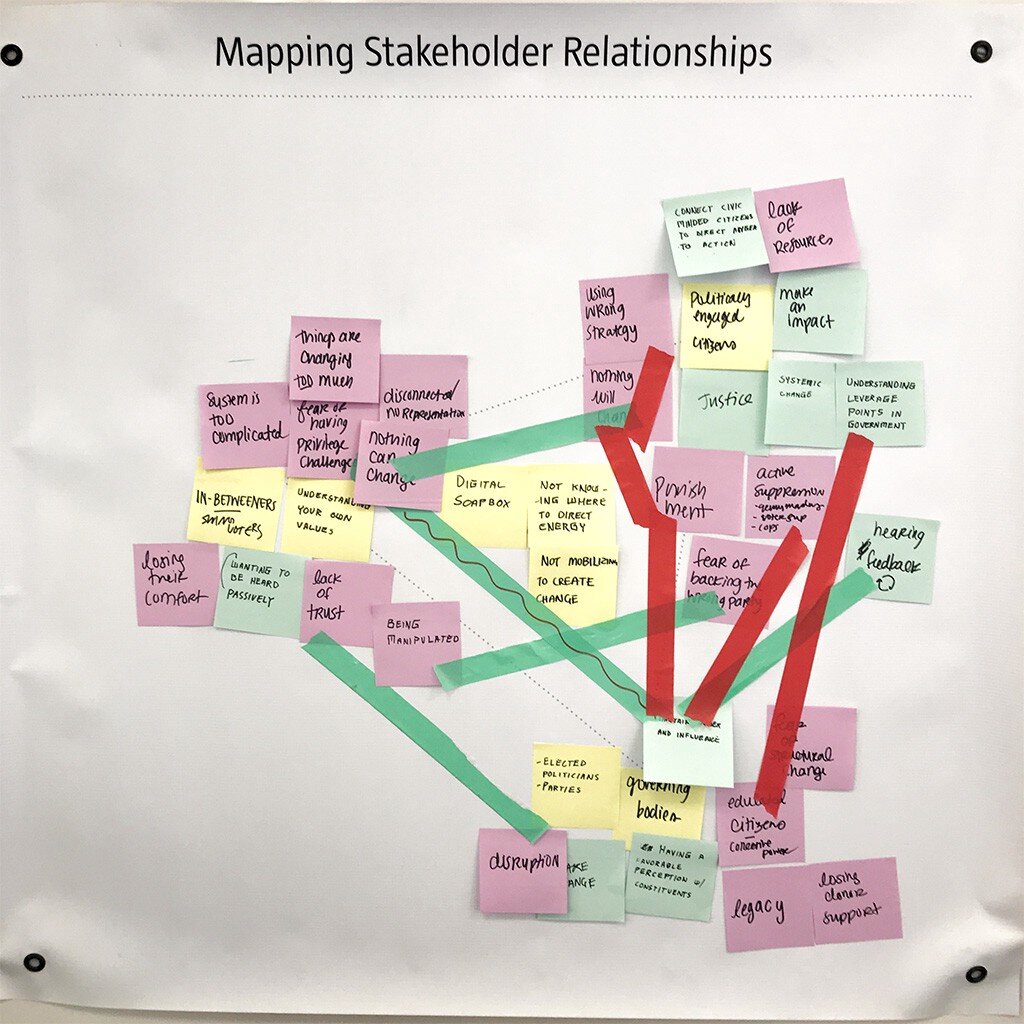
This is our stake-holder map, there are many like it, but this one is ours.

This is our stake-holder map, there are many like it, but this one is ours.

The advantage of this style of mapping is that we do not need to work from the current state toward feasible solutions. While the appearance may be linear, we actually developed our ideas for bridging the gaps by first looking forward, to a preferred state. Herbert A. Simon succinctly described the field of design as “changing existing circumstances into preferred ones,” which is exactly what we are plotting with this map. We then can backcast from the preferred state, and identify patterns and opportunities for intervention.

This tool is simple as it is effective. For weeks we had been looking at how technology was affecting citizens’ perception of reality (bots, trolls, hackers, fake news, hoaxes, disinformation campaigns, post-truth, etc.) but we had not adequately considered how bidirectional that perception was. In late 2013, a hacktivist documentary titled, TPB AFK (The Pirate Bay, Away From Keyboard) was released. This film chronicled the political and social aspects of digital sharing, and the rise of Sweden’s “Pirate Party.” Having won seats in parliament in 2009, The Pirate Party of Sweden was a recognized political group. Since then, other nations (e.g., Germany and Iceland) have also elected members from this movement.

The philosophy of the Pirate Party is best understood from their belief that “the internet is real.” They do not make the distinction between interactions “IRL” (In Real Life) and “online.” Instead, they use the term “AFK” (Away From Keyboard) to describe that state. In American politics, we can see the disruption all around us from this misunderstanding. People have been tricked into believing that their online activities are somehow contained, safely behind a prophylactic digital barrier. It’s “on the internet” and therefore not real. Except that it is. Imagine the mayhem that would exist if people believed that their personal vehicles and the roads on which they travelled were somehow a totally self-contained reality, separate from everything else.

Our goal therefor is not to leverage technology to help citizens become more engaged IRL, or AFK, but to help them understand that they are still citizens, even (and especially) when occupying digital spaces.

Considering stakeholders

Civic engagement: how grassroots movements make lasting impact.

As I continue to think about what citizenship truly means, I am disturbed to think about the lack of participation in western democracy. As I mentioned in an earlier post, the 2016 general election saw a 20-year low in voter turnout. It is tempting to shake my finger and to blame systems and policy (I still do this, in private), but when you pan back and look at the tension between discrete categories, it becomes much clearer what the stakes really are. I have heard from many of my closest friends and peers, that the election of Donald Trump has sparked an ad-hoc civics class. The Washington Post even launched a podcast whose title illustrates this phenomenon: Can He Do That?

One of the factors that prevents people from engaging with politics in a meaningful way, is the pervasive feeling of uncertainty. When you do not understand the mechanics of government and politics it is easy to be discouraged. The first amendment of the US Constitution guarantees the right to petition government for redress of grievances. This principle makes sense, but government is not a monolith. Government is not a person or a place, so who or what do you call upon when you have a valid complaint? When there is an emergency, you can call 9–1–1, but what about the slow-moving emergency of climate change, wage stagnation, the rising costs of education, childcare, or medical services? We the people might be pissed off. Many of the people who voted for Trump were voting with their middle finger — people often make poor choices when acting in anger.

Grassroots movements have historically been the most successful when groups form durable solidarity toward specific and appropriate goals. If we can find a way to synthesize a learning experience to form coherence with groups who share common grievances, we can make real impact. The 2020 election presents a unique opportunity to pressure elected officials. This is an ideal setting for researching this wicked problem.

Decoding a learning experience: notes from class presentation

We have not yet finished in-class presentations, but I wanted to take a moment to record what has been seen so far:

“The Learning Network” Provides current events in the format of lesson plans. Their goal — to expand reach to students. This is achieved through a combination of online lesson plans, quizzes, and student opinions.

Want to learn to play racquetball? Hillary described her initial interest as “like playing tennis, but indoors” — which makes sense, considering that we are living through winter in Pittsburgh. She discovered that Pickleball players (who are mostly 50+ year olds) are obsessed with this sport, and have countless posts on YouTube. Racquetball videos on YouTube, by comparission, are exceptionally rare (very few videos, the top pick being an upload from 10 years ago). Key takeaway: learn the moves before learning the rules.

Michelle Chou presented a sustainable seafood guide. App and website: Seafoodwatch.org, a resource created by the Monterey Bay Aquarium. Users can enter a search for the type of seafood they want to eat. The guide then provides information and recommendations (environmental impact, overfishing, etc.) Categories include: Best Choices, Good Alternatives, Avoid.

Kate played a showreel for the barbican Digital Revolution Exhibition. This traveling exhibition seeks to inform the public on how digital culture permeates modern-day life. The most impactful exhibit (I think) was an exploration into “Digital archaeology” (the history of human computer interaction).

Next, we looked at an online tool designed to teach DSLR users how to be more effective at digital photography: http://photography-mapped.com/. Most DSLR owners shoot in Auto-Mode, and never touch the manual settings. This interactive website explains the different functions of a DSLR. One of the key features of the siteShows instant feedback to help develop understanding.

There were more presentations (I might come back and post more from my notes), but you may have already noticed a pattern: new technology is what makes all of these learning experiences possible. These experiences may happen online or in-person, but all of them are leveraging technology to enhance people’s learning. Some of these experiences were not even possible a few decades ago.

Decoding a learning experience: a case study of factitious

One major area of concern going into the 2020 election is the role of social media in spreading disinformation. While I firmly believe that social media companies (e.g., Facebook and Twitter) need to take a more proactive role in combating fake news (and other propaganda), users and community stakeholders can also help to fight against the tide. One helpful tool is an online game, factitious.

The rules are simple: players are presented with a headline, text, and images — is it real or fake? The correct answer will be rewarded with points, while incorrect answers will provide helpful tips for how to spot a fake. Why is this game important? One of the hard-learned lessons from the 2016 election year was that people often share a news story without ever vetting the contents. Even worse, many Facebook users were willing to share a news story without ever having read the article.

What works: the game is simple, informative, entertaining, and free to the public. What could be better: the game is low stakes, and while that certainly encourages players to give it a try, it doesn’t have any replay value, or real incentives for competition. This could be improved.

Related links:

https://www.brookings.edu/blog/order-from-chaos/2018/05/09/how-misinformation-spreads-on-social-media-and-what-to-do-about-it/

https://www.brookings.edu/research/how-to-combat-fake-news-and-disinformation/

https://www.cits.ucsb.edu/fake-news/protecting-ourselves-teach

https://www.poynter.org/ifcn/anti-misinformation-actions/

Citizenship and technology: questions and hypotheses

This week we continued to explore citizenship from the lens of learning experience design (LxD). This issue is complex, affecting countless individuals, institutions, systems, and more. It was helpful to visualize the issue with a team (we continued a second day of whiteboard sketching, with post-its for card sorting. Ultimately, this helped us to identify the categories of “Five Ws” (Who, What, When, Where, Why) and How.

Who: voters (including potential voters). In 2016, voter turnout was at a 20–year low. Nearly half of voting-age Americans did not cast a ballot in 2016. It could be easy — even tempting — to look at this group and condemn their inaction. After all, Hillary Clinton received nearly 3 million more votes than Donald Trump, but lost the electoral college due to roughly 100,000 votes spread between three so-called “swing states.” If we ever are to have a health democracy, we need more people to vote, and they need to vote consisently. There are no “off years” for civic duties.

What can be done to increase voter turnout? This varies from one state to the next, so this question cannot be addressed at a national level, unless we first address the specifics of each state. Since the focus of this class is not public policy, we should instead look at voters and what resources would help them to understand the election process. There are many competing ideas, and it is likely that not just one policy or change to our elections will do the trick. Ultimately, we need voters to understand the necessary steps in the process, from registration to the act of casting a ballot.

When? Now.

It is not particularly helpful to only look at voters during our election years — every year, all year is what we need. Voting is only one small piece of civic responsibility. Volunteering in your community, military service, writing and calling your representatives, participating in demonstrations, jury duty, and even paying your taxes are major areas of concern, and these activities happen every day (if not to you, then to someone you know) in the United States.

Where can we reach eligible voters? One of the challenges with an always-online culture is that attention itself has become a commodity. There is serious competition for clicks and participation. This constant battle for your attention leaves only razor-thin margins for the less exciting, less sexy areas of real life. Combating distraction presents a real challenge.

Why is voting turnout is low? This question is more difficult to answer. Voter suppression tactics, gerrymandering, apathy, and public misperceptions and attitudes about democracy are major factors.

How can we change that? Before we can answer that question, we must first understand what factors determine a person’s level of political engagement. This should be a serious area of focus for further research.

Further Reading:

Voter turnout (https://www.cnn.com/2016/11/11/politics/popular-vote-turnout-2016/index.html)

Swing state voter margin (https://www.washingtonpost.com/graphics/politics/2016-election/swing-state-margins/)

Voter suppression (https://www.motherjones.com/politics/2017/10/voter-suppression-wisconsin-election-2016/)

Gerrymandering(https://www.nytimes.com/2019/06/27/us/what-is-gerrymandering.html)

Topics of interest: challenges in exploring the design of learning experiences

After the results of the 2016 election, many Americans (including a candidate who received nearly 3 million more votes than Donald Trump) wanted to know: what happened? What has unfolded since then has been an endless firehose of scandals, breaches of public trust, attacks against journalists, amplification of white nationalism, and a polarization of politics unlike anything seen in recent decades or even generations. For many, this question has been more about whether we are reliving 1968 or 1934. Depending on what happens in this year’s election, we may have an answer to that dreaded question.

I believe that recent events and how we interpret them are dangerously subjected to a “fragmentalization” of narrative: this happened, and that happened, because (?). It is in our nature to seek out patterns — we depend on them to make sense of our reality — but just like Rorschach tests, cloud formations, tea leaf and palms readings, what we *think* we see is often much more subjective than we are willing to admit. These truthy relationship between separate parts can easily deceive us, and make it harder to see firmer (but much less pleasant) truths. The facts remain the same, even if our interpretation of them varies wildly.

This is why I am choosing to engage in two important topics this semester: technology and citizenship (i.e., civic engagement). I believe that in our ever-increasingly digital world, that it makes no sense to separate these two topics. They are deeply interlinked, (from our political discourse online, Tweets by the President and his feverish supporters, the sharing of stories on social media, cybersecurity, data breaches, electronic voting, online privacy, and so much more) technology influences politics, just as politics influences technology. What we do to one, through innovation or policy, will affect the other. In other words: to understand 21st century politics is to understand the fifth dimension — cyberspace.

Here are some specific questions worth exploring: how can we combat disinformation, fake news, state-sponsored propaganda, bots, and trolls? If we are living in a post-truth era of hopelessly tribal politics, how do we exit from it? Is that even possible? Voter turnout in general elections has been flat (around 55%) since the 1970s, how can we get more eligible voters to engage in their civic duties? How can we promote a more confident and informed public? I have some ideas about all of this, but will wait until class tomorrow where we can discuss. I hope to get some good feedback.

Evaluating Tools for Information Architecture

OmniGraffle for Mac

From the website:

OmniGraffle is a comprehensive, yet easy to use diagramming and drawing application. Drag and drop to create wireframes, flow charts, network diagrams, UI mockups, family trees, office layouts, and more. OmniGraffle 7 comes with plenty of features to get started in Standard. OmniGraffle Pro has everything in Standard, plus features suited specifically for folks that make a living designing or working with graphics—things like Shared Layers, Artboard Layers, Non-Destructive Shape Combinations, Blending Modes and Fill Effects, Visio support, SVG export, and more.

Weaknesses:

  • Price - even their educational license for students costs $89.99. They do offer a free trial, but it only works for 14 days

  • Compatibility - not easy to transfer projects to other platforms (i.e., Visio)

  • Learning curve - many reviews complain that it is difficult to learn how to use

xSort for Mac

From the website:

  • Visual environment simulating a table with cards (and outline view).

  • Supports open, semi-open and closed exercises.

  • Supports sub-groups (participants can put groups inside groups).

  • Control every aspect of the exercise(sorting type, cards placement, etc.).

  • Statistical results (cluster tree, distance table, etc.) updated in real time.

  • Displays individually all the info related to an individual session.

  • Easily select the sessions you want to use based on different criterias.

  • Create, read, print and export reports with a single click.

  • Lock the document so that a participant may do only one session.

  • Fully integrated with Mac (Intel and PowerPC-based Macs).

  • Price - Free

Weaknesses:

  • 32-bit only (does not work with latest version of MacOS

  • No support

  • Has not been updated in years

PowerMapper Desktop

From the website:

  • Platforms - Macintosh and Windows

  • Webcrawl - Automatically maps websites

  • Agnostic - Works in-browser and on the cloud

  • Light system requirements - works well on older computers

Weaknesses:

  • Price - $150 per license and no educational license is offered, updates require annual subscription of $37.25

  • Limited use - primarily designed for website analytics

Evaluating Tools for Interaction Design

From paper to digital

UXTools.co has some very useful information about design tools - and they break these down into specific tasks, such as:

Just one of many intuitive rankings for useful design tool categories

Just one of many intuitive rankings for useful design tool categories

Which tool is best for information architecture? I cannot say for sure. There are many, many, many tools for designers to choose from. Knowing which tool is best for a particular task can save time and money. Let’s look at three:

This vector drawing app is part of an entire suite of tools offered by Adobe

This vector drawing app is part of an entire suite of tools offered by Adobe

Adobe Illustrator 2020

Strengths:

  • Compatibility - part of an “ecosystem” it works seamlessly with other Adobe apps

  • Established standards - works with a variety of file types, and produces files that can be used with a variety of other apps

  • Maturity - with more than three decades of development, it is not likely to go away anytime soon

  • Updates - the software is frequently updated (with both new features and bug fixes)

Weaknesses:

  • Price - Adobe products have always been expensive, and every version of Illustrator since Adobe CS6 has been priced as a subscription, billed annually or monthly

  • Interactivity - does not support interactive features. Elements are static

  • Collaboration - does not support simultaneous editing

I do not have personal experience with this app (yet) but here’s what stackshare.io has to say:

I do not have personal experience with this app (yet) but here’s what stackshare.io has to say:

Figma

Strengths:

  • Collaboration - while both Figma and Illustrator offer vector-based graphic design tools, only Figma is capable of collaboration in real-time. Multiple users can tweak and edit the same file simultaneously.

  • Endless design file versioning - file versioning is considered a “best practice” when working on a project. With Illustrator, this is done manually (users must be “good citizens” and use the “save as” option, adding _Vxx to the end of their file names. Figma does this automatically, and embeds the changes into metadata

  • Platform agnostic - Figma runs in browser. You can switch between machines to continue working on a variety of platforms. Illustrator works with a variety of platforms (Windows, MacOS, and iOS), but each system requires a separate installation

  • Responsive UI - simple changes to graphics elements update in real-time

  • Prototyping - Illustrator can produce graphics, but it cannot produce interactive prototypes.

  • Handoff - prototypes can easily be handed off to web developers to be converted into fully-functional assets.

  • Price - it is free for students

Weakness:

  • Standardization - Illustrator is generally regarded as an industry standard, and it supports “legacy” project files. Figma is much more modern, but not as backward compatible.

  • No access to API - Illustrator users can program functions directly. This is especially useful when a project requires several repetitive tasks

  • Popularity - “According to the StackShare community, Adobe Illustrator has a broader approval, being mentioned in 80 company stacks & 57developers stacks; compared to Figma, which is listed in 60 company stacks and 54 developer stacks.” - stackshare.io

Adobe’s offering for designers who need to prototype for interaction

Adobe’s offering for designers who need to prototype for interaction

Adobe Xd 2020

Strengths:

  • Compatibility - part of an “ecosystem” it works seamlessly with other Adobe apps.

  • Prototyping - intuitive interface allows designers to rapidly “wire” their screens through a variety of triggers.

  • Large library - offers a wide variety of animations, transitions, and triggers.

  • Platform specific templates - includes built-in templates for quickly establishing a project format. Users can work from a variety of pre-baked device settings (iPhones, Android, Web, Desktop).

  • Updates - the software is frequently updated (with both new features and bug fixes).

  • Web-based sharing - prototypes can be shared and launched in browser. Works with Adobe Cloud

Weaknesses:

  • Price - Adobe products have always been expensive, priced as a subscription, billed annually or monthly

  • Limited multimedia abilities - while the graphics components are fairly robust, the sound features are extremely limited

  • Collaboration - does not support simultaneous editing

Which tool is right for evaluating information architecture?

I do not know. I have decided that I will work with Figma, because I believe that their list of features are compelling and complete enough for my first IxD prototype project this semester. Additionally, Figma has gained significant industry presence. Knowing how to use this software could be beneficial to a variety of future careers.

Designing Experiences For Learning

What excites me about diving into designing experiences for learning and why.

During my undergraduate studies, I took an elective on Design Thinking, and nothing has been the same ever since. I began to rethink what it means to solve problems, and became acutely aware of how easily and often products and services fail to address human needs. This journey lead me to volunteering at a “Design and Innovation” classroom at Ockley Green Middle School in Portland, OR. Working with these young minds helped me to appreciate the value of fresh perspectives, and exposed many of my own gaps of knowledge. I was gobsmacked to see people half my age building interactive prototypes for mobile apps, and completing design challenges with intuition and glee. In many cases, they were even doing more compelling work than some of my peers in the Art School at Portland State. The craft was often lacking, but their concepts were rich and deeply human — solid evidence that their imaginations were still unspoiled and wild.

When given permission to try “crazy ideas,” while also being properly supported by mentors and educators, there is earnest potential for groundbreaking innovation (this was evident, even in a K-12 context). Through many exchanges and observations along the way, I knew that I wanted to be a part of this process, to educate and support this kind of growth. My own experiences with public education were less than ideal, and I never saw this sort of potential before. I became deeply interested in the learning process, and wanted to know why some students succeed while others fail. I wanted to know what methods and environments helped people to become better versions of themselves. Most of all, I wanted to know what role Design Thinking could play in these developments.

Prototyping for IxD - Case Study

Information Architecture: Frankie Bunz

Pittsburgh, PA

One other component worth considering in the context of the customer journey and user experience (see my previous post), is the Information Architecture of the food menu. Let’s take another look at the menu:

There are a total of three menus at Frankie Bunz: one in the window, one on the ordering counter, and a handwritten banner inside the restaurant.

There are a total of three menus at Frankie Bunz: one in the window, one on the ordering counter, and a handwritten banner inside the restaurant.

The Food

There are eight standardized options:

The Frankie Bunz

The Don

The Hyman Roth

The Fredo’s Frank

The Sonny Special

The Henry Hill

The Mr. Miyagi Doggie

The Grateful Dog

The Chairman of the Dog

Customers choosing a standard dog still have the option to add additional toppings (more about this later), and must choose from one of four bun types*:

White

Wheat

Pretzel

Onion

*The only exception is the “Mr. Miyagi Doggie” which is an Asian Fusion spin on the classic corndog - featuring a tempura batter and side of slaw with special “dragon sauce.”

There is also an option to “B.Y.O.D” (Build Your Own Dog) with six dog options:

Smith’s Natural Skin Casing Hot Dog

Jubilee Farms All Beef Hot Dog

Hebrew National

Spicy Beef Dog

Turkey Dog

Veggie Dog

Toppings

There are two categories of toppings*:

“Frankie’s Fresh”

Premium

*The premium incurs a $1 charge per selection.

There are eleven “Frankie’s Fresh” toppings:

Ketchup

Mustard (Yellow, Dark, and Honey)

Siracha Mayo

Fresh Sauerkraut

Pickles

Onions (sweet vidalia)

Hot Peppers

Relish (sweet and dill)

And there are seven Premium toppings:

Chili Sauce

Bacon (candied)

Avocado

American cheese

Shredded, aged cheddar

Swiss

Pepper Jack

Sandwiches

If hot dogs are not your thing, they also offer large sides as well as grilled cheese sandwiches.

Grilled cheese sandwiches offer three options for bread:

White

Wheat

Sourdough

and four options for cheese*:

American

Swiss

Aged Cheddar

Pepper Jack

*Customers may select any combination, up to and including all four on the same sandwich

Customers may add any of the fourteen (fresh and premium) toppings offered for hotdogs to their grilled cheese (see above).*

*Customers can also add any choice of the six dogs (see above) for $2

There are also five standardized grilled cheese (with choice of bread), offered as a “daily special” Monday through Friday.

Sides

The only side offered are their fries.

There are four options to select from:

Regular

With melted cheese

“Da Woiks” (i.e., chili cheese fries with bacon)

"Poutini” (i.e., cheese curds, house gravy, and scallions)

Drinks

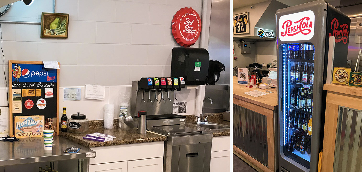
There are six fountain drinks (one cup size) and sixteen bottled drinks available. I won’t list them here; they offer Pepsi products, and you can see the options for yourself:

Drinks.jpg

Information Architecture

As you can see, there are many, many choices for customers to make. However, the choices have a logical flow and can be reduced to discrete categories with a linear progression.

A minimum of five choices must be made to complete an order.

A minimum of five choices must be made to complete an order.

Design For Service - Case Study

Case Study: Frankie Bunz, Pittsburgh, PA

I moved to Pittsburgh in August, 2019. Since moving here, I have eaten at only a handful of restaurants; Frankie Bunz (i.e., mobster-themed hot dogs) is easily one of my favorite local places to grab a bite. It is in Squirrel Hill, on Murray Avenue.

I have a weakness for anthropomorphic food.

I have a weakness for anthropomorphic food.

While this restaurant does offer some dine-in seating, it is primarily designed for grabbing food to go. In evaluating their services, I opted to dine in.

Customer Journey: Phase 1 - discovery

Customers are most likely to be attracted to this restaurant if they are on foot. The sidewalk immediately outside of Frankie Bunz advertises daily specials. There is a full menu in the window, as well as flyers promoting their most recently added items.

Their vegetarian chili (not pictured) is also quite good. Last week they were advertising egg rolls.

Their vegetarian chili (not pictured) is also quite good. Last week they were advertising egg rolls.

Customer Journey: Phase 2 - Entry

When you walk into Frankie Bunz, it immediately becomes clear that they do not have a large seating capacity, but they still provide an inviting atmosphere. Additionally, they provide a large banner-type version of their menu.

The interior is somewhat “cozy” and prioritizes a space for ordering and waiting over dine-in seating.

The interior is somewhat “cozy” and prioritizes a space for ordering and waiting over dine-in seating.

Customer Journey: Phase 3 - Ordering

I arrived for a late lunch (this first week of the semester has started out with many plates for me to spin, including this evaluation), and the only other customers were take-out or app-based delivery workers (e.g., Grubhub). The ordering and checkout process is reasonably frictionless. They use a touchscreen POS machine with contactless (Apple, Google, Samsung, etc.) and chip-reading capabilities.

Customers can either choose one of the standardized hotdogs, or build their own. The staff takes the order, unless the customer is ordering via a delivery app. Customers ordering a standardized hotdog (e.g., “Fredo’s Frank” or “The Don”) are still asked what kind of bun they’d like. Options include: wheat, white, pretzel, and onion roll. In addition to their buns, they also offer a tempura battered, fried dog on a stick (i.e., a “corndog” minus the cornmeal); they call it the “Mr Miyagi Doggie” and it includes an Asian Fusion slaw and special “dragon sauce.”

Customer Journey: Phase 4 - Payment

Despite the cluttered appearance of the equipment, the system works fairly well. On the left, there is a mobile phone that receives app-based orders, while the customer-facing touchscreen provides simple instructions to complete the transaction. The…

Despite the cluttered appearance of the equipment, the system works fairly well. On the left, there is a mobile phone that receives app-based orders, while the customer-facing touchscreen provides simple instructions to complete the transaction. The order information, prices, total, tip amount, and tax are easily presented without complexity.

The only substantial flaw with this setup is the counterintuitive chip-reader.

The icon on the lower right corner of the bezel doesn’t clarify the card orientation, so the owners added a post-it note, which adds to the confusion. Also: you cannot have my credit card number. 😘

The icon on the lower right corner of the bezel doesn’t clarify the card orientation, so the owners added a post-it note, which adds to the confusion. Also: you cannot have my credit card number. 😘

The arrow is pointing away from the slot, but this doesn’t necessarily clarify card orientation. The affordances of the device allow for both correct and incorrect insertion. In total, this card-reading device allows no less than eight card orientations and interactions (four in the card slot, and four in the slider), and only one of these actions is correct. To be generous, there is at least an 87.5% chance for error, even with written instructions. This is terrible design.

Despite this minor annoyance, the process is still supported by staff, and any errors can be quickly observed and corrected.

Customer Journey: Phase 5 - Fulfillment

Once the order is placed and the payment confirmed, customers have a brief waiting period while their meal is prepared. The open floor plan is reassuring, and promotes trustworthiness with customers: you can see your meal being prepared, and know that their kitchen is clean and safe.

There is nothing to hide. Even their supply room is open and visible.

There is nothing to hide. Even their supply room is open and visible.

While waiting for food, customers have a few options to occupy their time: there is a television, artwork, and a gender-neutral restroom.

By Executive Order, all hot dog artwork in the 21st century must be in 3D.

By Executive Order, all hot dog artwork in the 21st century must be in 3D.

Customer Journey: Phase 6 - Value

To extract value from the transaction, customers must receive and consume their food. I think this was worth the wait.

Order: one vegetarian hotdog on a pretzel bun, with onions, brown mustard and ketchup, and a side of shoestring fries.

Order: one vegetarian hotdog on a pretzel bun, with onions, brown mustard and ketchup, and a side of shoestring fries.

Reframing Climate Action

Climate change represents an existential threat to all human and non-human life on our planet. This is a global crisis. It is a complex, compounded problem, representing a multitude of technological, political, and economic challenges; as big and complex as they are, we should welcome these challenges. We can start by reframing the debate. Later this month, families in the United States will gather to celebrate Thanksgiving. You may find yourself sitting at a table with someone who opposes the radical transformations necessary to address the climate emergency — someone who refuses to acknowledge the dire warnings from climate scientists, and who sees no real need to change our economy, food production or modes of transportation. Instead of browbeating them for their lack of concern or sense of ecological stewardship, consider this alternative: talk about how exciting this transformation could be.


Sustainability cannot be achieved if the only source of inspiration is our fear of a climate catastrophe. We need enthusiasm and a sense of adventure; we need to dream of big, radical shifts from the brightest corners of science fiction. We need to inspire people’s imagination, and show them a future that is possible: with proper planning and investment into new technologies, we can build something better. Recycling our plastic bottles, taking public transportation or riding a bicycle to work might make us feel good about our carbon footprint (and if you do these things, thank you), but these kinds of actions do little to inspire. We need a moonshot of new technologies that make fossil fuels obsolete. This cannot be a lateral transition.


One of the most common objections to adopting the necessary changes and policies to address climate change (e.g., generating 100% of our electricity from solar, wind, and other renewables, massive expansion of public transportation infrastructure, abandoning fossil fuels in virtually every area of the global economy, sweeping reforms to agricultural practices and global trade, etc.) is the notion that these changes are both radical and sudden. In fact, these changes are. It is radical to reshape how people power their homes, what they eat, or how they commute to and from work. The IPCC says that “unprecedented and urgent changes” are needed to keep warming below 1.5°C, and that failing to meet that goal will have catastrophic impact. In fact, even with the target of 1.5°C we are likely to see significant ecological impact beyond what has already taken place.


What these objections fail to account for is that radical change is happening, and it will continue so long as new technologies are being developed. At the beginning of the twentieth century, most people traveled long distances by rail, ships, or even by riding on the backs of domesticated animals. The Wright brothers sparked a radical change in 1903, when they successfully completed the first heavier-than-air powered flight in Kitty Hawk, North Carolina. Less than thirty years later in 1927, Charles Lindbergh became the first aviator to successfully complete a non-stop trans-Atlantic flight. A little more than a decade later in 1941, the Japanese Imperial forces launched a massive naval air strike against the United States Pacific Fleet at Pearl Harbor. That same decade, in 1947,Chuck Yeager became the first pilot to break the sound barrier. Roughly twenty years after that, in 1969, Neil Armstrong walked on the moon. By the end of the twentieth century, massive fiberoptic networks and satellites connected people from around the world and enabled communication at the speed of light.


It is an undeniable fact that some of the most transformative technologies of the twentieth century were not planned by governments or voted on by the consent of the public, but instead began with hobbyists. From powered flight to the home computer, radical change can come from the most humble beginnings. With proper funding, institutional support, public and private investments, and an insatiable drive for continual improvements, these new technologies have reshaped every aspect of our daily lives.


Even though it is commonplace today, flying on a commercial jet is still an adventure. One century ago, the wealthiest and most powerful people in the world could not enjoy the convenience or speed we now take for granted. It is an optimistic act to step inside of an aluminum tube and to trust total strangers to safely accelerate to over five-hundred miles per hour, thirty-thousand feet above the ground.


Unfortunately, this miraculous convenience comes at a heavy price: air travel is also a major source of greenhouse gas emissions. According to one study from 2016, air travel alone could account for a quarter of our carbon budget by the year 2050. This is alarming but not hopeless. We do not need to abandon air travel and or return to riding on the backs of horses. The fundamental physics of aviation do not even require burning fossil fuels. In fact, there are already a number of prototype hydrogen-fueled aircraft that fly without producing any carbon emissions. Research indicates that hydrogen is the most suitable alternative fuel; hydrogen is abundant (it is the most common element in the known universe) and because it burns clean, it could extend the life of jet engines by 25%.


Why stop there? Jet A-1 (one of the most common jet fuels in use today) was developed in the 1950s. Considering the rapid progress of modern aviation, why should we continue to use a seventy-year-old fuel? Jet A-1 has a maximum burn temperature of roughly 4,000°F; that is impressive, but hydrogen can burn over a thousand degrees hotter at 5,100°F. The byproduct of burning this fuel is water vapor. What can we do with that extra thermal energy? SABRE hypersonic Reaction Engines are currently in development, and could potentially lead to commercial aircraft with a speed of over 4,000 mph. That’s three times faster than the (now defunct) supersonic Concorde airliners.


Imagine flying from New York to London in one hour.


That’s exciting, but I forgot to mention something: that speed only accounts for altitudes of 30,000 feet. Hydrogen-oxygen engines, unlike their antiquated kerosene-burning counterparts, are not dependent on atmosphere for their combustion. At higher altitudes, where there is no atmosphere or wind resistance, these hypersonic jets could reach speeds of up to 19,000 mph. Imagine flying from London to Sydney in less than four hours. This is radical change; it is faster, higher, hotter, and cleaner than anything we have ever built before, but it is not unprecedented. This is what we have always done: better, and more exciting.

 United Nations, “Special Climate Report: 1.5ºC Is Possible But Requires Unprecedented and Urgent Action” 08 October, 2018. (https://www.un.org/sustainabledevelopment/blog/2018/10/special-climate-report-1-5oc-is-possible-but-requires-unprecedented-and-urgent-action/)

 Roz Pidcock, Sophie Yeo, “Analysis: Aviation could consume a quarter of 1.5C carbon budget by 2050” 08 August, 2016. (https://www.carbonbrief.org/aviation-consume-quarter-carbon-budget)

 Andrew J. Hawkins, “This company wants to fill the skies with hydrogen-powered planes by 2022” 14 August, 2019. (https://www.theverge.com/2019/8/14/20804257/zeroavia-hydrogen-airplane-electric-flight)

 A. Godula-Jopek, A. Westenberger, “Compendium of Hydrogen Energy, Vol. 4: Hydrogen Use, Safety and the Hydrogen Economy” 2016. (Pages 67-85)

 Rachel Cormack, “This Hypersonic ‘Space Plane’ Can Get From New York to London in One Hour” 27 September, 2019. (https://robbreport.com/motors/aviation/sabre-hypersonic-space-plane-2871535/)


Visual Communication Fundamentals Project: Anti-Affordances Video

Feels like forever since I’ve updated my blog. I have been learning to use Cinema 4D to create realistic 3D animations - it has been quite an adventure. I’ll be backdate posting some content about my process, but for now, I wanted to get this uploaded:


Human Factors of Paqui's One Chip Challenge

This is an evaluation of human factors applied to a novelty food item: Paqui’s “One Chip Challenge.”

Consider these human factors:

Physical Factors

Packaging:

- Casket shaped box, with thumb-sized semicircular cutouts

- Single envelope, with tear-open notch for easy opening

Cognitive Factors

Graphics:

- Grim Reaper and red skull imagery to emphasize spicy content

- Interior and exterior text warn users of what to expect

Emotional Factors

Experience:

- The anticipation of something spicy

- Discomfort, pain, endorphins

- Relief and a sense of accomplishment


Notes on "Wicked Problems in Design Thinking" by Richard Buchanan

The concept of capital-D Design is amorphous and continues to expand in scope, from specialized trades (Graphic Design, Industrial Design), to a generalized “liberal art of technological culture” (page 5).

The author describes this strange journey from silos of specialization to a generalized approach of research in the 20th century.

To quote John Dewey (The Quest for Certainty) :

The key takeaway from the Dewey’s block quotes seems to suggest that Science, art, and technology’s interactions in the 20th century transformed from a method for gaining knowledge through proscribed process, to one of gradual expansion of knowledge through incremental, evolutionary precision. This is achieved by planned set of linear operations. But what remains poorly understood is the relationships between art, technology, and science as a set of specialized knowledge. Science is a product of a process, and is easily mistaken for truth, rather than the outcome of process.

There is too much reverence for this process, and when this “recipe” is applied to technology, we run the hazard of advancing (through technology) inferior solutions to human problems (e.g., making a better mousetrap is given precedent over improving our understanding of rodents and what attracts them). Dewey describes this “circular relationship (page 7) between arts of production and science.”

“Instead of meaning knowledge of how to make and use artifacts or the artifacts themselves, technology for Dewey is an art of experimental thinking” The author suggestions (page 8) that technology can be produced through science, but that art (liberal art context), “lies behind and provides the basis for creating other types of products.”

Observations:

From last week’s reading, the author described Edison’s experimentation through iteration is slow and sloppy. It does not follow the same set of steps typically found in the scientific method. But it is another approach to development of technology.

In the syllabus, Jonathan Chapman described design as, “the process of turning existing situations into preferred ones.” This is a quote by Herbert Simon. Herbert Simon is mentioned (On page 9), and his text is quoted from The Science of the Artificial.

The proper study of mankind is the science of design, not only as the professional component of a technical education but as a core discipline for every liberally educated man.”

Design as a multidisciplinary practice can be categorized in four different ways (page 9):

  • Symbolic and visual communication (graphic design)

  • Material objects (product/industrial design)

  • Activities and organized services (Interaction Design/UX)

  • Complex systems or environments for living, working, playing (urban/city planning, architecture, sustainability, etc.)

The author then explains how these discrete categories could not remain compartmentalized, and quickly expanded, overlapped, and evolved into other fields (architecture is a good example).

The author suggests that this pattern grew beyond categories, and into a set of placements.

Placements are constrained, but can exist within different circumstances (contexts).

Categories lock the ways we think about problems, and limit us to thinking in those older (and possibly outdated) paradigms. Placement allows for novel approaches to existing problems, outside of their original contexts.

The author assert (on page 13), that placements are primary, and categories are secondary. Scientists and designers often struggle to communicate within a meaningful framework, because designers rarely work within the boundaries of any one discipline - scientists are typically specialized to specific fields (page 14).

From page 15: it is tempting to divide design thinking into two steps: problem definition, problem solution. This suggests a linear process (which is clearly not true). The author also makes their first mention of “wicked problems.” And on page 16 the author suggests that designers often are confronted with “wicked problems” because design is a universal field, related to all human experience.


Weekend update

Went to the Carnegie Museum of Art this weekend to see their exhibit on Accessibility. This sparked a lot of new ideas about how to focus on solving human problems through empathy. The variety of solutions was truly impressive (concerts for the deaf, eating utensils, mobility assistance and augmentation, navigation technology for the visually impaired, and so much more!)

Just like eyewear has become a personal accessory, prosthetic limbs can also be made fashionable.

Just like eyewear has become a personal accessory, prosthetic limbs can also be made fashionable.

Opportunities for selfies cannot be dismissed.

Opportunities for selfies cannot be dismissed.

Why putting on the brakes is not enough

Pittsburgh Public.jpeg

Jack Dorsey, CEO of Twitter, knows his platform allows for bad craziness to spread like cancer, but fuck it! He’s still getting rich. Who cares if his platform amplified the worst voices in this country, and did so at the shared expense of everyone else? Right? Anyone who still works for Twitter should seriously reconsider what they are doing with their lives. Imagine getting paid to provide Nazis a global megaphone. How do you sleep at night, @Jack?

Thoughts on Ruined by Design, by Mike Monteiro:


I’ve finished reading Mike Monteiro’s book, Ruined By Design, and his message is clear: “as designers, we need to think of ourselves as gatekeepers.” This means we must refuse to put harmful designs (in any form) into the world. He uses the analogy of the Hippocratic Oath, and a doctor’s pledge to “first, do no harm,” and argues for designers to adopt a code of ethics.

I can hardly disagree with the notion that designers, like many other professions, ought to operate under a set of values. But is this enough? No. It is not enough to *not* do unethical design. It’s a good start, but it is not enough. For every harmful act, for every data breach, for every easily preventable hack, for every racist and hateful Tweet, for every man-made environmental catastrophe, and for every preventable tragedy brought upon us in the name of “innovative technology” and “disruption,” there is another mile we all travel on this dark highway. Refusing to do something harmful is a neutral act, and ought to be perceived as part of a neutral position. If you are someone who remains “neutral” on climate change, staggering wealth inequality, or the very real threats of fascism and white nationalism, then you’re not really part of the solution - you’re just a speed bump.

We need to reverse this, and Mike Monteiro is passionately calling for us to start by putting on the brakes. It’s not enough, but it is an essential first step. What we desperately need is positive change. We are going down this road at the speed of internal, infernal combustion. We are going faster than hot chrome and sweaty sex. Running in the red.

Almost everyone (aside from a handful of oligarchs and their Fox News sycophants) agrees that we should (at the very least) slow down. And if you suggest we stop, do you know how you will be labeled? You will be called a “far-left radical.” As if wanting every hard working family in this country to live with some basic level of dignity is a communist plot! As if wanting Twitter and the rest of Silicon Valley to actually be held responsible for what they put out into the world is “too liberal” or “too PC.” Well, call me liberal, but I cannot see the value in letting racist assholes have a platform to make terroristic threats against hospitals. Seriously: Fuck you, Jack Dorsey.

Why are these matters controversial at all? Maybe it is because the only thing more grotesque than this horrify status quo is: ourselves. We have been ignoring hard truths for such a long time that we often fail to see how far off we have wandered. It’s after midnight. The road is dark. The engine is running in the red. Why? From wealth inequality, to endless wars, to climate change, we live in a world where crisis is the status quo. Why?

(?)

What the author correctly identified is that this is because it is designed that way. We can’t fix this by simply refusing to go further down this road; we need to actively work against the designs that lead to ruin. We need to take the wheel. And if we crash, we need to pile up the debris and preserve only that which functions as a warning sign: to tell future generations not to go down that same path ever again. I’ll let Mike have the last word on this.

If we want positive search results, we should do positive things. If we want to reassure the users of our products that they can trust us, we should do positive things. There’s a reason I wrote these last three chapters in this order. Community breeds standards; standards breed accountability; accountability breeds trust; licensure validates that trust. It’s a journey. It may be a long journey, but that doesn’t mean it’s not worth taking.

Do positive things.

Monteiro, Mike. Ruined by Design: How Designers Destroyed the World, and What We Can Do to Fix It (p. 206). Mule Books.