Tackling the challenges for our learners

Bridging knowledge gaps.

Working with a team of three other designers, we began to see points of divergence for our goals. Amanda’s focus on online activism and leveraging new technologies was compelling, but she was driven to do this work independently. Nandini and Michelle were also interested in the digital realm, but were not sure about the framing for citizenship.

One of the key challenges for addressing citizenship in the 21st century is the fundamental misunderstanding by the public of how we interact with these new technologies. Twitter, Facebook, Instagram, etc. have removed the traditional political boundaries and geographic limitations of culture and ideas.

This is our stake-holder map, there are many like it, but this one is ours.

This is our stake-holder map, there are many like it, but this one is ours.

The advantage of this style of mapping is that we do not need to work from the current state toward feasible solutions. While the appearance may be linear, we actually developed our ideas for bridging the gaps by first looking forward, to a preferred state. Herbert A. Simon succinctly described the field of design as “changing existing circumstances into preferred ones,” which is exactly what we are plotting with this map. We then can backcast from the preferred state, and identify patterns and opportunities for intervention.

This tool is simple as it is effective. For weeks we had been looking at how technology was affecting citizens’ perception of reality (bots, trolls, hackers, fake news, hoaxes, disinformation campaigns, post-truth, etc.) but we had not adequately considered how bidirectional that perception was. In late 2013, a hacktivist documentary titled, TPB AFK (The Pirate Bay, Away From Keyboard) was released. This film chronicled the political and social aspects of digital sharing, and the rise of Sweden’s “Pirate Party.” Having won seats in parliament in 2009, The Pirate Party of Sweden was a recognized political group. Since then, other nations (e.g., Germany and Iceland) have also elected members from this movement.

The philosophy of the Pirate Party is best understood from their belief that “the internet is real.” They do not make the distinction between interactions “IRL” (In Real Life) and “online.” Instead, they use the term “AFK” (Away From Keyboard) to describe that state. In American politics, we can see the disruption all around us from this misunderstanding. People have been tricked into believing that their online activities are somehow contained, safely behind a prophylactic digital barrier. It’s “on the internet” and therefore not real. Except that it is. Imagine the mayhem that would exist if people believed that their personal vehicles and the roads on which they travelled were somehow a totally self-contained reality, separate from everything else.
Our goal therefor is not to leverage technology to help citizens become more engaged IRL, or AFK, but to help them understand that they are still citizens, even (and especially) when occupying digital spaces.

Considering stakeholders

Civic engagement: how grassroots movements make lasting impact.

As I continue to think about what citizenship truly means, I am disturbed to think about the lack of participation in western democracy. As I mentioned in an earlier post, the 2016 general election saw a 20-year low in voter turnout. It is tempting to shake my finger and to blame systems and policy (I still do this, in private), but when you pan back and look at the tension between discrete categories, it becomes much clearer what the stakes really are. I have heard from many of my closest friends and peers, that the election of Donald Trump has sparked an ad-hoc civics class. The Washington Post even launched a podcast whose title illustrates this phenomenon: Can He Do That?

One of the factors that prevents people from engaging with politics in a meaningful way, is the pervasive feeling of uncertainty. When you do not understand the mechanics of government and politics it is easy to be discouraged. The first amendment of the US Constitution guarantees the right to petition government for redress of grievances. This principle makes sense, but government is not a monolith. Government is not a person or a place, so who or what do you call upon when you have a valid complaint? When there is an emergency, you can call 9–1–1, but what about the slow-moving emergency of climate change, wage stagnation, the rising costs of education, childcare, or medical services? We the people might be pissed off. Many of the people who voted for Trump were voting with their middle finger — people often make poor choices when acting in anger.

Grassroots movements have historically been the most successful when groups form durable solidarity toward specific and appropriate goals. If we can find a way to synthesize a learning experience to form coherence with groups who share common grievances, we can make real impact. The 2020 election presents a unique opportunity to pressure elected officials. This is an ideal setting for researching this wicked problem.

Decoding a learning experience: notes from class presentation

We have not yet finished in-class presentations, but I wanted to take a moment to record what has been seen so far:

“The Learning Network” Provides current events in the format of lesson plans. Their goal — to expand reach to students. This is achieved through a combination of online lesson plans, quizzes, and student opinions.

Want to learn to play racquetball? Hillary described her initial interest as “like playing tennis, but indoors” — which makes sense, considering that we are living through winter in Pittsburgh. She discovered that Pickleball players (who are mostly 50+ year olds) are obsessed with this sport, and have countless posts on YouTube. Racquetball videos on YouTube, by comparission, are exceptionally rare (very few videos, the top pick being an upload from 10 years ago). Key takeaway: learn the moves before learning the rules.

Michelle Chou presented a sustainable seafood guide. App and website: Seafoodwatch.org, a resource created by the Monterey Bay Aquarium. Users can enter a search for the type of seafood they want to eat. The guide then provides information and recommendations (environmental impact, overfishing, etc.) Categories include: Best Choices, Good Alternatives, Avoid.

Kate played a showreel for the barbican Digital Revolution Exhibition. This traveling exhibition seeks to inform the public on how digital culture permeates modern-day life. The most impactful exhibit (I think) was an exploration into “Digital archaeology” (the history of human computer interaction).

Next, we looked at an online tool designed to teach DSLR users how to be more effective at digital photography: http://photography-mapped.com/. Most DSLR owners shoot in Auto-Mode, and never touch the manual settings. This interactive website explains the different functions of a DSLR. One of the key features of the siteShows instant feedback to help develop understanding.

There were more presentations (I might come back and post more from my notes), but you may have already noticed a pattern: new technology is what makes all of these learning experiences possible. These experiences may happen online or in-person, but all of them are leveraging technology to enhance people’s learning. Some of these experiences were not even possible a few decades ago.

Decoding a learning experience: a case study of factitious

One major area of concern going into the 2020 election is the role of social media in spreading disinformation. While I firmly believe that social media companies (e.g., Facebook and Twitter) need to take a more proactive role in combating fake news (and other propaganda), users and community stakeholders can also help to fight against the tide. One helpful tool is an online game, factitious.

The rules are simple: players are presented with a headline, text, and images — is it real or fake? The correct answer will be rewarded with points, while incorrect answers will provide helpful tips for how to spot a fake. Why is this game important? One of the hard-learned lessons from the 2016 election year was that people often share a news story without ever vetting the contents. Even worse, many Facebook users were willing to share a news story without ever having read the article.

What works: the game is simple, informative, entertaining, and free to the public. What could be better: the game is low stakes, and while that certainly encourages players to give it a try, it doesn’t have any replay value, or real incentives for competition. This could be improved.

Related links:

https://www.brookings.edu/blog/order-from-chaos/2018/05/09/how-misinformation-spreads-on-social-media-and-what-to-do-about-it/

https://www.brookings.edu/research/how-to-combat-fake-news-and-disinformation/

https://www.cits.ucsb.edu/fake-news/protecting-ourselves-teach

https://www.poynter.org/ifcn/anti-misinformation-actions/

Citizenship and technology: questions and hypotheses

This week we continued to explore citizenship from the lens of learning experience design (LxD). This issue is complex, affecting countless individuals, institutions, systems, and more. It was helpful to visualize the issue with a team (we continued a second day of whiteboard sketching, with post-its for card sorting. Ultimately, this helped us to identify the categories of “Five Ws” (Who, What, When, Where, Why) and How.

Who: voters (including potential voters). In 2016, voter turnout was at a 20–year low. Nearly half of voting-age Americans did not cast a ballot in 2016. It could be easy — even tempting — to look at this group and condemn their inaction. After all, Hillary Clinton received nearly 3 million more votes than Donald Trump, but lost the electoral college due to roughly 100,000 votes spread between three so-called “swing states.” If we ever are to have a health democracy, we need more people to vote, and they need to vote consisently. There are no “off years” for civic duties.

What can be done to increase voter turnout? This varies from one state to the next, so this question cannot be addressed at a national level, unless we first address the specifics of each state. Since the focus of this class is not public policy, we should instead look at voters and what resources would help them to understand the election process. There are many competing ideas, and it is likely that not just one policy or change to our elections will do the trick. Ultimately, we need voters to understand the necessary steps in the process, from registration to the act of casting a ballot.

When? Now.

It is not particularly helpful to only look at voters during our election years — every year, all year is what we need. Voting is only one small piece of civic responsibility. Volunteering in your community, military service, writing and calling your representatives, participating in demonstrations, jury duty, and even paying your taxes are major areas of concern, and these activities happen every day (if not to you, then to someone you know) in the United States.

Where can we reach eligible voters? One of the challenges with an always-online culture is that attention itself has become a commodity. There is serious competition for clicks and participation. This constant battle for your attention leaves only razor-thin margins for the less exciting, less sexy areas of real life. Combating distraction presents a real challenge.

Why is voting turnout is low? This question is more difficult to answer. Voter suppression tactics, gerrymandering, apathy, and public misperceptions and attitudes about democracy are major factors.

How can we change that? Before we can answer that question, we must first understand what factors determine a person’s level of political engagement. This should be a serious area of focus for further research.

Further Reading:

Voter turnout (https://www.cnn.com/2016/11/11/politics/popular-vote-turnout-2016/index.html)

Swing state voter margin (https://www.washingtonpost.com/graphics/politics/2016-election/swing-state-margins/)

Voter suppression (https://www.motherjones.com/politics/2017/10/voter-suppression-wisconsin-election-2016/)

Gerrymandering(https://www.nytimes.com/2019/06/27/us/what-is-gerrymandering.html)

Topics of interest: challenges in exploring the design of learning experiences

After the results of the 2016 election, many Americans (including a candidate who received nearly 3 million more votes than Donald Trump) wanted to know: what happened? What has unfolded since then has been an endless firehose of scandals, breaches of public trust, attacks against journalists, amplification of white nationalism, and a polarization of politics unlike anything seen in recent decades or even generations. For many, this question has been more about whether we are reliving 1968 or 1934. Depending on what happens in this year’s election, we may have an answer to that dreaded question.

I believe that recent events and how we interpret them are dangerously subjected to a “fragmentalization” of narrative: this happened, and that happened, because (?). It is in our nature to seek out patterns — we depend on them to make sense of our reality — but just like Rorschach tests, cloud formations, tea leaf and palms readings, what we *think* we see is often much more subjective than we are willing to admit. These truthy relationship between separate parts can easily deceive us, and make it harder to see firmer (but much less pleasant) truths. The facts remain the same, even if our interpretation of them varies wildly.

This is why I am choosing to engage in two important topics this semester: technology and citizenship (i.e., civic engagement). I believe that in our ever-increasingly digital world, that it makes no sense to separate these two topics. They are deeply interlinked, (from our political discourse online, Tweets by the President and his feverish supporters, the sharing of stories on social media, cybersecurity, data breaches, electronic voting, online privacy, and so much more) technology influences politics, just as politics influences technology. What we do to one, through innovation or policy, will affect the other. In other words: to understand 21st century politics is to understand the fifth dimension — cyberspace.

Here are some specific questions worth exploring: how can we combat disinformation, fake news, state-sponsored propaganda, bots, and trolls? If we are living in a post-truth era of hopelessly tribal politics, how do we exit from it? Is that even possible? Voter turnout in general elections has been flat (around 55%) since the 1970s, how can we get more eligible voters to engage in their civic duties? How can we promote a more confident and informed public? I have some ideas about all of this, but will wait until class tomorrow where we can discuss. I hope to get some good feedback.

Evaluating Tools for Information Architecture

OmniGraffle for Mac

From the website:

OmniGraffle is a comprehensive, yet easy to use diagramming and drawing application. Drag and drop to create wireframes, flow charts, network diagrams, UI mockups, family trees, office layouts, and more. OmniGraffle 7 comes with plenty of features to get started in Standard. OmniGraffle Pro has everything in Standard, plus features suited specifically for folks that make a living designing or working with graphics—things like Shared Layers, Artboard Layers, Non-Destructive Shape Combinations, Blending Modes and Fill Effects, Visio support, SVG export, and more.

Weaknesses:

  • Price - even their educational license for students costs $89.99. They do offer a free trial, but it only works for 14 days

  • Compatibility - not easy to transfer projects to other platforms (i.e., Visio)

  • Learning curve - many reviews complain that it is difficult to learn how to use

xSort for Mac

From the website:

  • Visual environment simulating a table with cards (and outline view).

  • Supports open, semi-open and closed exercises.

  • Supports sub-groups (participants can put groups inside groups).

  • Control every aspect of the exercise(sorting type, cards placement, etc.).

  • Statistical results (cluster tree, distance table, etc.) updated in real time.

  • Displays individually all the info related to an individual session.

  • Easily select the sessions you want to use based on different criterias.

  • Create, read, print and export reports with a single click.

  • Lock the document so that a participant may do only one session.

  • Fully integrated with Mac (Intel and PowerPC-based Macs).

  • Price - Free

Weaknesses:

  • 32-bit only (does not work with latest version of MacOS

  • No support

  • Has not been updated in years

PowerMapper Desktop

From the website:

  • Platforms - Macintosh and Windows

  • Webcrawl - Automatically maps websites

  • Agnostic - Works in-browser and on the cloud

  • Light system requirements - works well on older computers

Weaknesses:

  • Price - $150 per license and no educational license is offered, updates require annual subscription of $37.25

  • Limited use - primarily designed for website analytics

Evaluating Tools for Interaction Design

From paper to digital

UXTools.co has some very useful information about design tools - and they break these down into specific tasks, such as:

Just one of many intuitive rankings for useful design tool categories

Just one of many intuitive rankings for useful design tool categories

Which tool is best for information architecture? I cannot say for sure. There are many, many, many tools for designers to choose from. Knowing which tool is best for a particular task can save time and money. Let’s look at three:

This vector drawing app is part of an entire suite of tools offered by Adobe

This vector drawing app is part of an entire suite of tools offered by Adobe

Adobe Illustrator 2020

Strengths:

  • Compatibility - part of an “ecosystem” it works seamlessly with other Adobe apps

  • Established standards - works with a variety of file types, and produces files that can be used with a variety of other apps

  • Maturity - with more than three decades of development, it is not likely to go away anytime soon

  • Updates - the software is frequently updated (with both new features and bug fixes)

Weaknesses:

  • Price - Adobe products have always been expensive, and every version of Illustrator since Adobe CS6 has been priced as a subscription, billed annually or monthly

  • Interactivity - does not support interactive features. Elements are static

  • Collaboration - does not support simultaneous editing

I do not have personal experience with this app (yet) but here’s what stackshare.io has to say:

I do not have personal experience with this app (yet) but here’s what stackshare.io has to say:

Figma

Strengths:

  • Collaboration - while both Figma and Illustrator offer vector-based graphic design tools, only Figma is capable of collaboration in real-time. Multiple users can tweak and edit the same file simultaneously.

  • Endless design file versioning - file versioning is considered a “best practice” when working on a project. With Illustrator, this is done manually (users must be “good citizens” and use the “save as” option, adding _Vxx to the end of their file names. Figma does this automatically, and embeds the changes into metadata

  • Platform agnostic - Figma runs in browser. You can switch between machines to continue working on a variety of platforms. Illustrator works with a variety of platforms (Windows, MacOS, and iOS), but each system requires a separate installation

  • Responsive UI - simple changes to graphics elements update in real-time

  • Prototyping - Illustrator can produce graphics, but it cannot produce interactive prototypes.

  • Handoff - prototypes can easily be handed off to web developers to be converted into fully-functional assets.

  • Price - it is free for students

Weakness:

  • Standardization - Illustrator is generally regarded as an industry standard, and it supports “legacy” project files. Figma is much more modern, but not as backward compatible.

  • No access to API - Illustrator users can program functions directly. This is especially useful when a project requires several repetitive tasks

  • Popularity - “According to the StackShare community, Adobe Illustrator has a broader approval, being mentioned in 80 company stacks & 57developers stacks; compared to Figma, which is listed in 60 company stacks and 54 developer stacks.” - stackshare.io

Adobe’s offering for designers who need to prototype for interaction

Adobe’s offering for designers who need to prototype for interaction

Adobe Xd 2020

Strengths:

  • Compatibility - part of an “ecosystem” it works seamlessly with other Adobe apps.

  • Prototyping - intuitive interface allows designers to rapidly “wire” their screens through a variety of triggers.

  • Large library - offers a wide variety of animations, transitions, and triggers.

  • Platform specific templates - includes built-in templates for quickly establishing a project format. Users can work from a variety of pre-baked device settings (iPhones, Android, Web, Desktop).

  • Updates - the software is frequently updated (with both new features and bug fixes).

  • Web-based sharing - prototypes can be shared and launched in browser. Works with Adobe Cloud

Weaknesses:

  • Price - Adobe products have always been expensive, priced as a subscription, billed annually or monthly

  • Limited multimedia abilities - while the graphics components are fairly robust, the sound features are extremely limited

  • Collaboration - does not support simultaneous editing

Which tool is right for evaluating information architecture?

I do not know. I have decided that I will work with Figma, because I believe that their list of features are compelling and complete enough for my first IxD prototype project this semester. Additionally, Figma has gained significant industry presence. Knowing how to use this software could be beneficial to a variety of future careers.

Weekend update

Went to the Carnegie Museum of Art this weekend to see their exhibit on Accessibility. This sparked a lot of new ideas about how to focus on solving human problems through empathy. The variety of solutions was truly impressive (concerts for the deaf, eating utensils, mobility assistance and augmentation, navigation technology for the visually impaired, and so much more!)

Just like eyewear has become a personal accessory, prosthetic limbs can also be made fashionable.

Just like eyewear has become a personal accessory, prosthetic limbs can also be made fashionable.

Opportunities for selfies cannot be dismissed.

Opportunities for selfies cannot be dismissed.

Mac Mini 2018 in Fusion 360

This month cruised by fast. I have been spending the bulk of my time in Fusion 360, both for class projects, as well as personal exploration of the software. Here are some recent renderings:

Apple updated the Mac Mini last month, adding an optional 6-core Intel Coffee Lake (Core i7 8700B) processor configuration, Thunderbolt 3 (USB Type C interface), and a “Space Gray” makeover. using photos from Apple’s product page, I reconstructed th…

Apple updated the Mac Mini last month, adding an optional 6-core Intel Coffee Lake (Core i7 8700B) processor configuration, Thunderbolt 3 (USB Type C interface), and a “Space Gray” makeover. using photos from Apple’s product page, I reconstructed the IO layout and customized material and appearance settings. You can download my model here.

Opposite angle, to show off that sweet white LED!

Opposite angle, to show off that sweet white LED!

For anyone getting into CAD, I also recommend GrabCAD.com, where you can download (and contribute) 3D models for free! I was able to accelerate my workflow by downloading prebuilt models of the ethernet, USB, and HDMI ports.

A Robot Took Your Job

Last week I returned from my trip to Memphis (thanks, Andy! Hope Meara’s potty training is going well!) and I’ve been playing catchup ever since. I’m getting back into Fusion 360 with some more challenging projects. This week we covered how to use joints in assemblies. This is pretty wild stuff. You can download models from GrabCAD.com and upload them Fusion 360. It auto-magically converts models to work natively (with mixed results) in the work space. From there, you can define joints and move parts in real time! We did this in class using an industrial robot model. Of course, this meant the robots needed to fight…

Four robots go in, four robots come out. Because they are metal, and very strong, and even knives won’t kill them!!

Four robots go in, four robots come out. Because they are metal, and very strong, and even knives won’t kill them!!

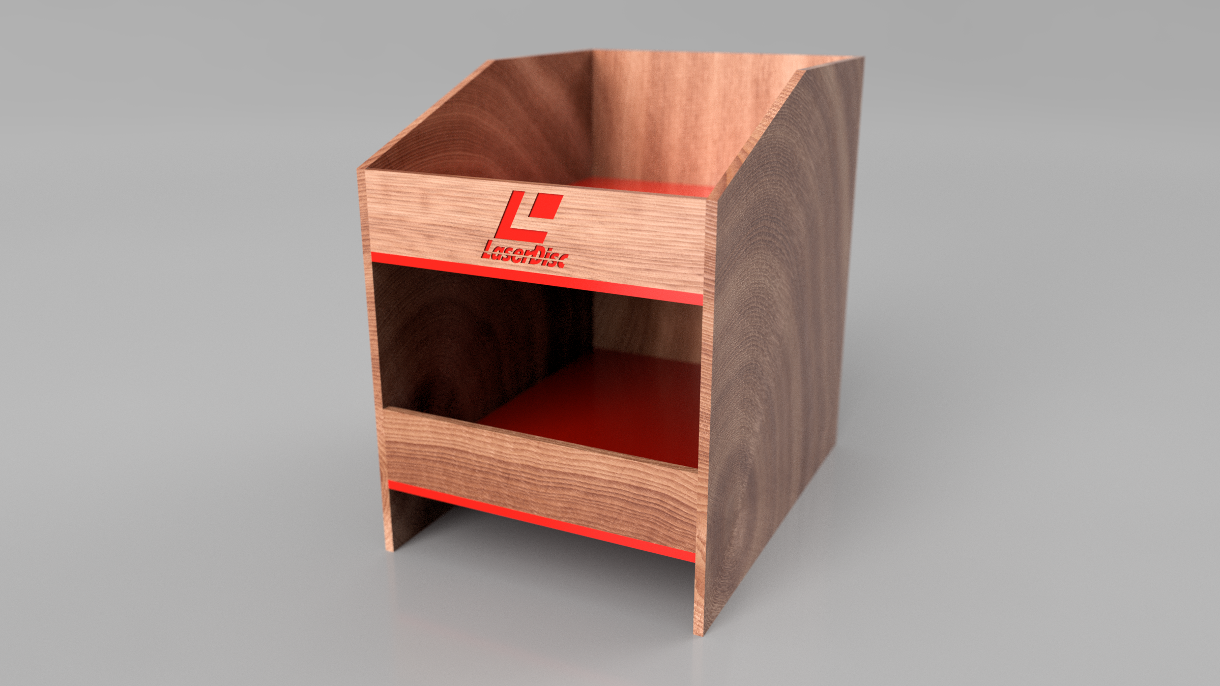
This wasn’t the actual assignment. Instead we needed to create a render scene involving an earlier model from this class being assembled by robots. I was grinding away at this all day yesterday, and finally got around to rendering it. Because of the complexity of the scene, it’s taking quite some time to bake in all of those rays at HD+ resolution. Here’s the object being assembled for reference:

This is based on an existing design from a vinyl shelf I bought to keep my Laserdisc collection in prime display condition. I fantasized about having an actual product made for Laserdisc, and what that might look like. You gotta with red trim right?…

This is based on an existing design from a vinyl shelf I bought to keep my Laserdisc collection in prime display condition. I fantasized about having an actual product made for Laserdisc, and what that might look like. You gotta with red trim right? Because LASERS!!

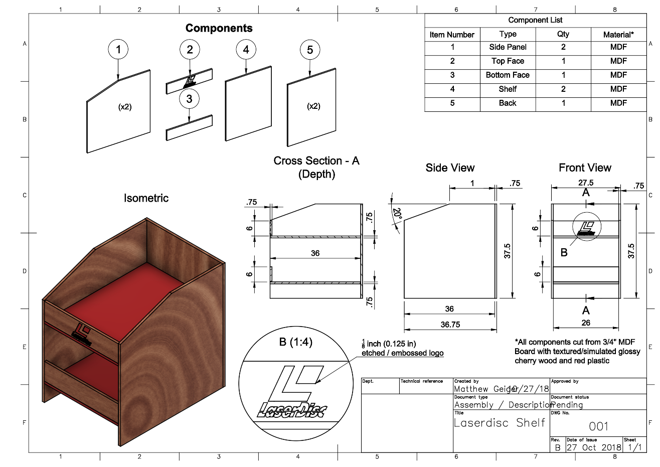
Here’s a technical drawing, if you want to build your own. This will probably hold about 250 titles, based on my experience with my current shelf ( tweaked the dimensions to give it a bit more depth and room to breathe between stacks.

Here’s a technical drawing, if you want to build your own. This will probably hold about 250 titles, based on my experience with my current shelf ( tweaked the dimensions to give it a bit more depth and room to breathe between stacks.

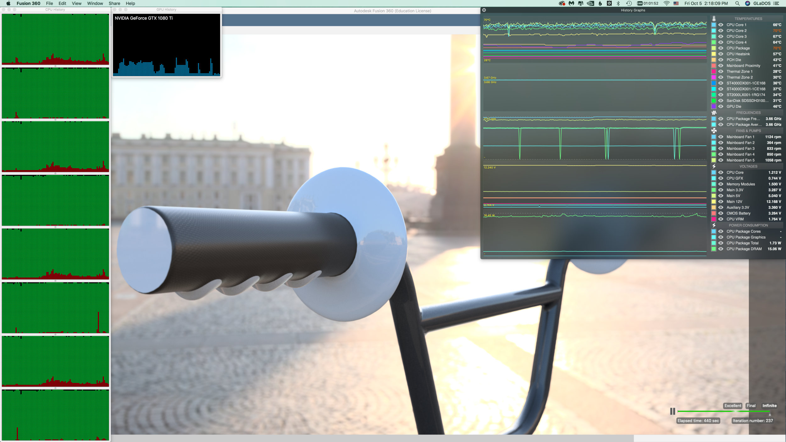
i’ve been taking this class as an opportunity to not only learn the software, but also to push the limits of what the software can do. For me, this practice is like cartography. I’m mapping the borders by extending to the edge in all things. With this project, I wanted to not only torture test the rendering pipeline, but also test the limits of my beefy Hackintosh. As noted previously, my CPU appears to be the main bottleneck. But I wanted to see what it takes to exceed memory requirements. For this design and ray tracing session I’m utilizing ~25 GB of memory, and cooking my poor little quad-core Haswell® chip.

Nothing cooks like CAD! Note that the temperatures reflect a system with AIO liquid cooled CPU, and nine total fans, packed into an old PowerMac G4 case. Even when protein folding on both GPU and CPU, the system usually has a CPU core temperature ce…

Nothing cooks like CAD! Note that the temperatures reflect a system with AIO liquid cooled CPU, and nine total fans, packed into an old PowerMac G4 case. Even when protein folding on both GPU and CPU, the system usually has a CPU core temperature ceiling of about 70˚ C.

It’s been over four hours as of writing this, and the rendering has not yet reached “final” quality. Scene complexity is a huge factor in rendering time.

PHOTOSHOP CALISTHENICS

Reference can be found here.

“1) Use the selection tools + refine edge to isolate objects from the Culture Catalogue image, then copy and paste them into a New Document, so that each is on a new layer.  Rename the layers, save as: lastname-isolated-objects.psd”

Click here to download a copy.

“2) Use Retouch and Repair tools to modify radically alter the castle while maintaining a ‘realist’ aesthetic.  Save as lastname-weird-castle.psd

geiger_weird-castle.png

Click here to download a copy.

“3) Recombine objects from the Culture Catalogue within the Castle image, using refine-edge to integrate the objects more seamlessly.  Save as lastname-weird-castle-2.psd”

geiger_weird-castle-v2.png

PHOTOSHOP INTRODUCTION

Week 3 – Day 2

Photoshop tutorial 

First, make sure you change three defaults:

Auto-select/Layers/Show Transform Controls 

SELECTION TOOLS

Marquee//Lasso//Wand

screen-shot-2016-04-13-at-6-16-52-pm1.png

Modify Selections by holding down SHIFT to add to a selection or Option to subtract from a selection.

Note: By default, when copy/pasting, it is added to a new layer

Checkerboard pattern indicates a transparent background

When selecting an object on a white background, you may get a white edge.

Use Refine Edge:

Option under selection tool.

Brush based retouch and repair tools

            Healing Brush

            Patch Tool

            Content-Aware

I started with this image:

Source: Flickr User – “tickr”

Source: Flickr User – “tickr”

I then decided it was time to “patch” this castle to its former glory…

I expanded the vertical dimensions by more than 400%, and then proceeded to “build” more layers of bricks, up into the sky. I used the lens distortion tools to create an illusion of perspective. Finally, I decided to add a “window” by cloning and inverting one of the smaller doors. Overall, I am pleased with how convincing this image is, but there are a few “bugs” in the picture (redundant, duplicate patterns) that detract from the overall realism. Still, I think I’ve done a better job than North Korea, and their use of Photoshop.

We miss you, Jon.

We miss you, Jon.

Source: The Guardian

Source: The Guardian


PROJECT-1: WEEKEND UPDATE

I’ve taken the criticisms into careful consideration, and here are the latest image updates:

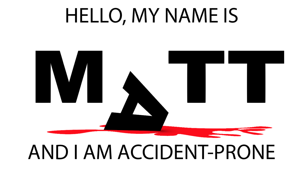
I spent a lot of time figuring out how to use perspective to give the blood spatter a solid “floor,” but the letters felt too flat against that perspective surface. Carl had some input on this, and the end solution was to include a 3D Extrude stylization filter to give depth and dimension to the letter “A”. There is a nice contrast with the flat letters in the background, and a slightly more gray value is applied to the background letters to emphasize this.The blood was given more detail by using the Wrinkle Tool. Overall, this is a pleasing change and I’m much happier with the results than earlier versions.

hat kind of magician would I be without a rabbit? The peer critique included an earlier, rougher version of this critter, but I’ve refined it to a point where it is a welcome distraction and not just a proof of concept. The sparse grayscale image really Pops thanks to the included red bowtie. This was created as a series of shape (Rectangle Tool) and a thicker brush setting for the outline. A heavy use of Gradient was applied to multiple Layers of the top-hat to give it a more three-dimensional appearance. Abracadabra!

The lion’s share of time went into this third image. Carl had an interesting suggestion to give the background a crumpled paper appearance. I scoured the web for a few options on how to do this. One suggested using a gradient tool in Photoshop and importing that image into Illustrator like so:

This wasn’t a bad approach, but it didn’t really “look right” in Illustrator. The better solution I found came from a multistep approach involving actual crumpled paper (Read here). I started by crumpling a folded piece of paper, and then scanning a highDPI image of it and saving the PNG for use in Illustrator. I then used the Image Trace tool to assign shapes their corresponding values (4 shades of gray). The end effect was more convincing because it was derived from the genuine object. Next, I created improved letter “clippings” for the ransom note stylization by choosing a variety of fonts and color combinations, grouped with rectangles that were altered using Transform to give them a more natural appearance.

The final steps involved creating a severed finger – because just one pool of blood in a project is never enough. I started with the Rectangle tool and created two segments, for the third segment (the fingertip), I used a pair of Ellipse tool shapes (fingertip and fingernail), which I altered with the Pen Tool. I then used a gradient fill to give the nail some depth, but struggled to find a gradient to give the finger segments an illusion of depth. I decided to hold off on that detail and used a regular color fill from the Skin Tone Library (color swatch). I then rotated the segments to give the finger a more curled appearance, and the Pen Tool to create the creases in the skin.

Solution for creating depth: I layered four stacks of cloned finger (object groups) on top of one another and then used the Eraser to create a gradation of shadows (Stylization and Drop Shadow)to create a rounder appearance. The end effect is consistently cartoonish with the rest of the image.

Finally, I created a “blood soaked paper” effect by changing the fill color of the surrounding Image Trace generated shapes and the Wrinkle Tool to give it a more distressed appearance. The one effect I want but haven’t been able to figure out is how to “crinkle” the ransom note letters themselves. They feel a bit too flat, and out of place, but after a few failed attempts with the Knife Tool to create segments I’ve decided to error on the side of caution. If I come up with a solution by Monday, I’ll be sure to update the results here.


PROJECT 1 UPDATE

Minimal Realism:

” When I look at a wildlife or nature subject, I don’t see the feathers in the wings, I just count the wings. I see exciting shapes, color combinations, patterns, textures…”

Illustrator Demo

Type Text “CARL”

Object -> Make Outline

DON’T FORGET TO: Ungroup Text

Knife Tool -> Cut “waves” through the text.

Color the top half “Fill” Brown

Color the bottom half “Fill” Blue

Brush Pallet (icon looks like books on a shelf (i.e., library))

            Using the brush tool change the outline of the letters to give a more “watery” look. Change stroke size to amplify effect.

Texture Pallet

            Just like the brush library, you can fill an object with a variety of textures.

Command: Paste in place

This creates a copy of an object directly on top of the original; useful because you do not need to align the new object.

How to make triangles:

Use the Polygon tool, and then rightclick for a menu to select “sides”, change to: 3


Create object from center:

Hold down the option key

How to create “Distressing” shapes

Use the “Warp Tools”. The Icon looks somewhat like a tulip.


PNG Export: (For blog)

            Use Artboard

            300 DPI (High)

Background color: White

Critique Notes:

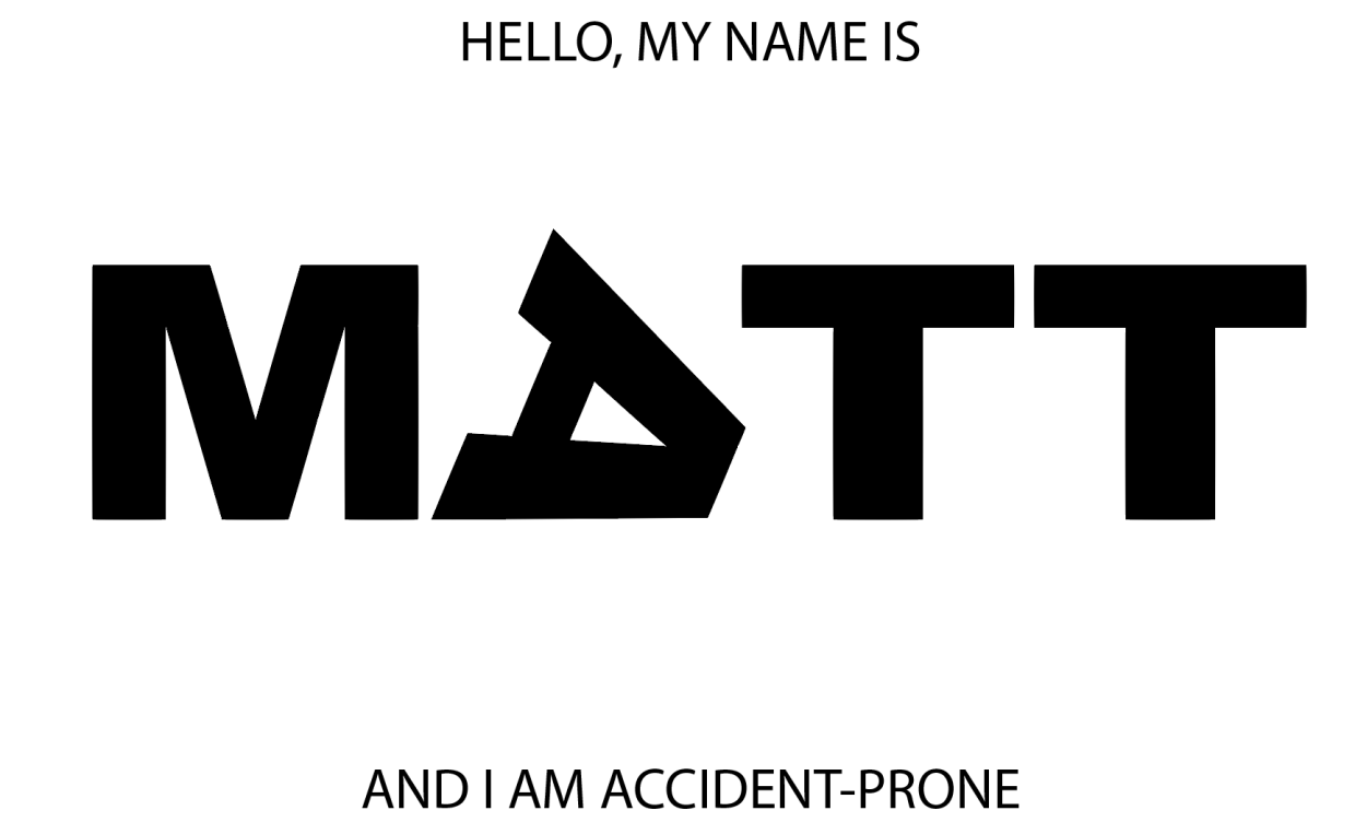
As of Wednesday evening this was the status of my three images:

My peers had some excellent suggestions.

Image one (accident-prone), is too flat. Consider moving the other letters of the text “back” into the image to create more depth

Image two (magician), needs more color. Black and white images are less interesting in this context, and more stylization of the letters would really help. Just as adding a gradient to the “wand tips” gave greater depth, consider adding more depth to this image as well.

Image three (hostage). This is an early start, and needs more work. Particularly, the texture on the letter “A” isn’t working well. The concept is interesting, but more details will make this a successful piece.

PROJECT 1: TYPOGRAPHIC PORTRAIT

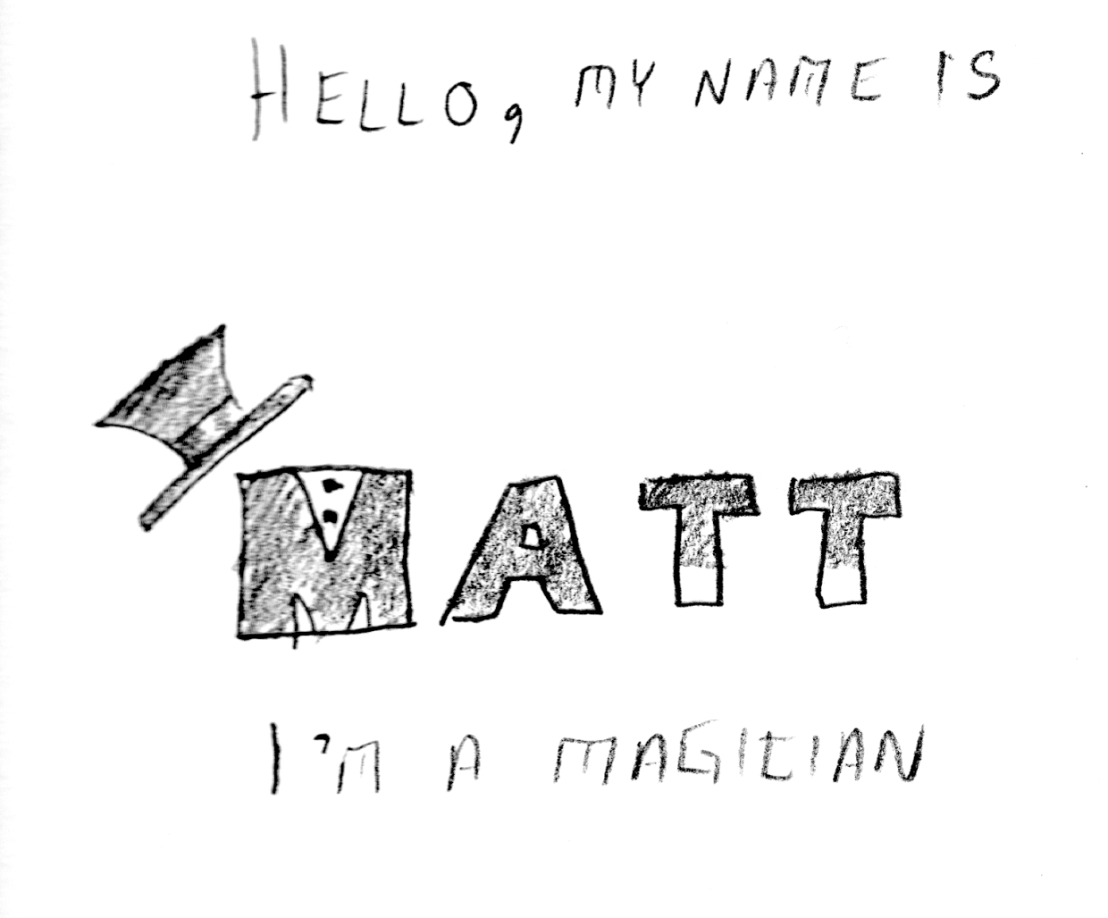
The first day of the week and we’ve hit the ground running on this first project. It’s almost the end of class and I’m just now getting to the 2nd (of three) portraits. I asked for help on my first iteration, because it seemed like something was missing. I had followed the basic draft pretty closely, but it felt bare and uninteresting.

After talking with the professor, it was clear that I needed to express a greater range of tools. This was my second iteration:

Better, but not great. I added an organic shape and used the gradient tool to create a shadow effect. Still, the image felt a little too flat. One more tweak:

This simple vertical offset creates a bit more motion and surprise. I’m not sure what more I could add or subtract at this point. On to my second portrait…

In order to create a three-dimensional “floor” I used the perspective grid tool:

It isn’t really easy to see what I’m experimenting with just by looking at the image, but I have several elements that are grouped into logical objects. The “wand tips”are made using the rectangle Shape Tool, arranged above the Text and then individually grouped with their respective “T”s. Same for the “shirt buttons” on the “M”, as well as the top-hat. I’m not sure if this one would benefit from color or not. Perhaps I can use the gradient tool to give the “wand” more of a cylindrical appearance?

ADOBE ILLUSTRATOR READING RESPONSE – ART 119

Over the weekend I had a chance to sit down and read over the first two chapters of Adobe Illustrator guide. I think I may have just confused myself. One of the key challenges is the fact that I have very little experience with Adobe’s Creative Suite. It’s like a whole new language. Furthermore, I do not have this software at home, and thus cannot easily relate to these new sets of terms. It is hard to apply knowledge when everything about it is purely theoretical. Last but not least: this was just a ton of new information.

At least there were pictures.

Clear as mud, but at least you can see it. Page 33 (Artboard printing)

Clear as mud, but at least you can see it. Page 33 (Artboard printing)

llustrator is a massive heap of skeuomorphisms, and this only makes sense for those who began their careers in print making prior to the advent of computers in Graphics Design. This can be a huge challenge for newcomers, but this challenge is hardly unique to Illustrator. True story: a seventeen-year-old in one of my freshmen courses once described the save button in MS Word as a “purple truck”.

Beep! Beep! I’m a truck!

Beep! Beep! I’m a truck!

See, the thing was, she’d never even seen a floppy disk before. This graphic held no contextual meaning for her. She never experienced the joy of inserting a 3.5-inch piece of plastic into a clunky (yet essential) device to save her document. By the time she was old enough for K-12, the iMac was standard, and those computers (controversially) never shipped with a floppy drive.

“No floppy, no problem! You’ve got the World-Wide Web, son!” source:betanews.com

“No floppy, no problem! You’ve got the World-Wide Web, son!” source:betanews.com

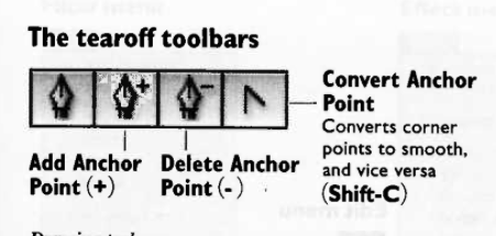
she accepted the function (saving her document was important, after all), but couldn’t make the connection between function and form. I’m not telling this story because it is funny (I still laugh when I think about her), but because I can now relate to her better after reading about Adobe Illustrator’s Tool Bar and Control Panel. Some of the symbols are easy to recognize, despite the fact that I’ve never actually used them in real life:

Page 3 – The tearoff toolbar

Page 3 – The tearoff toolbar

I’ve never used a fountain pen. I’ve had a classmate spatter ink on me accidentally with one, but that’s really about it. Generally speaking, I “get” pens. I’m fond of needlepoint over ballpoint, but that’s not the graphic here. What if I’d never seen a fountain pen before? How’d I ever hope to recognize the function?

I’m sure I’ll catch up, and with enough practice become proficient with this tool set. I just wonder how many “purple truck” moments I’ll have along the way.


INTRO TO ADOBE ILLUSTRATOR

Week 1 – Day 2

Introduction to Adobe Illustrator and Vector Graphics

Illustrator is part of Adobe’s Creative software suite (now “Creative Cloud”). The primary focus of Illustrator is the use of and creation of vector graphics. Most graphics are rasterized (a grid of pixels with assigned values); vectors are “drawn” by software (or hardware, if supported) and are not limited by resolution. At our university’s Mac lab, we have preloaded versions of Illustrator, here’s a quick run-through:

There are lots of ways to launch the program. My preferred method is to use Spotlight search.

Command+[Spacebar]

This will open a search box (this is like Google for your computer), just start typing “illustrator” and you’ll get an auto-complete before you finish typing it. Just hit Enter when it fills in the remaining characters. BAM! You’re in.

Next, we need to create a new project:

File -> New ->

Name: Lastname-Intro [Geiger-Intro ART119]

Profile: Web

Size: 960 x 560

Units: Pixels

Orientation: Landscape

After creating this new document, save it.

File -> Save ->

Save as: Lastname-Intro.ai [Geiger-Intro-ART119.ai]

Default settings -> OK

Terms:

Artboard

Working area


Shape Tool

Used to create a vector object


Vector object

            Vector Objects are defined with Paths and Points


Stroke

            Defines the thickness of lines (vectors)


Fill

            Defines the “filling” of an object (like Twinkies)


Arrange

            Illustrator “stacks” objects in the order they were created. To change this order, go to the top menu:

Object -> Arrange -> Send to…(back/front) Bring to (back/front)

Align

            Like with a text editor, aligns an object to different orientations (objects, Artboard, etc.)


Keyboard Shortcuts:

Option+LeftClick(on object)+drag

            Drag to new area to create a duplicate

LeftClick+drag(over objects)

            Bounding box selects multiple items

Command+S

            Save current progress

In-class exercise: practice drawing your name. I wrote mine in cyrillic:

The letter “а” is tricky, and I didn’t quite get it right on the first try (“Матвей Гайгер” The first “a” looks like an “o”). This was all done with the pen tool, but switching back and forth between the curve and straight pen.

Project 1: Typographic Portraits

Timeline:

Mar 30: Project Intro, sketch ideas for next class (blog)

Apr 05: Work time in class following demonstrations

Apr 07: Work Time in class, following demonstrations

Apr 11: Review Typographic Portraits


Example: “Eruption” “Tilt-A-Whirl” “Balloon Darts” “Roller Bowler” “Cock Clock” “Exit” “Copernicus”.


Choose 3 of 6 provided character prompts. Use your name, first and/or last or nickname. Along with typographic and design…


“Hello my name is______ and I’m…”


Due Monday:

Sketches and ideas for project

Reflection on Open House (Blog)

Reflection on reading (Adobe Illustrator (Blog))