Our online survey is now underway, and while this virtual format isn’t exactly like so-called “speed dating,” we are hoping that it will be able to serve a similar purpose for our research. Creating a meaningful online experience for our participants was a tall order, especially with such tight constrains. There are many risks when created a fully automated and hands-off system. Not being there to clarify or to address questions or concerns in realtime was something we needed to accept as a trade-off. In exchange, we have a dozen unique participants ranging from 2 years to 27 years of experience, and from various districts around the country.
So far, the majority of responses have been from an online community of English teachers, so our data is skewed toward this perspective. On the plus side, English teachers provide excellent written responses. To avoid the pitfalls of statistics and quantitative analysis, we designed an online survey with open text fields, and we framed our questions around hypothetical scenarios. This would provide us with reflection and insights into how teachers imagine these concepts for themselves, and what perceived deficiencies come up for them in thinking about these systems in action.
Screenshot of survey responses, exported into a CSV file
The last 24 hours in particular have been very exciting, as we finally gained access to online educator communities. This process has been slower than wanted, but we first needed to fully develop our survey before we could deploy it. This process in and of itself was a design challenge.
Last weekend, we decided to use the Tripetto platform. This gave us the same logic capabilities as TypeForm, but without any additional costs. It became clear almost immediately that we would need to prototype and refine our survey before receiving teacher feedback, and this effort was highly collaborative.
With multiple teammates, it was possible to divide this task into several areas that could be worked on independently and in parallel. We first decided on a basic structure and strategized the division of labor. Carol worked on the text/content based on a logic diagram we crafted together. While Carol crafted this outline, I created a mockup version in Tripetto. Without access to finalized concept sketches, I took some poetic license.
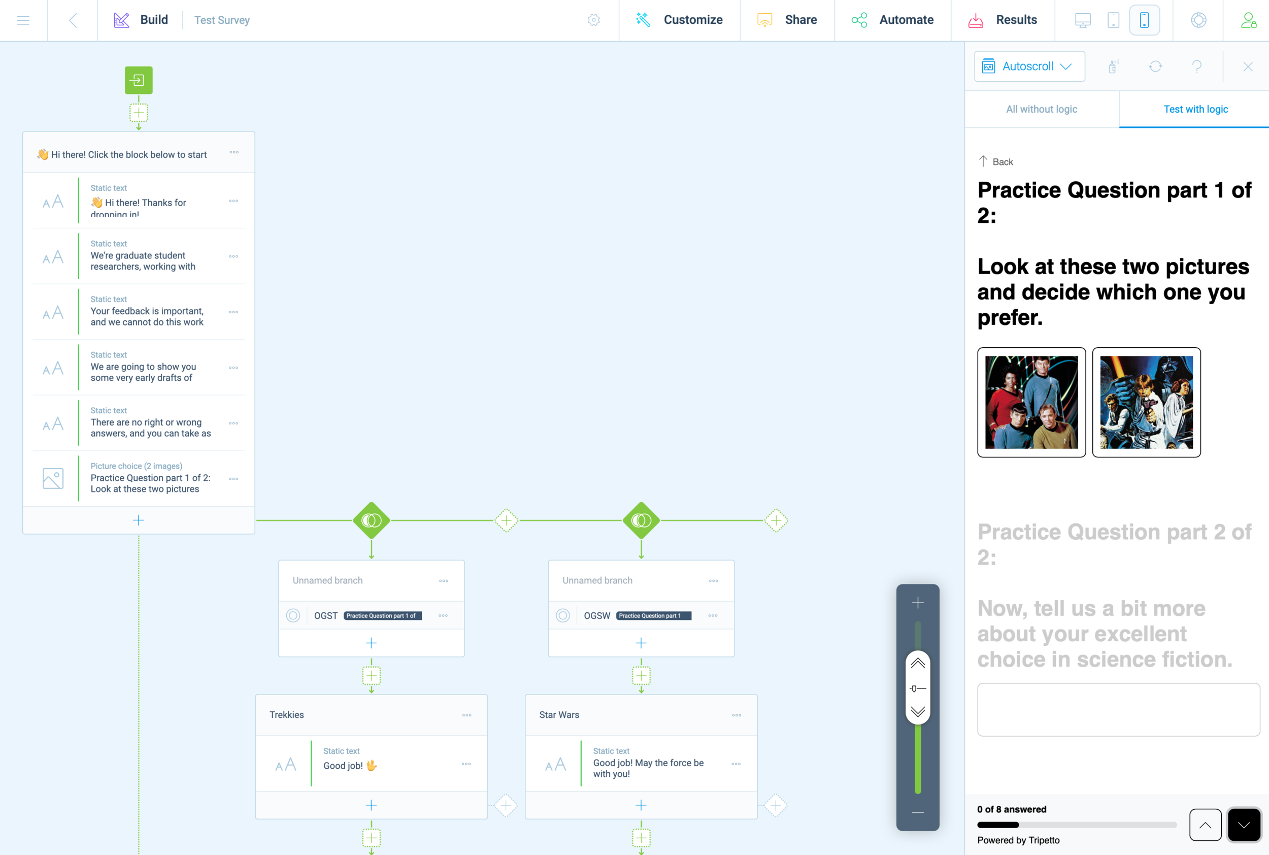
Screenshot of 2nd iteration prototype survey
As Carol and I worked together to refine the text copy, Cat and Chris worked together to create images and descriptive text for our participants. Once all of this content was ready for Tripetto, we began doing test runs, trying to break the experiences. This revealed some quirks with Tripetto’s logic functions and some of the less apparent features.
There are a few honorable mentions; Tripetto has a lot of subtle features that we often take for granted in other online experiences. Things like placeholder text, required fields, multiple choice radio buttons, checkboxes, multi and single-line text boxes. During the refinement phase, these features became essential and it was exciting to discover them—only after they were deemed essential enough to be worth the effort.
The minimalist UI of Tripetto made these features less evident, but not too hard to locate or execute. From start to finish, this experience felt a little shaky and uncertain but viable.
I often found myself this week grinding away on the platform, slipping into a state of mind that Mihaly Csikszentmihalyi describes as “flow.” In other words, creating a survey on Tripetto wasn’t easy to use, but just challenging enough to keep me interested in working through obstacles. I think that what helped support this effort the most was building models within platforms where everyone on the team is already fluent. For us, this was primarily Miro, Google Docs, and Sheets.
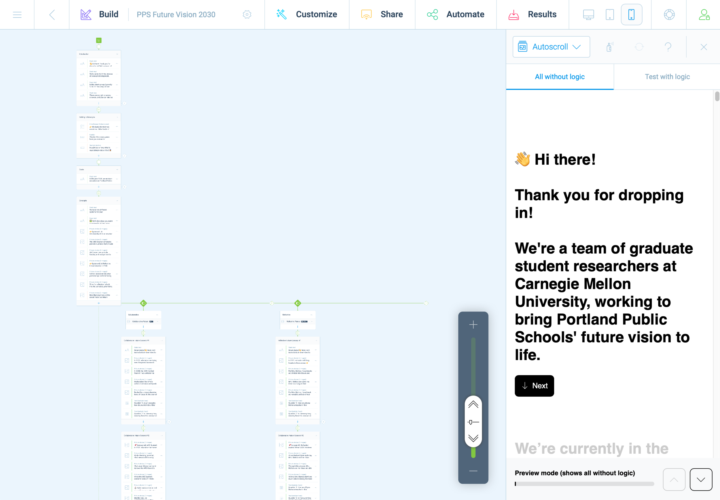
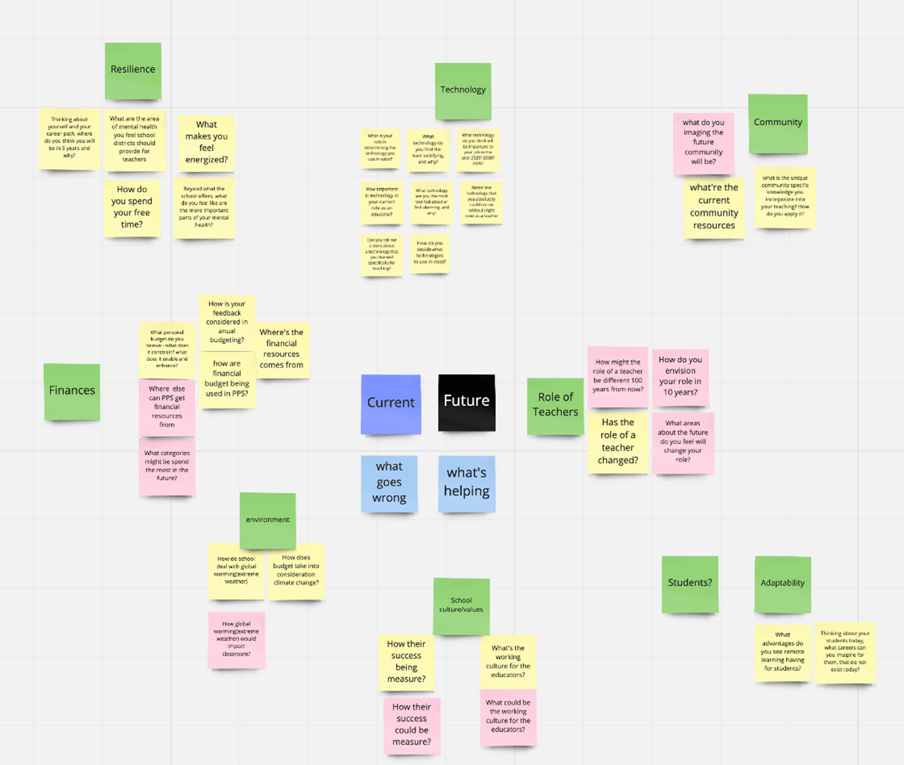
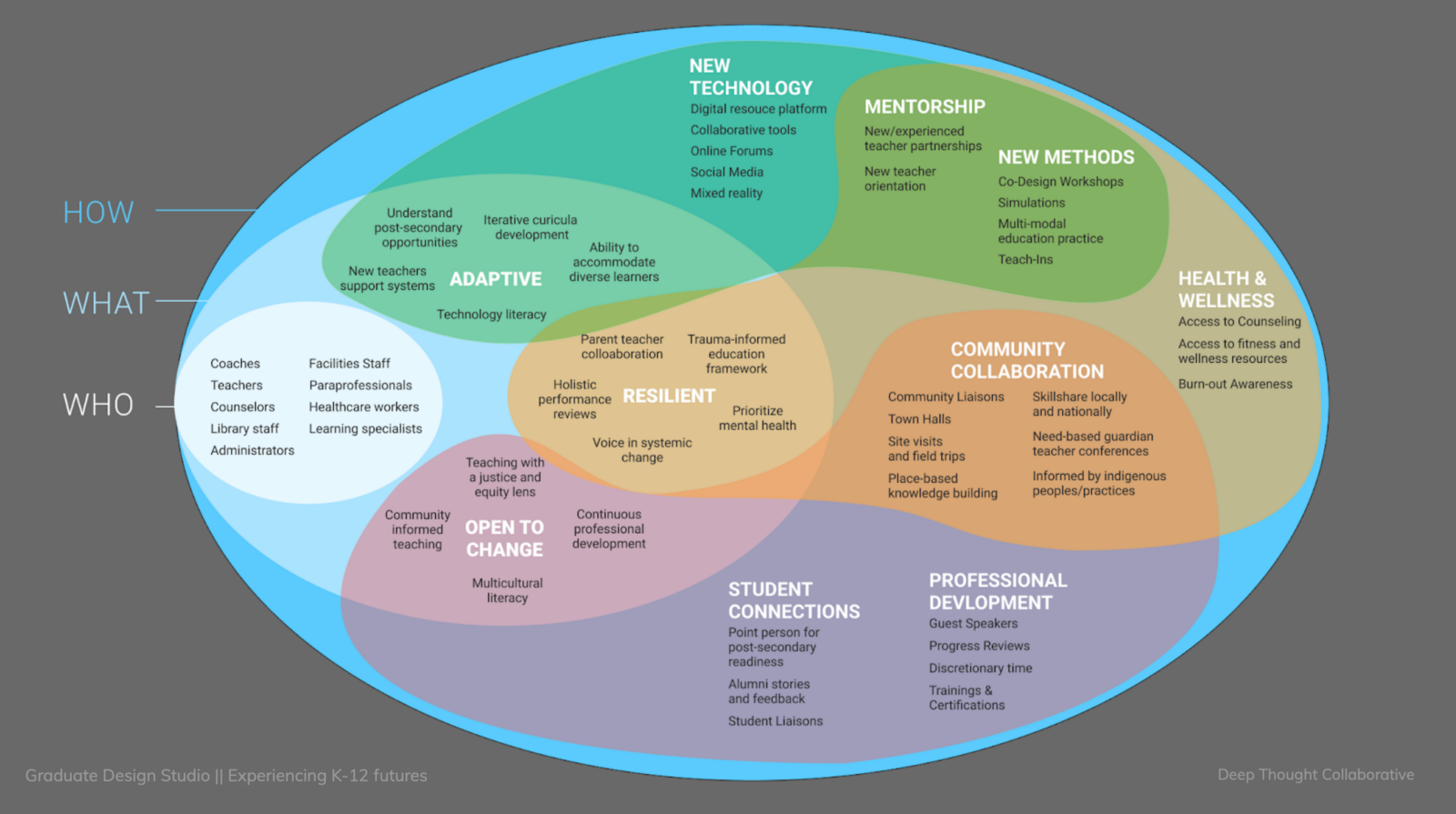
Screenshot of two representations of the survey, carried across platforms (Miro and Sheets)
First impressions matter, and we didn’t want to put out anything that wasn’t necessarily a work in progress. Even with this in mind, we did have a few last minute tweaks as we adapted our survey to maximize pulling power with other social media environments.
Arnold Wasserman’s desk critique was incredibly valuable for our team, as his feedback helped us to consider the importance of our survey as a communication tool. He recommended that we make the implicit, explicit, to directly communicate to our participants what we expected and why. We were encouraged to explain what questions we were asking, and to share this openly. This kind of transparency can be tedious, especially in text-based systems. I took this to task and simplified statements throughout the entire experience.
This gave the survey a personality all its own; like a casual and curious friend, we asked about specifics but with little pressure. We kept things open.
Open data cannot be calculated, it must be evaluated for patterns. Next week will be a scramble to synthesize patterns and new insights as we work to finalize system concepts into well defined parameters. We hope that through this process we will also identify opportunities to produce relevant and compelling artifacts (our final output/deliverable).
It still feels like a risk to be so far into a process and to still not have a clear idea of what it is we are making. We instead draw our assurances from what we have already made: an index of relevant articles, interview notes, countless diagrams and visual representations of high-level abstract concepts and maps at almost every level of visual fidelity imaginable, hundreds of presentation slides, dozens of pages of reflective text, and months worth of slack messages, shared links, and drafted emails. We created interactive digital workshop spaces and protocols for our participants, and archives with 256-bit encryption.
When looking at the collective volume of effort from this team, it’s difficult to imagine that we wouldn’t make something meaningful in the end. Is that too optimistic? Ask me in a month.

