Spoonfuls of updates

This week was packed full of progress on multiple projects. I received feedback for my group’s birth control information app “MyGallery.” Our work was even featured on CMU’s Design page.

Crafting an iconographic representation for the withdrawal method was my proudest moment.

Crafting an iconographic representation for the withdrawal method was my proudest moment.

I’ve continued to explore fluid simulations with Blender. I’ve ran into some technical hurdles: Blender 2.82 uses a variety of protocols to leverage GPUs for rendering and computation. It offers an AI-driven denoiser (Optix), CUDA path tracing, and OpenCL. My MacBook Pro has an AMD Radeon Pro 5500M GPU as well as the option to plug in a Radeon Frontier Edition (first generation Vega) eGPU on Thunderbolt 3. Plenty of GPU compute power in either configuration, but there is a snag: MacOS 10.15 (Catalina) has deprecated OpenCL in favor of Metal 2+. CUDA and Optix are proprietary to nVidia GPUs. Apple hasn’t shipped a Mac with nVidia GPUs since Kepler launched (GeForce 700 series). Blender supports AMD ProRender, but I found it was terribly unstable.

I could easily slip into a tangent about how unfortunate the breakup between Apple and nVidia truly is, but I will spare you.

My current workflow involves queuing some tasks to my desktop, running Windows 10. The GPUs are dual Radeon VIIs. Unfortunately, I found that rendering on Blender is unstable when both GPUs render in parallel. No problem, since I can free up the other GPU for Folding@Home (a hobby of mine that has exploded in response to COVID-19). Who would have guessed that a global pandemic would boost a distributed computing project to exascale?

Despite these obstacles of platform compatibility, I have made significant progress on my simulation-based research. It is difficult to understate how exciting this project has been for me. For some context: the ASCI Red supercomputer (at the Sandia National Laboratories) was built in 1996, and was the fastest supercomputer in the world until 2000. It was the first computer to achieve true terascale computing (one trillion floating point operations per second). I built my first terascale computer in 2013. This was shortly after leaving my job at Intel. There was something very gratifying about building a computer with a CPU I helped manufacture. GLaDOS G4 (you can see the project here, scroll down to “Everything Else”) was built with a GeForce GTX 780 GPU and Intel Core i7 4770k overclocked to 4.5 GHz. It ran nearly silent and fit inside an up cycled Apple Power Mac G4 (microATX equivalent) case.

The ASCI Red supercomputer was designed to simulate nuclear weapons tests. Today, I am using a system roughly ten times more powerful to simulate soup spilling out of a spoon. I was inspired to approach this problem by two projects. The first was a 2013 project from Portland State University (my alma mater) to make a coffee cup for zero-gravity environments. they used drop cages and 3D printing to iterate several designs until they had a shape that held liquid. “It wasn’t needed, but it was requested.”

The other project hit me right in the heart.

The S’up Spoon is the embodiment of good design. The design was inspired by deep empathy for a user’s problem, and the solution involves as little design as possible. There are few technologies in this world that we trust enough to put in our mouths. If you can make it in this space, you can make it (almost) anywhere. During the fall semester, Moira and I visited the Carnegie Museum of Art. They had an exhibition on accessibility design, and I was brought to tears by stories of innovation and vibrant improvements to quality of life for people with disabilities. Technology, at its very best empowers people to realize their fullest potential. We can easily get lost in the exhilaration of the complex, but this impulse must not dampen our ability to appreciate the elegance of simplicity. Some problems are best solved by form. I saw many incredible solutions in that exhibition, but this spoon has really stuck with me.

My goal is not to make something better, but perhaps a little bit different. The shape of the S’up spoon is intuitive, and if we had never seen a spoon before, we might conclude that it is the better design over more traditional forms. It is however, under our current cultural context, a strange thing to behold. It looks more like a wizard’s pipe or a warrior’s horn. It is beautiful and ergonomic. I do not intend to elevate those specifications. Instead, my goal is to make a spoon that is inconspicuous while still achieving similar results for users who suffer from motor movement difficulties.

How has my first design faired under simulation?

While I can certainly see the appeal of a long hollow channel, I’ve become increasingly concerned with how this shape my be difficult to keep clean. I can imagine objects getting wedged toward the back depending on what is being consumed. I have began to work on a second iteration with a more shallow channel. Still, this first iteration does fairly well. It is managing to retain most of the 15ml (i.e., 1 tablespoon) of fluid under rapid movement.

I enjoyed this simulation so much that decided to make a rendering:

I have not yet gotten back into Cinema 4D to evaluate RealFlow. Despite the challenges regarding compatibility, I am truly impressed with how powerful this open source software has become with this latest release.

Now that I have established this workflow, I can easily switch out revised designs to test under identical conditions. I’m still not sold on the current handle shape, and I think I can improve liquid retention by tweaking the angle of the lips. The flat bottom (Chinese style spoon) does fairly well, with it’s obtuse angle walls. Next, I will try a concave structure with a wider base for the handle and a more aggressive descending angle.

Prototyping – Part 2

Working with Blender has continued to go well.

I have also been looking at some of the existing solutions in this space:

KFS Easy Eat

http://www.eating-help.com

Liftware, by verily

https://www.liftware.com

EliSpoon

https://elispoon.com

Ornamin - Supportive Cutlery (Parkinson’s)

https://www.ornamin.co.uk/shop/cutlery-set?number=SW24

S’up Spoon

https://www.youtube.com/watch?v=C8nNlWw6KbA

Apex Medicine Spoon

https://www.riteaid.com/shop/apex-medicine-spoon-0233706

I have been sketching and studying these forms in consideration for my own designs.

Sketch.jpg
Sketch 1.jpg
Some shapes are unappealing because of their associations. These still deserve consideration, as they function well in this space.

Some shapes are unappealing because of their associations. These still deserve consideration, as they function well in this space.


This week I will begin iterating designs in Fusion 360. Hopefully, I will finally be able to make use of my RealFlow trial license. I’m curious to see how the “out of the box” settings function with these geometries.

Fluid Simulation in Blender

“Throw off your fears let your heart beat freely at the sign that a new time is born.” — Minnie Riperton

I’ve completed my workflow design for fluid dynamics testing in Blender. Here’s a proof of concept:

Now I just need to figure out RealFlow in C4D…

Blender: Time To Make The Donuts

I’m very happy with the results of my first project in Blender.

White Frosting

White Frosting

Classic Pink

Classic Pink

And Nekkid!

And Nekkid!

After struggling with Cinema 4D, I decided to use a plugin rather than trying to cludge together some handcrafted fluid simulation. Unfortunately, I ran into a licensing problem with Next Limit’s RealFlow plugin. I’ve been emailing back and forth all week, and they finally got a fix for me — SUCCESS! While I waited to sort that out, I decided to give Blender a try. I began following this tutorial, but quickly found myself getting lost. I needed to become more familiar with the software and interface. I decided to follow a beginner’s tutorial to get my feet wet. I choose this particular video series because it employs procedurally generated elements, and covers all the basic modeling commands, node handling, and the complete stack of scene construction. And also: donuts are delicious. The world is terrifying, and we could all use something sweet.

I am honestly shocked that Blender is a free program. Many 3D programs are horrifically expensive; without student licensing, I could never afford to touch most of the 3D tools I’ve been learning over the years. Yet Blender seems to be very capable as a 3D program. I have only scratched the surface, but it is very impressive. Now that I have familiarized myself with Blender, and have a working fluid simulator plugin for C4D, I am in good shape to begin A/B testing.

Prototyping Cutlery

For one of my final projects this semester, I’m interested in creating a set of eating tools that help account for involuntary muscle movements (e.g., Parkinson's disease or tremors) and other mobility difficulties that limit the enjoyment and consumption of foods; I'm interested in exploring simple solid shapes, living hinges, and assembly forms derived from explicit advantages of additive manufacturing techniques.

[I want to make a really nifty spoon.]

Fabricating physical prototypes will be a challenge (…)

Seriously: fuck you, COVID-19.

This is not the only challenge, however. Finding access to food-safe materials, conducting a series of user tests, iterating forms, and self-directed research will also require creative workarounds to overcome the limitations of working while under “shelter-in-place” orders due to global pandemic.

I have decided to go 100% digital. instead of building various forms and testing their ability to hold fluids under rapid motion, I will instead conduct a series of simulated physics tests to evaluate forms. For the first part of this project, I am required to conduct an A/B test or evaluation. I have decided to conduct dual testing using different 3D programs.

Method 1:

Maxon Cinema 4D includes a variety of physical simulation abilities—including particles and fluid dynamics. I intend to leverage this software’s capacity to test various designs and forms. Tests will be designed to evaluate fluid retention under repeated multi-axial movements. Cutlery designs will be tested against traditional forms (e.g., standard soup spoons).

Method 2:

Blender is a free, open source platform for creating 3D models, rendering, animation, and more. Among the built-in features is a fluid simulator. Combined with rigid body and gravity physics, it should be possible to evaluate a variety of spoon shapes and (potentially) even different forms of cutlery.

Considerations:

By using two different simulations, it should be possible to more thoroughly evaluate a design’s fluid retention abilities.

Timeline:

Week 1 — Cinema 4D Workflow: Since I am already familiar with Cinema 4D, I have decided to begin this project by constructing my first simulation with this software. I will use Fusion 360 to generate original spoon designs, as well as a “traditional” spoon shape to compare performance.

Week 2 — Blender Workflow: Using the assets from week 1, I will spend week 2 developing and executing a comparable test running under Blender’s fluid simulation engine.

Resources:

Blender Tutorial - Realistic Fluid Simulation: https://www.youtube.com/watch?v=zmw-BTCbWMw

Cinema 4D Tutorial - Water simulation Animation: https://www.youtube.com/watch?v=JehbYBAZw7c

What does Day 1 look like?

Let’s just say I have a lot to learn.

Interactive Design Prototyping

THE TIME HAS COME TO…PUSH THE BUTTON

Wireless communication between Arduino #1 and #2

Wireless communication between Arduino #1 and #2

My current project in IxD Prototyping involves physical computing (i.e., “interactive systems that can sense and respond to the world around them.”) I have worked with Arduino before (Restricted Area, 2017) but this newest project is expected to have a daily use. In my head, I keep a long list of annoying technology interactions—this gets updated frequently. We are saturated with unsatisfying technology and devices that cause more problems than they solve. We have inconveniences stacked upon inconveniences, and if we were to step outside of this environment, you would inevitably conclude that most electronics are made to punish the buyers. I am looking to improve just one such interaction.

Back in 2012 I bought an HD video projector. If you love to watch movies, there is something magical about having “the big screen” at home. I love it. Do you know what I don’t love? Using an infrared remote control on a devices that is mounted above and behind me. Seriously, Epson: what where you guys (and yes, I’m assuming it was a team of men, with their dumb penises getting in the way of common sense) thinking?! The primary function of the remote control is to simply turn the projector on and off. I would gladly give up the remote control entirely if I could simply move the power button to the armrest of my couch. Instead, I must contort my arm in Kama Sutra fashion just to find the right angle to get the sensor to recognize the POWER-ON command from the remote.

Getty Images: the various methods for turning on an Epson HD Projector.

Getty Images: the various methods for turning on an Epson HD Projector.

My girlfriend’s method to bypass the projector is more elegant: she retrieves a step-stool from our utility closet and presses the ON/OFF button on the projector chassis. This works well, but … well, let’s just say, it ruins the mood. I began to explore other options, and realized that the primary issue is that IR remotes are directional. The IR sensor is part of the assembly, and cannot be relocated. Arduino is capable of IR communication, it is also capable of RF communication. Radio frequency is far less dependent on line-of-sight, especially within the context of indoor and residential use. Imagine what WiFi would be like if it worked over infrared. Consider also that Apple abandoned their IR remote interface for the Mac.

Enter the Arduino

I found a few open source projects that utilize IR and RF communication:

https://learn.sparkfun.com/tutorials/ir-communication/all

https://www.electroschematics.com/ir-decoder-encoder-part-2-diy-38-khz-irtr-module/

https://create.arduino.cc/projecthub/electropeak/use-an-ir-remote-transmitter-and-receiver-with-arduino-1e6bc8

https://learn.adafruit.com/using-an-infrared-library/hardware-needed

https://www.sparkfun.com/datasheets/Components/nRF24L01_prelim_prod_spec_1_2.pdf (PDF Warning)

https://www.deviceplus.com/arduino/nrf24l01-rf-module-tutorial/

https://forum.arduino.cc/index.php?topic=421081.0

https://howtomechatronics.com/tutorials/arduino/arduino-wireless-communication-nrf24l01-tutorial/

All of these resources are excellent. I want to call attention to one more link: https://create.arduino.cc/projecthub/muhammad-aqib/nrf24l01-interfacing-with-arduino-wireless-communication-0c13d4

I have a bone to pick with this one. Take a look at the wiring diagram:

Diagram created by /u/Muhammadaqibdutt

Diagram created by /u/Muhammadaqibdutt


Note the LED pin-out for the receiver. This diagram shows the positive leg of the LED connecting to Pin 3

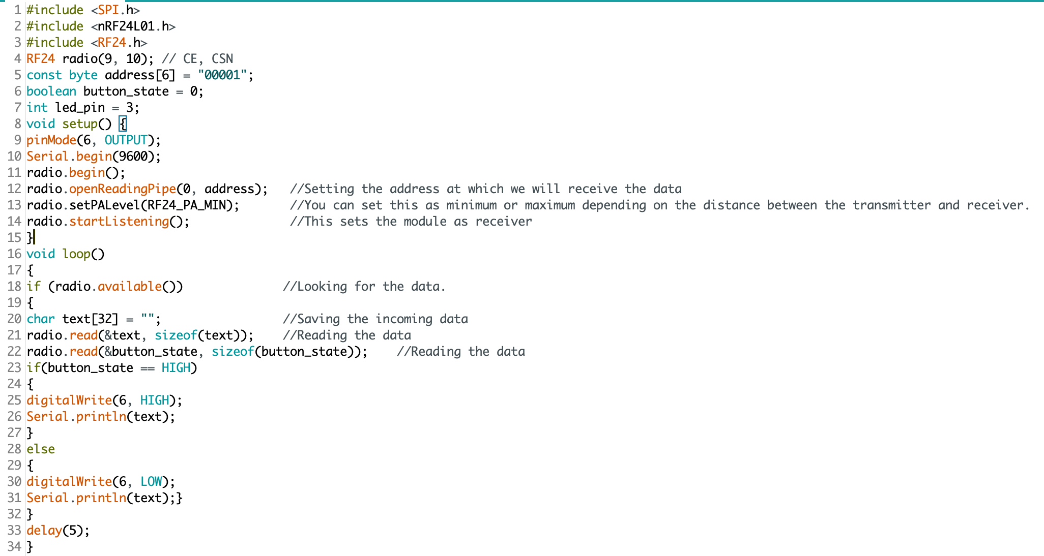
Now, lets take a look at the code:

SOURCE.png

The devil is in the details: “digitalWrite(6, HIGH)” condition turns the LED on. Pin 3 does nothing.

This made for some very “fun” troubleshooting. I’ve since ironed out all the kinks, and have successfully pirated the IR remote signal from an Epson brand projector (on loan from the Design Office at CMU), and have moved on to making an enclosure. Will I 3D print or laser cut? I have not yet decided.

Here is some sample code for my RF triggered IR emitter:

(NOTE: this code is just one half of the project, and by itself cannot do anything. You’ll also need IR and RF libraries to make this code work on your Arduino)

#include <SPI.h>
#include <nRF24L01.h>
#include <RF24.h>
#include <IRLibAll.h>
RF24 radio(9, 10); // CE, CSN
const byte address[6] = "00001";
boolean button_state = 0;
int led_pin = 3;
IRsend mySender;
void setup() {
  pinMode(6, OUTPUT);
  Serial.begin(9600);
  radio.begin();
  radio.openReadingPipe(0, address);   
  radio.setPALevel(RF24_PA_MIN);
  radio.startListening();
}
void loop()
{
  if (radio.available())
  {
    char text[32] = ""; 
    radio.read(&text, sizeof(text)); 
    radio.read(&button_state, sizeof(button_state));
    if (button_state == HIGH)
    {
      digitalWrite(6, HIGH);
      Serial.println(text);
      //Arduino Remote On/Off button code
      mySender.send(NEC, 0xffa25d);
    }
    else
    {
      digitalWrite(6, LOW);
      Serial.println(text);
    }
  }
  delay(5);
}

Playing Catch-up

Thinking fast vs. looking back

Season 2, episode 1 is easily the most famous episode of the 1950s TV series, I Love Lucy. Ethel and Lucy go to work at a chocolate factory, while Fred and Ricky take on their respective housework. Whether or not you’re familiar with this comedy, chances are you probably know (or are about to know) where this is headed.

I Love Lucy, “Job Switching” (Season 2, Episode 1), 1952

I Love Lucy, “Job Switching” (Season 2, Episode 1), 1952

Lucy and Ethel are assigned with the task of wrapping chocolates on an assembly line. Having already disappointed the foreman with their poor performance from earlier in the episode, this is their last chance to avoid being fired. Their task is simple, and repetitive: wrap the chocolates as they come down the belt, and don’t let any chocolates through unwrapped. At first the speed is manageable, but it quickly speeds up, and the quantity of chocolates increases dramatically — and that’s what makes this episode so damn funny. Lucy and Ethel panic. They begin setting chocolates aside, but eventually resort to stuffing the chocolates into their blouses and mouths. At the end of the episode, Fred and Ricky realize that they are terrible housekeepers, and decide that they want Lucy and Ethel to return to their traditional roles. As a token of appreciation, Ricky gives Lucy a gift: a box of chocolates.

What does any of this have to do with LxD, civic engagement, elections, or the unaddressed hazards of 21st century technology? Not much. It is however, a great analogy for my schedule last week. I managed to stay on top of things through the first few weeks of the semester, but then the belt sped up, and I had too many “chocolates” without the capacity to wrap them. I’m now looking back, instead of writing and reflecting in the moment. This shift in perspective has been fruitful, I along with the rest of my team have made significant strides toward our goal of developing a learning experience.

What is still missing are my posts on Medium and this personal blog. I want to document this process, but am doing so one week later. The next two posts (06-11 February) are dated to correspond with the class schedule and for their prompts. This is done for clarity, and not a deception. The advantage of writing from this vantage point is that I now have the benefit of knowing how these ideas unfolded. I can write about what was done, and how it changed things.

Notes from class presentations

Considering approaches and interventions

This week, groups in our class presented their initial findings from researching their chosen field of interest. I recorded some of my ideas and observations during class session and thought it would be worthwhile to include a couple of them here:

Ema, Kate, Nick, and Yue: Food Systems

This group is exploring the relationships that college freshmen have with their food, through the context of campus food vending services. There are many places to eat on campus. We have a food truck, cafés, several eating areas in the University Center, as well as residential halls. There is a disconnect between the staff and the food they serve. This is compounded by the disconnect students experience by not preparing meals themselves. The team has proposed a series of interventions, designed to create more student engagement and a sense of ownership.

My thoughts: Freshmen are going through a series of drastic changes in their life. This presents a unique opportunity to change habits early in adult life — people are more likely to adopt new habits during periods of change. I am also curious about the idea of a student-led cleaning weekly session. Could this produce an opportunity to build empathy with the staff? Could it create a greater sense of joint ownership?

Amanda: Civics and Tech

Amanda is interested in how to instruct political radicals to leverage technologies to mobilize and affect meaningful political and social change. She has several different avenues to explore along this subject:

  • Political engagement through digital and physical spaces

  • Who are their stakeholders and what are your thoughts on their understanding of them and discoveries they made?

  • Mass mobilization and online activists

  • Students

  • Politically-minded

  • Radicals

  • High focus on community

  • Interested in both digital and analog engagement

The *How* remains unclear (this is more or less true for all of the groups at this stage), but I do have some thoughts, given that we began this process as a single group:

What are your thoughts on their use of the 4MAT System (McCarthy) to propose ways of planning and executing effective learning experiences?

I agree with the method of starting with the WHY quadrant of the 4MAT chart. I do wonder if you will meet an obstacle due to knowledge gaps. “Why” can be harder to justify if the intended audience does not already understand “WHAT.” I wonder if there is a way to leverage the audience’s curiosity, and to help them learn of their own knowledge gaps. How then would you proceed from that discovery, to compel them to consider the “WHY.” One other thing that comes to mind is the alternate reality game, “YEAR ZERO” (https://en.wikipedia.org/wiki/Campaign_timeline_of_Year_Zero). Originally launched in 2007, it anticipated a future America in the year 2022 (we are getting close now), where America’s government has fallen, replaced by a Christian-dominionist, fascist government (this seems more likely now, which is terrifying). A resistance group uses digital technologies to try to fight back against an oppressive regime, leading to a series of clandestine information sharing methods. Have you considered alternate reality games? It could spark some creative methods for teaching this subject.

Tackling the challenges for our learners

Bridging knowledge gaps.

Working with a team of three other designers, we began to see points of divergence for our goals. Amanda’s focus on online activism and leveraging new technologies was compelling, but she was driven to do this work independently. Nandini and Michelle were also interested in the digital realm, but were not sure about the framing for citizenship.

One of the key challenges for addressing citizenship in the 21st century is the fundamental misunderstanding by the public of how we interact with these new technologies. Twitter, Facebook, Instagram, etc. have removed the traditional political boundaries and geographic limitations of culture and ideas.

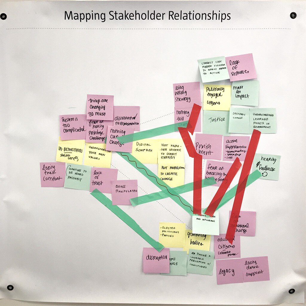
This is our stake-holder map, there are many like it, but this one is ours.

This is our stake-holder map, there are many like it, but this one is ours.

The advantage of this style of mapping is that we do not need to work from the current state toward feasible solutions. While the appearance may be linear, we actually developed our ideas for bridging the gaps by first looking forward, to a preferred state. Herbert A. Simon succinctly described the field of design as “changing existing circumstances into preferred ones,” which is exactly what we are plotting with this map. We then can backcast from the preferred state, and identify patterns and opportunities for intervention.

This tool is simple as it is effective. For weeks we had been looking at how technology was affecting citizens’ perception of reality (bots, trolls, hackers, fake news, hoaxes, disinformation campaigns, post-truth, etc.) but we had not adequately considered how bidirectional that perception was. In late 2013, a hacktivist documentary titled, TPB AFK (The Pirate Bay, Away From Keyboard) was released. This film chronicled the political and social aspects of digital sharing, and the rise of Sweden’s “Pirate Party.” Having won seats in parliament in 2009, The Pirate Party of Sweden was a recognized political group. Since then, other nations (e.g., Germany and Iceland) have also elected members from this movement.

The philosophy of the Pirate Party is best understood from their belief that “the internet is real.” They do not make the distinction between interactions “IRL” (In Real Life) and “online.” Instead, they use the term “AFK” (Away From Keyboard) to describe that state. In American politics, we can see the disruption all around us from this misunderstanding. People have been tricked into believing that their online activities are somehow contained, safely behind a prophylactic digital barrier. It’s “on the internet” and therefore not real. Except that it is. Imagine the mayhem that would exist if people believed that their personal vehicles and the roads on which they travelled were somehow a totally self-contained reality, separate from everything else.

Our goal therefor is not to leverage technology to help citizens become more engaged IRL, or AFK, but to help them understand that they are still citizens, even (and especially) when occupying digital spaces.

Considering stakeholders

Civic engagement: how grassroots movements make lasting impact.

As I continue to think about what citizenship truly means, I am disturbed to think about the lack of participation in western democracy. As I mentioned in an earlier post, the 2016 general election saw a 20-year low in voter turnout. It is tempting to shake my finger and to blame systems and policy (I still do this, in private), but when you pan back and look at the tension between discrete categories, it becomes much clearer what the stakes really are. I have heard from many of my closest friends and peers, that the election of Donald Trump has sparked an ad-hoc civics class. The Washington Post even launched a podcast whose title illustrates this phenomenon: Can He Do That?

One of the factors that prevents people from engaging with politics in a meaningful way, is the pervasive feeling of uncertainty. When you do not understand the mechanics of government and politics it is easy to be discouraged. The first amendment of the US Constitution guarantees the right to petition government for redress of grievances. This principle makes sense, but government is not a monolith. Government is not a person or a place, so who or what do you call upon when you have a valid complaint? When there is an emergency, you can call 9–1–1, but what about the slow-moving emergency of climate change, wage stagnation, the rising costs of education, childcare, or medical services? We the people might be pissed off. Many of the people who voted for Trump were voting with their middle finger — people often make poor choices when acting in anger.

Grassroots movements have historically been the most successful when groups form durable solidarity toward specific and appropriate goals. If we can find a way to synthesize a learning experience to form coherence with groups who share common grievances, we can make real impact. The 2020 election presents a unique opportunity to pressure elected officials. This is an ideal setting for researching this wicked problem.

Decoding a learning experience: notes from class presentation

We have not yet finished in-class presentations, but I wanted to take a moment to record what has been seen so far:

“The Learning Network” Provides current events in the format of lesson plans. Their goal — to expand reach to students. This is achieved through a combination of online lesson plans, quizzes, and student opinions.

Want to learn to play racquetball? Hillary described her initial interest as “like playing tennis, but indoors” — which makes sense, considering that we are living through winter in Pittsburgh. She discovered that Pickleball players (who are mostly 50+ year olds) are obsessed with this sport, and have countless posts on YouTube. Racquetball videos on YouTube, by comparission, are exceptionally rare (very few videos, the top pick being an upload from 10 years ago). Key takeaway: learn the moves before learning the rules.

Michelle Chou presented a sustainable seafood guide. App and website: Seafoodwatch.org, a resource created by the Monterey Bay Aquarium. Users can enter a search for the type of seafood they want to eat. The guide then provides information and recommendations (environmental impact, overfishing, etc.) Categories include: Best Choices, Good Alternatives, Avoid.

Kate played a showreel for the barbican Digital Revolution Exhibition. This traveling exhibition seeks to inform the public on how digital culture permeates modern-day life. The most impactful exhibit (I think) was an exploration into “Digital archaeology” (the history of human computer interaction).

Next, we looked at an online tool designed to teach DSLR users how to be more effective at digital photography: http://photography-mapped.com/. Most DSLR owners shoot in Auto-Mode, and never touch the manual settings. This interactive website explains the different functions of a DSLR. One of the key features of the siteShows instant feedback to help develop understanding.

There were more presentations (I might come back and post more from my notes), but you may have already noticed a pattern: new technology is what makes all of these learning experiences possible. These experiences may happen online or in-person, but all of them are leveraging technology to enhance people’s learning. Some of these experiences were not even possible a few decades ago.

Decoding a learning experience: a case study of factitious

One major area of concern going into the 2020 election is the role of social media in spreading disinformation. While I firmly believe that social media companies (e.g., Facebook and Twitter) need to take a more proactive role in combating fake news (and other propaganda), users and community stakeholders can also help to fight against the tide. One helpful tool is an online game, factitious.

The rules are simple: players are presented with a headline, text, and images — is it real or fake? The correct answer will be rewarded with points, while incorrect answers will provide helpful tips for how to spot a fake. Why is this game important? One of the hard-learned lessons from the 2016 election year was that people often share a news story without ever vetting the contents. Even worse, many Facebook users were willing to share a news story without ever having read the article.

What works: the game is simple, informative, entertaining, and free to the public. What could be better: the game is low stakes, and while that certainly encourages players to give it a try, it doesn’t have any replay value, or real incentives for competition. This could be improved.

Related links:

https://www.brookings.edu/blog/order-from-chaos/2018/05/09/how-misinformation-spreads-on-social-media-and-what-to-do-about-it/

https://www.brookings.edu/research/how-to-combat-fake-news-and-disinformation/

https://www.cits.ucsb.edu/fake-news/protecting-ourselves-teach

https://www.poynter.org/ifcn/anti-misinformation-actions/

Citizenship and technology: questions and hypotheses

This week we continued to explore citizenship from the lens of learning experience design (LxD). This issue is complex, affecting countless individuals, institutions, systems, and more. It was helpful to visualize the issue with a team (we continued a second day of whiteboard sketching, with post-its for card sorting. Ultimately, this helped us to identify the categories of “Five Ws” (Who, What, When, Where, Why) and How.

Who: voters (including potential voters). In 2016, voter turnout was at a 20–year low. Nearly half of voting-age Americans did not cast a ballot in 2016. It could be easy — even tempting — to look at this group and condemn their inaction. After all, Hillary Clinton received nearly 3 million more votes than Donald Trump, but lost the electoral college due to roughly 100,000 votes spread between three so-called “swing states.” If we ever are to have a health democracy, we need more people to vote, and they need to vote consisently. There are no “off years” for civic duties.

What can be done to increase voter turnout? This varies from one state to the next, so this question cannot be addressed at a national level, unless we first address the specifics of each state. Since the focus of this class is not public policy, we should instead look at voters and what resources would help them to understand the election process. There are many competing ideas, and it is likely that not just one policy or change to our elections will do the trick. Ultimately, we need voters to understand the necessary steps in the process, from registration to the act of casting a ballot.

When? Now.

It is not particularly helpful to only look at voters during our election years — every year, all year is what we need. Voting is only one small piece of civic responsibility. Volunteering in your community, military service, writing and calling your representatives, participating in demonstrations, jury duty, and even paying your taxes are major areas of concern, and these activities happen every day (if not to you, then to someone you know) in the United States.

Where can we reach eligible voters? One of the challenges with an always-online culture is that attention itself has become a commodity. There is serious competition for clicks and participation. This constant battle for your attention leaves only razor-thin margins for the less exciting, less sexy areas of real life. Combating distraction presents a real challenge.

Why is voting turnout is low? This question is more difficult to answer. Voter suppression tactics, gerrymandering, apathy, and public misperceptions and attitudes about democracy are major factors.

How can we change that? Before we can answer that question, we must first understand what factors determine a person’s level of political engagement. This should be a serious area of focus for further research.

Further Reading:

Voter turnout (https://www.cnn.com/2016/11/11/politics/popular-vote-turnout-2016/index.html)

Swing state voter margin (https://www.washingtonpost.com/graphics/politics/2016-election/swing-state-margins/)

Voter suppression (https://www.motherjones.com/politics/2017/10/voter-suppression-wisconsin-election-2016/)

Gerrymandering(https://www.nytimes.com/2019/06/27/us/what-is-gerrymandering.html)

Topics of interest: challenges in exploring the design of learning experiences

After the results of the 2016 election, many Americans (including a candidate who received nearly 3 million more votes than Donald Trump) wanted to know: what happened? What has unfolded since then has been an endless firehose of scandals, breaches of public trust, attacks against journalists, amplification of white nationalism, and a polarization of politics unlike anything seen in recent decades or even generations. For many, this question has been more about whether we are reliving 1968 or 1934. Depending on what happens in this year’s election, we may have an answer to that dreaded question.

I believe that recent events and how we interpret them are dangerously subjected to a “fragmentalization” of narrative: this happened, and that happened, because (?). It is in our nature to seek out patterns — we depend on them to make sense of our reality — but just like Rorschach tests, cloud formations, tea leaf and palms readings, what we *think* we see is often much more subjective than we are willing to admit. These truthy relationship between separate parts can easily deceive us, and make it harder to see firmer (but much less pleasant) truths. The facts remain the same, even if our interpretation of them varies wildly.

This is why I am choosing to engage in two important topics this semester: technology and citizenship (i.e., civic engagement). I believe that in our ever-increasingly digital world, that it makes no sense to separate these two topics. They are deeply interlinked, (from our political discourse online, Tweets by the President and his feverish supporters, the sharing of stories on social media, cybersecurity, data breaches, electronic voting, online privacy, and so much more) technology influences politics, just as politics influences technology. What we do to one, through innovation or policy, will affect the other. In other words: to understand 21st century politics is to understand the fifth dimension — cyberspace.

Here are some specific questions worth exploring: how can we combat disinformation, fake news, state-sponsored propaganda, bots, and trolls? If we are living in a post-truth era of hopelessly tribal politics, how do we exit from it? Is that even possible? Voter turnout in general elections has been flat (around 55%) since the 1970s, how can we get more eligible voters to engage in their civic duties? How can we promote a more confident and informed public? I have some ideas about all of this, but will wait until class tomorrow where we can discuss. I hope to get some good feedback.

Evaluating Tools for Information Architecture

OmniGraffle for Mac

From the website:

OmniGraffle is a comprehensive, yet easy to use diagramming and drawing application. Drag and drop to create wireframes, flow charts, network diagrams, UI mockups, family trees, office layouts, and more. OmniGraffle 7 comes with plenty of features to get started in Standard. OmniGraffle Pro has everything in Standard, plus features suited specifically for folks that make a living designing or working with graphics—things like Shared Layers, Artboard Layers, Non-Destructive Shape Combinations, Blending Modes and Fill Effects, Visio support, SVG export, and more.

Weaknesses:

  • Price - even their educational license for students costs $89.99. They do offer a free trial, but it only works for 14 days

  • Compatibility - not easy to transfer projects to other platforms (i.e., Visio)

  • Learning curve - many reviews complain that it is difficult to learn how to use

xSort for Mac

From the website:

  • Visual environment simulating a table with cards (and outline view).

  • Supports open, semi-open and closed exercises.

  • Supports sub-groups (participants can put groups inside groups).

  • Control every aspect of the exercise(sorting type, cards placement, etc.).

  • Statistical results (cluster tree, distance table, etc.) updated in real time.

  • Displays individually all the info related to an individual session.

  • Easily select the sessions you want to use based on different criterias.

  • Create, read, print and export reports with a single click.

  • Lock the document so that a participant may do only one session.

  • Fully integrated with Mac (Intel and PowerPC-based Macs).

  • Price - Free

Weaknesses:

  • 32-bit only (does not work with latest version of MacOS

  • No support

  • Has not been updated in years

PowerMapper Desktop

From the website:

  • Platforms - Macintosh and Windows

  • Webcrawl - Automatically maps websites

  • Agnostic - Works in-browser and on the cloud

  • Light system requirements - works well on older computers

Weaknesses:

  • Price - $150 per license and no educational license is offered, updates require annual subscription of $37.25

  • Limited use - primarily designed for website analytics

Evaluating Tools for Interaction Design

From paper to digital

UXTools.co has some very useful information about design tools - and they break these down into specific tasks, such as:

Just one of many intuitive rankings for useful design tool categories

Just one of many intuitive rankings for useful design tool categories

Which tool is best for information architecture? I cannot say for sure. There are many, many, many tools for designers to choose from. Knowing which tool is best for a particular task can save time and money. Let’s look at three:

This vector drawing app is part of an entire suite of tools offered by Adobe

This vector drawing app is part of an entire suite of tools offered by Adobe

Adobe Illustrator 2020

Strengths:

  • Compatibility - part of an “ecosystem” it works seamlessly with other Adobe apps

  • Established standards - works with a variety of file types, and produces files that can be used with a variety of other apps

  • Maturity - with more than three decades of development, it is not likely to go away anytime soon

  • Updates - the software is frequently updated (with both new features and bug fixes)

Weaknesses:

  • Price - Adobe products have always been expensive, and every version of Illustrator since Adobe CS6 has been priced as a subscription, billed annually or monthly

  • Interactivity - does not support interactive features. Elements are static

  • Collaboration - does not support simultaneous editing

I do not have personal experience with this app (yet) but here’s what stackshare.io has to say:

I do not have personal experience with this app (yet) but here’s what stackshare.io has to say:

Figma

Strengths:

  • Collaboration - while both Figma and Illustrator offer vector-based graphic design tools, only Figma is capable of collaboration in real-time. Multiple users can tweak and edit the same file simultaneously.

  • Endless design file versioning - file versioning is considered a “best practice” when working on a project. With Illustrator, this is done manually (users must be “good citizens” and use the “save as” option, adding _Vxx to the end of their file names. Figma does this automatically, and embeds the changes into metadata

  • Platform agnostic - Figma runs in browser. You can switch between machines to continue working on a variety of platforms. Illustrator works with a variety of platforms (Windows, MacOS, and iOS), but each system requires a separate installation

  • Responsive UI - simple changes to graphics elements update in real-time

  • Prototyping - Illustrator can produce graphics, but it cannot produce interactive prototypes.

  • Handoff - prototypes can easily be handed off to web developers to be converted into fully-functional assets.

  • Price - it is free for students

Weakness:

  • Standardization - Illustrator is generally regarded as an industry standard, and it supports “legacy” project files. Figma is much more modern, but not as backward compatible.

  • No access to API - Illustrator users can program functions directly. This is especially useful when a project requires several repetitive tasks

  • Popularity - “According to the StackShare community, Adobe Illustrator has a broader approval, being mentioned in 80 company stacks & 57developers stacks; compared to Figma, which is listed in 60 company stacks and 54 developer stacks.” - stackshare.io

Adobe’s offering for designers who need to prototype for interaction

Adobe’s offering for designers who need to prototype for interaction

Adobe Xd 2020

Strengths:

  • Compatibility - part of an “ecosystem” it works seamlessly with other Adobe apps.

  • Prototyping - intuitive interface allows designers to rapidly “wire” their screens through a variety of triggers.

  • Large library - offers a wide variety of animations, transitions, and triggers.

  • Platform specific templates - includes built-in templates for quickly establishing a project format. Users can work from a variety of pre-baked device settings (iPhones, Android, Web, Desktop).

  • Updates - the software is frequently updated (with both new features and bug fixes).

  • Web-based sharing - prototypes can be shared and launched in browser. Works with Adobe Cloud

Weaknesses:

  • Price - Adobe products have always been expensive, priced as a subscription, billed annually or monthly

  • Limited multimedia abilities - while the graphics components are fairly robust, the sound features are extremely limited

  • Collaboration - does not support simultaneous editing

Which tool is right for evaluating information architecture?

I do not know. I have decided that I will work with Figma, because I believe that their list of features are compelling and complete enough for my first IxD prototype project this semester. Additionally, Figma has gained significant industry presence. Knowing how to use this software could be beneficial to a variety of future careers.

Designing Experiences For Learning

What excites me about diving into designing experiences for learning and why.

During my undergraduate studies, I took an elective on Design Thinking, and nothing has been the same ever since. I began to rethink what it means to solve problems, and became acutely aware of how easily and often products and services fail to address human needs. This journey lead me to volunteering at a “Design and Innovation” classroom at Ockley Green Middle School in Portland, OR. Working with these young minds helped me to appreciate the value of fresh perspectives, and exposed many of my own gaps of knowledge. I was gobsmacked to see people half my age building interactive prototypes for mobile apps, and completing design challenges with intuition and glee. In many cases, they were even doing more compelling work than some of my peers in the Art School at Portland State. The craft was often lacking, but their concepts were rich and deeply human — solid evidence that their imaginations were still unspoiled and wild.

When given permission to try “crazy ideas,” while also being properly supported by mentors and educators, there is earnest potential for groundbreaking innovation (this was evident, even in a K-12 context). Through many exchanges and observations along the way, I knew that I wanted to be a part of this process, to educate and support this kind of growth. My own experiences with public education were less than ideal, and I never saw this sort of potential before. I became deeply interested in the learning process, and wanted to know why some students succeed while others fail. I wanted to know what methods and environments helped people to become better versions of themselves. Most of all, I wanted to know what role Design Thinking could play in these developments.