PROJECT 1: TYPOGRAPHIC PORTRAIT

Our first project in Digital Media / Time Design is a “Typographic Portrait.” What is a typographic portrait? It’s a combination of visual communication through stylization, combining graphical and textual elements. Here is the professor’s example:

Image by Carl Diehl, art119.wordpress.com

Image by Carl Diehl, art119.wordpress.com

As you can see from the above example, the name represents visual elements implying both “land” and “water”. The earth-tone brown is combined with wavy aquamarine/teal. Since amphibians are able to live both underwater and on dry land, this graphical representation is appropriate.

Our first step is to select from six options and perform a similar stylization on our own name:

Hello my name is Matt … I’m a magician

I’m accident-prone

I’m losing my temper

I’m visiting Portland

I’m afraid of the dark

Hello my name is _________ (fill in the blank)

Each image has some advantage. I tend to think that it is better to make work that is provocative than safe. The “ransom note” lettering is fun, but includes a dark humor component, the “magician” is playful but a bit on the nose, the “marksman” is very literal, but exists within the context of America’s gun violence epidemic (a controversial subject, to say the least), and the “Portland” is a bit more esoteric, and depends on a person’s familiarity with the sketch comedy of Portlandia‘s “Put a bird on it”. We’ll see what the professor has to say during today’s lab.

INTRO TO ADOBE ILLUSTRATOR

Week 1 – Day 2

Introduction to Adobe Illustrator and Vector Graphics

Illustrator is part of Adobe’s Creative software suite (now “Creative Cloud”). The primary focus of Illustrator is the use of and creation of vector graphics. Most graphics are rasterized (a grid of pixels with assigned values); vectors are “drawn” by software (or hardware, if supported) and are not limited by resolution. At our university’s Mac lab, we have preloaded versions of Illustrator, here’s a quick run-through:

There are lots of ways to launch the program. My preferred method is to use Spotlight search.

Command+[Spacebar]

This will open a search box (this is like Google for your computer), just start typing “illustrator” and you’ll get an auto-complete before you finish typing it. Just hit Enter when it fills in the remaining characters. BAM! You’re in.

Next, we need to create a new project:

File -> New ->

Name: Lastname-Intro [Geiger-Intro ART119]

Profile: Web

Size: 960 x 560

Units: Pixels

Orientation: Landscape

After creating this new document, save it.

File -> Save ->

Save as: Lastname-Intro.ai [Geiger-Intro-ART119.ai]

Default settings -> OK

Terms:

Artboard

Working area


Shape Tool

Used to create a vector object


Vector object

            Vector Objects are defined with Paths and Points


Stroke

            Defines the thickness of lines (vectors)


Fill

            Defines the “filling” of an object (like Twinkies)


Arrange

            Illustrator “stacks” objects in the order they were created. To change this order, go to the top menu:

Object -> Arrange -> Send to…(back/front) Bring to (back/front)

Align

            Like with a text editor, aligns an object to different orientations (objects, Artboard, etc.)


Keyboard Shortcuts:

Option+LeftClick(on object)+drag

            Drag to new area to create a duplicate

LeftClick+drag(over objects)

            Bounding box selects multiple items

Command+S

            Save current progress

In-class exercise: practice drawing your name. I wrote mine in cyrillic:

The letter “а” is tricky, and I didn’t quite get it right on the first try (“Матвей Гайгер” The first “a” looks like an “o”). This was all done with the pen tool, but switching back and forth between the curve and straight pen.

Project 1: Typographic Portraits

Timeline:

Mar 30: Project Intro, sketch ideas for next class (blog)

Apr 05: Work time in class following demonstrations

Apr 07: Work Time in class, following demonstrations

Apr 11: Review Typographic Portraits


Example: “Eruption” “Tilt-A-Whirl” “Balloon Darts” “Roller Bowler” “Cock Clock” “Exit” “Copernicus”.


Choose 3 of 6 provided character prompts. Use your name, first and/or last or nickname. Along with typographic and design…


“Hello my name is______ and I’m…”


Due Monday:

Sketches and ideas for project

Reflection on Open House (Blog)

Reflection on reading (Adobe Illustrator (Blog))


TIME DESIGN: ART119- SPRING 2016

Time Design relies on a few key elements: recurrence, subjectivity, intensity, and scope.

Scope: The range of actions or viewpoints within a given moment, and, conceptually, the range of ideas one’s mind can grasp.

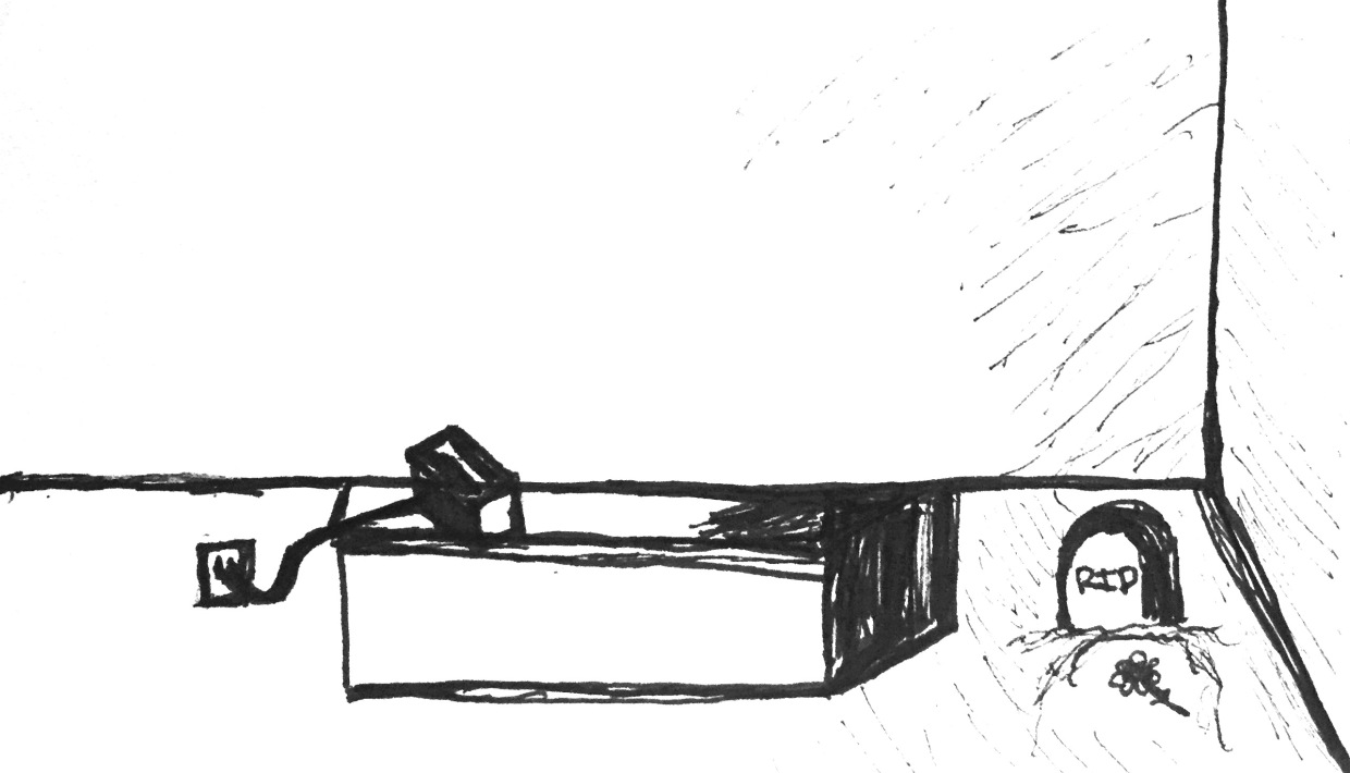
his single-panel sketch compacts an efficient narrative: We see a toaster oven, still plugged in, and a grave site next to the counter where toast never materialized.

Subjectivity: Depicting a subject experiencing the passage of time through emotion, action, or movement.

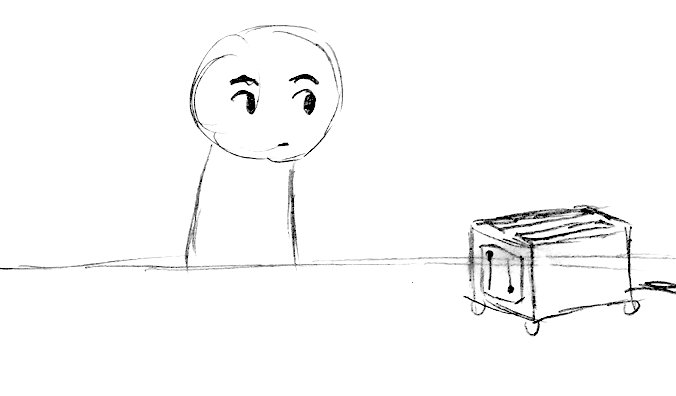
In this three-panel sketch, we see Subjectivity at work, with intensification. The subject is seen waiting in the first pane, and then a stylization of toast as a clock signifies a passage of time (to reinforce/intensify the wristwatch from the first pane), and then in the final panel, we see a skull with attached cobwebs. This peak intensity, coupled with a toaster that still hasn’t produced toast, exaggerates the feeling of waiting – literally forever.

Intensity: Sequential exaggeration of particular attributes within a series of images.

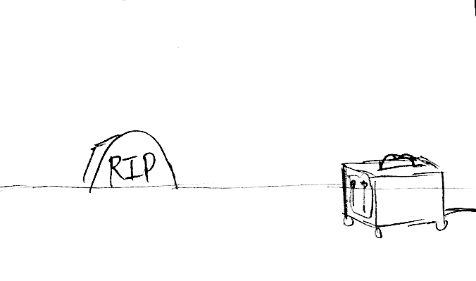
n this final sequence, a four-panel sketch, we see a similar use of intensification. The subject ages, and dies. The toast materializes only after the subject has passed.