Over the weekend I had a chance to sit down and read over the first two chapters of Adobe Illustrator guide. I think I may have just confused myself. One of the key challenges is the fact that I have very little experience with Adobe’s Creative Suite. It’s like a whole new language. Furthermore, I do not have this software at home, and thus cannot easily relate to these new sets of terms. It is hard to apply knowledge when everything about it is purely theoretical. Last but not least: this was just a ton of new information.
At least there were pictures.

Clear as mud, but at least you can see it. Page 33 (Artboard printing)
llustrator is a massive heap of skeuomorphisms, and this only makes sense for those who began their careers in print making prior to the advent of computers in Graphics Design. This can be a huge challenge for newcomers, but this challenge is hardly unique to Illustrator. True story: a seventeen-year-old in one of my freshmen courses once described the save button in MS Word as a “purple truck”.

Beep! Beep! I’m a truck!
See, the thing was, she’d never even seen a floppy disk before. This graphic held no contextual meaning for her. She never experienced the joy of inserting a 3.5-inch piece of plastic into a clunky (yet essential) device to save her document. By the time she was old enough for K-12, the iMac was standard, and those computers (controversially) never shipped with a floppy drive.

“No floppy, no problem! You’ve got the World-Wide Web, son!” source:betanews.com
she accepted the function (saving her document was important, after all), but couldn’t make the connection between function and form. I’m not telling this story because it is funny (I still laugh when I think about her), but because I can now relate to her better after reading about Adobe Illustrator’s Tool Bar and Control Panel. Some of the symbols are easy to recognize, despite the fact that I’ve never actually used them in real life:
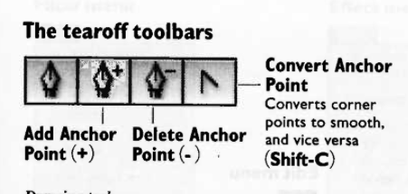
Page 3 – The tearoff toolbar
I’ve never used a fountain pen. I’ve had a classmate spatter ink on me accidentally with one, but that’s really about it. Generally speaking, I “get” pens. I’m fond of needlepoint over ballpoint, but that’s not the graphic here. What if I’d never seen a fountain pen before? How’d I ever hope to recognize the function?
I’m sure I’ll catch up, and with enough practice become proficient with this tool set. I just wonder how many “purple truck” moments I’ll have along the way.


