Haptic feedback checkout system
ABOUT
How might we improve the experience of grocery store shopping, and what controls do shoppers and staff rely upon to complete important tasks? These questions formed the basis for a research-based interaction design challenge. In the winter of 2020, students in the Master of Arts program in the School of Design at Carnegie Mellon University were assigned to research interactions in the context of grocery stores, parking structures, vending machines, vehicles, and other everyday activities. The goals for this project included:
Rapidly generating ideas and making interaction design decisions based on established design patterns and principles, relevant constraints, field research, and understanding the context of use.
Iterating and evolving a design concept over time-from sketches to wireframes and mock-ups, to prototypes, through visual design and specifications.
Designing for a range of interaction modalities (e.g., screen, voice, gestural, haptic).
Field research observations from a local grocery store in Pittsburgh, PA, revealed a rich array of electronics and physical controls associated with the checkout and point-of-sale systems. This area of user interaction provided endless opportunities for intervention. This process ultimately led to a focus on the feedback mechanisms associated with product scanning; I propose an intervention that is more inclusive, accessible, and more enjoyable for users.
This project was part of a series of studio-based learning assignments in Introduction to Interaction Design by taught by Raelynn O’Leary and Ashely Deal of Dezudio.
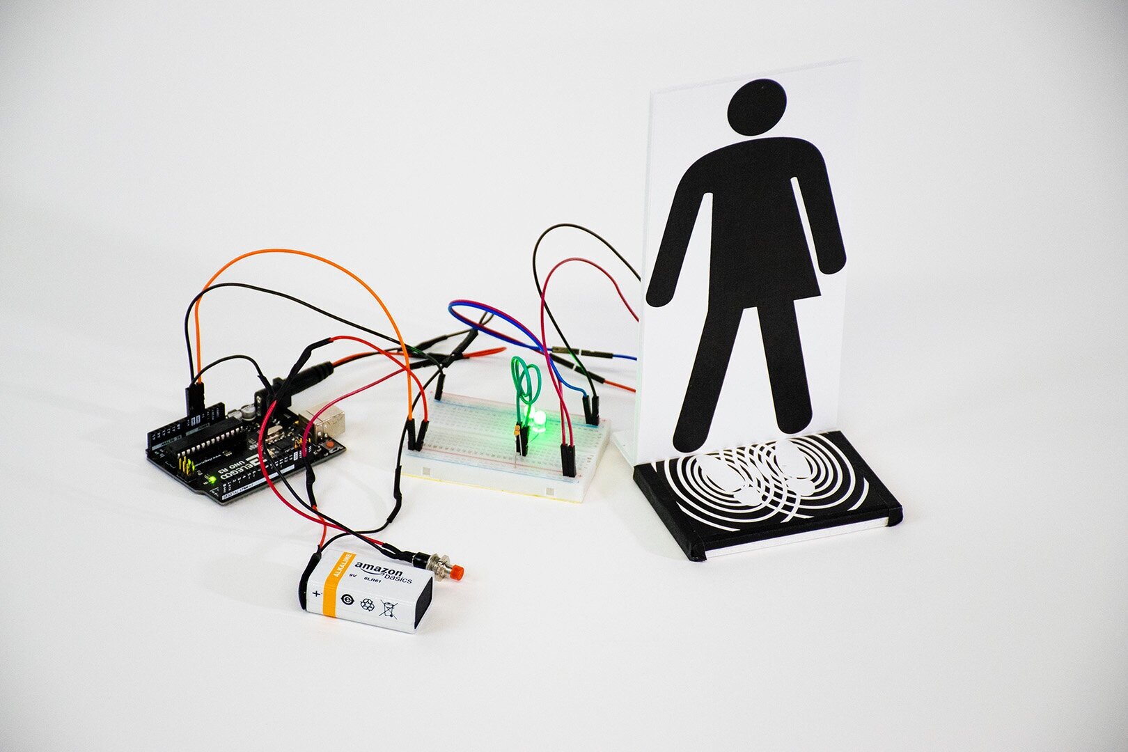
Interactive prototype, demonstrating haptic feedback experience for checkout systems.
Field Research
PITTSBURGH, PA.
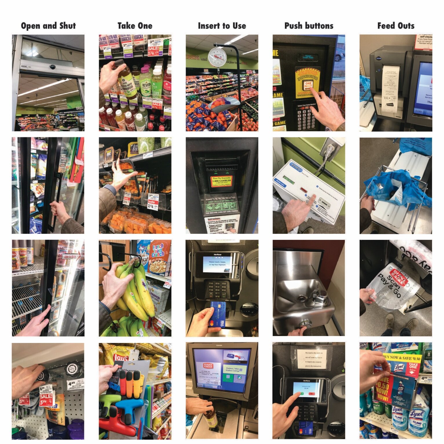
Field research began and concluded at the Giant Eagle Supermarket on Murray Avenue in Squirrel Hill. Like most modern grocery stores in the United States, Giant Eagle follows a predictable user flow: customers enter through automatic sliding doors, navigate through discrete categories of products, and then arrive at a point of sale section. This final stage is either completed by the customer (self-checkout) or cashiers. I recorded more than twenty interactions throughout the store, a disproportionate number of these were part of the self-checkout experience. This process was so rich with interactions and overlapping complexity, that it ultimately became a focal point of my observational research.
In its current state, the process of self-checkout is unpleasant. It is unpaid labor, executed by the customer. The design is narrowly focused on simplicity and speed. It is not made to be enjoyable, only quick. Despite this sparse, utilitarian approach, the existing system is also plagued with needless complexity, prone to repeated human errors, and wasteful redundancy.
Inventory of interactions
CATEGORIZATION AND INTERPRETATION OF EXISTING MODELS
Taking inventory of interactions helped to reveal patterns of the user experience. By evaluating these interaction through the lens of discrete categories, it was easier to understand existing models and to propose meaningful interventions.
After completing individual and group field research, students presented their findings and compared observations. In the above example, I described interactions related to the experience of shopping. While these observations were not directly tied to the proposed solution for self-checkout, they were a necessary component to understanding both the goals of self-checkout and to properly frame the process within the context of the preceding interactions.
IDEATION
CATEGORIZATION AND INTERPRETATION OF EXISTING MODELS
Taking inventory of interactions helped to reveal patterns of the user experience. By evaluating these interaction through the lens of discrete categories, it was easier to understand existing models and to propose meaningful interventions.
Sketching concepts for potential interventions was an essential component of this project. Due to the constraints of rapid deadlines and the expectation of designing a meaningful control, sketching simple thumbnails of potential solutions aided peer review and critical feedback. Sketches also provide a low-cost, low-stakes method of prototyping.
CONCEPT
The current paradigm for self-checkout systems requires constant feedback for scanning items. The use of sound is an extremely limited application.
PRODUCTION
Prototyping to test and evaluate a different feedback mechanism: one that customers can feel, instead of only hearing.
FORM CONSIDERATION
One of the key challenges in designing an effective prototype to evaluate this interaction was scale. Self-checkout kiosks are large, expensive, and technically sophisticated. They have several internal components, electromechanical devices that work in concert, proprietary software, and even lasers. These devices are as complex as they are unpleasant. I would need to simplify the interaction to understand how users would respond.
TESTING
After completing a series of sketches to consider the complete system, I began constructing simplified models to evaluate sub-components that users would interact with. Parts included a full-scale mat for users to stand on (with graphics to indicate the function), and a miniaturized electronic device to transmit vibrations.
VIDEO SIMULATION
To demonstrate the concept of a whole system, while only prototyping a single interaction, I decided to leverage 3D motion video to illustrate the process. This was achieved using Fusion 360, model assets from GrabCAD. com, and Cinema 4D. These tools allowed for rapid visualization, and to consider some the practical elements at a higher fidelity than would be permitted with physical materials.
FINAL DELIVERY
A combination of prototypes built at different levels of fidelity and scale to communicate a new design.
The constant sound of beeps is not only unpleasant, it is also ambiguous when in close proximity to several identical machines. Furthermore, it does not provide utility or value for the hearing impaired. How can we improve this interaction? We can leverage other human senses.
PROTOTYPING
BUILDING TO LEARN, LEARNING TO BUILD
Constructing a prototype was important to evaluate and test interaction. How would people respond to this kind of feedback? Does it work intuitively or does it add more complexity to an already ambiguous process? Ideation and prototyping are parallel processes, and some of the discoveries, decisions, and evaluations were deeply woven into a cycle of prototyping at various levels of fidelity.
FEEDBACK
Knowing that users needed to be able to consciously feel their feedback, I began constructing a miniature scale model. Users would not be able to stand on something this small, but by placing their fingers to match the drawn figure (an image based on a gender neutral icon from TheNounProject.com), users could still experience a felt form of feedback. I constructed a simple circuit with manually actuated vibration motors hidden under the base.
ABSTRACT
For the purposes of exploring feedback, it felt excessive to construct any kind of detection or scanning mechanisms. Instead, I used a simple push button to open and close the circuit. This allowed me to manually induce vibrations in the platform, while users placed simple mock-ups of grocery items onto a “scanner.” Because these models are familiar, it was relatively easy to get users to fill in the gaps with their own creativity.
DISCOVERY
While constructing this simplified model, I realized a design flaw that would affect users who experience mobility challenges. Not all grocery store customers have use of their legs. This can be a temporary or life-long condition. According to the Reeve Foundation, nearly 1 in 50 Americans are living with paralysis. Realizing that I would need to provide additional feedback mechanisms, I decided to integrate LEDs with the circuit’s vibration.
SCALE
To evaluate the embodied experience of users, some components were built to full scale, while minimizing the materials necessary to establish interaction. Non-electrical components were constructed with paper and mounting boards.
Fingertips are sensitive enough to be excellent candidates for detecting even weak vibrations. This is one of many advantage of building to this scale. It only requires a little bit of imagination.
Testing and CONCLUSIONs
By combining these simple elements, I was able to construct a working system to evaluate user interactions. The visual and haptic feedback mechanism proved to be a viable alternative, but with a few unknowns that are worth addressing:
Scale
Because the vibration feedback was not validated at scale, there might be additional considerations that remain unknown through this testing process.
Variability for users
The tests were conducted with able- bodied, healthy, young people. There might be hidden factors revealed if testing with a broader demographic.
Environment
A studio environment does not recreate the full experience of a crowded grocery store. To validate this system, environmental factors must also be considered.


